 By

Every page, email and ad you publish asks the reader to do something next. The call to action is where you say what that is. Picture a shop with a sign that reads "We have stuff": people wander in, look around and leave, because nothing tells them what to do. A clear call to action is the difference between a visitor who browses and a visitor who signs up, books or buys.
What is a call to action?
A call to action (CTA) is a prompt that asks someone to take one specific step: buy a product, sign up for a newsletter, download an ebook, book a call. It's usually a button or a link, with a few words of copy around it. A bakery sign that says "Buy one, get one free today" is a call to action too. It tells passers-by exactly what to do and why to do it now.
CTAs show up everywhere: on landing pages, in blog posts, in emails, in popups and floating bars, in social posts and ads, and on flyers. Wherever they appear, their job is the same, which is to move the reader from interest to action.
Why calls to action matter
Without a call to action, visitors have to work out the next step on their own, and most won't bother. A good CTA does three things for you:
- It turns attention into a result you can count: a sale, a lead, a subscriber.
- It makes the page easier to use, because people can see where to go next.
- It gives you something to measure. Clicks and conversions on a CTA tell you whether a page, email or ad is doing its job.
The right CTA can also lead to more than one sale. A buyer who had an easy, clear experience is more likely to come back and tell friends about you.
Types of calls to action
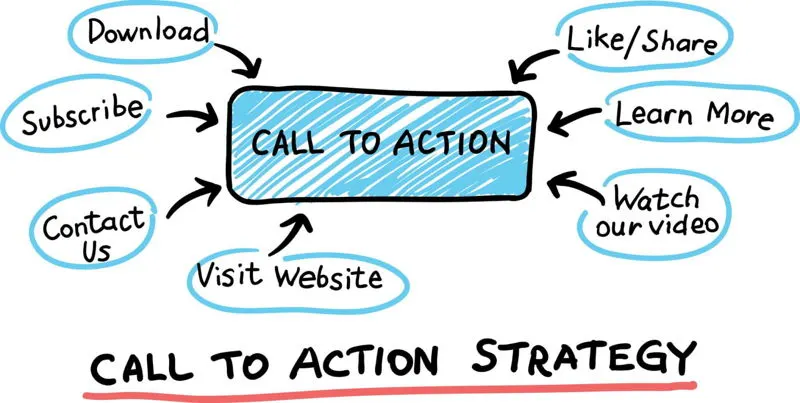
Calls to action differ by what they ask for. Choose the type that matches the channel and how ready the reader is to act. A social post can be casual and point people somewhere, while a landing page usually goes straight for the sign-up or sale.
| Type | What it asks for | Examples |
|---|---|---|
| Transactional | A purchase or a trial | Buy now, Start your free trial, Pre-order now |
| Lead generation | Contact details in return for something useful | Download the guide, Get a quote, Book a demo |
| Informational | More reading before a decision | Learn more, See how it works |
| Engagement | A share, comment or sign-up to a community | Share with a friend, Join our community |
| Navigational | A move to another page or place | Find a store near you, See all templates |
| Feedback | An opinion or review | Leave a review, Take the 1-minute survey |
CTAs also come in different formats. Buttons are the norm on websites and landing pages because they stand out and are easy to tap. Text links suit emails, blog posts and social captions, where a big button would feel out of place. Popups, slide-ins and floating bars put a CTA in front of visitors at a chosen moment, such as when they reach the end of an article.
How to write a call to action that gets clicked
Start with a verb
Action words tell people what to do: get, start, claim, join, download, book, try. "Get started" or "Download the checklist" gives the reader a clear step. "Submit" and "Click here" don't, so they rarely get clicked. Our list of power words has more verbs that work on buttons.
Say what the reader gets
The best CTAs name the result, not the mechanics. "Get my free quote" beats "Submit", and "Send me the guide" beats "Learn more". If the reader has to guess what happens after the click, many won't click. Compare "Sign up for our newsletter" with "Learn more about our newsletter": the first says what happens next, so it gets more sign-ups.
Keep it short
Two to five words on a button is usually enough. Put the detail in the line above or below it. "Sign up" is easy to read at a glance; "Subscribe to our newsletter and receive exclusive updates" is too long to read on a button, let alone click.
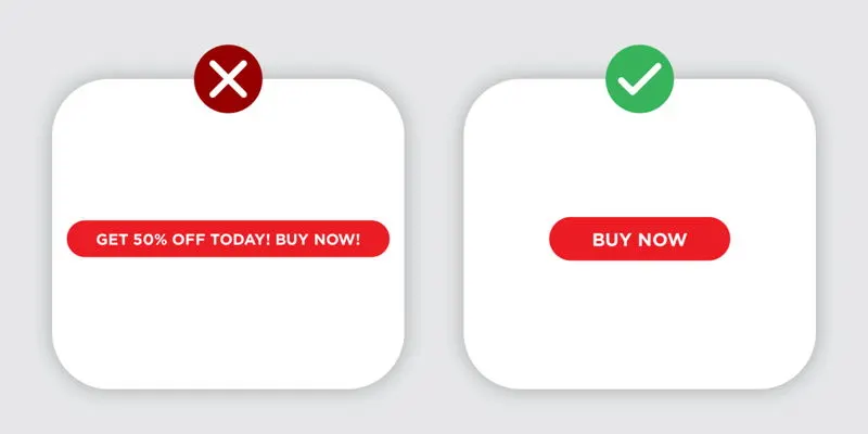
Add urgency when it's real
A deadline gives people a reason to act now. "Sale ends Sunday", "Last day for early-bird prices" and a countdown timer all work, as long as the deadline is true. Overdo it and people tune it out. Urgency works best combined with value: "Book your free consultation this week and get a written plan".
Make it personal
Write the CTA for the person reading it. First-person labels like "Start my trial" feel like the visitor's own choice, and CTAs that change with the audience perform better than generic ones. HubSpot found that personalised CTAs, tailored to who was viewing the page, converted 42% more visitors than the same CTA shown to everyone.
Match your brand's voice
A relaxed brand can say "Let's do this". A law firm should say "Book a consultation". The CTA should sound like the rest of the page, so it reads as the natural next step instead of a sales push.
The psychology behind a good CTA
Most strong CTAs lean on a few well-known motivators:
- Scarcity and urgency: "Only a few seats left" or "Offer ends at midnight" make waiting feel like a loss.
- Social proof: "Join thousands of subscribers" or nearby reviews show that other people have already said yes. Only use numbers that are true.
- Authority: a recognised certification or an expert's endorsement near the button lowers the risk of clicking.
- Belonging: "Join our community and get early access to new products" sells membership as well as the offer.
Feelings drive clicks more than logic. Nobody gets excited about "Submit form", but "Don't miss your spot" gives the reader something to feel.
CTA button design
Use contrast
Your main button should be the most noticeable thing on the screen. Pick a colour that stands out from the background and isn't used for anything else nearby. Colours carry associations, such as red for urgency, green for go and blue for trust, but no colour wins everywhere. Contrast with the page around it matters more than the colour itself, so test it.
Get the size and shape right
Too small and the button disappears; too big and it looks pushy. Make it large enough to read at a glance and to tap with a thumb, and give it rounded or square corners to match the rest of your design.
Give it space and a clear hierarchy
White space around a button draws the eye to it. Have one main CTA per screen, and make any secondary actions (such as "See pricing" next to "Start free trial") visibly quieter, for example as a text link or an outlined button.
Design for mobile
Many of your visitors will be on a phone. Buttons need to be big enough to tap, with readable text and enough space between them that people don't hit the wrong one. Check every CTA on a real phone, because a button that looks right on a laptop can break on a small screen.
Make it accessible
Use high contrast between the button text and its background, a font size people can read, and a label that makes sense on its own. Screen reader users often jump from link to link, so ten buttons that all say "Learn more" don't tell them anything. Make sure the button can be reached and pressed with a keyboard too.

Where to place your call to action
Placement can matter as much as wording. A few rules of thumb:
- On landing pages, put the main CTA above the fold, where people see it without scrolling, for visitors who arrive ready to act. Repeat it lower down for those who need more convincing first.
- At the end of a blog post, give readers a next step that fits what they just read.
- In emails, use one main CTA. Put it near the top or at the end of the message, and keep other links quiet.
- Match the CTA to the visitor's intent. A shopper on a product page wants "Add to cart"; a reader on a how-to article is more likely to take "Get the checklist".
Timing matters too. Convertful lets you show a CTA in a popup, floating bar or inline form and choose when it appears, for example when a visitor scrolls to the end of a post or moves to leave the page, so the offer arrives when they're paying attention.
Call to action examples by goal
- Online store: "Buy now and get free shipping", "Add to cart", "Claim 10% off your first order".
- Software: "Start your free trial", "See how it works", "Book a demo".
- Services: "Get your free consultation", "Request a quote".
- Publishers and newsletters: "Sign up for our newsletter", "Send me the weekly roundup".
- Nonprofits: "Donate now to help families this winter", "Volunteer with us".
- Events: "Save my seat", "Register for the webinar".
- Product launches: "Pre-order now", "Join the waitlist".
For more ideas, see 12 proven call to action phrases and 18 calls to action big brands have used.
Common call to action mistakes
- Vague labels. "Submit", "Click here" and a bare "Learn more" don't tell people what they'll get.
- Hiding the button. A CTA buried at the bottom of a long page, or in a colour that blends into the background, gets missed.
- Too many competing CTAs. Five buttons of equal weight leave people unsure which one matters, so they often click none.
- Clutter around the button. Images, links and text crowded around a CTA pull attention away from it.
- One CTA for every situation. The wording that works in an email may not work on a product page. Adapt it to the channel and the reader.
- Never testing. Gut feeling is a starting point. Your visitors' clicks are the answer.
How to test and measure your CTAs
Track a few numbers for every important CTA: click-through rate (how many people who saw it clicked), conversion rate (how many went on to finish the action), and, where you can, the revenue each CTA brings in. A low click-through rate usually points to the wording, design or placement. Lots of clicks but few conversions points to what happens after the click.
Then improve it with A/B tests. Show half your visitors one version and half another, change one thing at a time (the words, the colour, the size or the position), and keep the winner. Heatmaps show where people look and click, which helps you decide what to test next. Test on mobile separately, since what works on a laptop can fall flat on a phone. Before you call a winner, check the result with our statistical significance calculator.
Keep the wording and style of your CTAs consistent across your website, emails, social posts and ads, adapted to each format. People start to recognise them, and you can compare results between channels. For the wider picture, see our guide to conversion rate optimization.
Frequently asked questions
What is a call to action in marketing?
A call to action (CTA) is a prompt that asks your audience to take a specific next step, such as "Buy now", "Sign up" or "Download the guide". It's usually a button or link on a web page, in an email or in an ad.
What makes a good call to action?
A good CTA starts with a verb, says what the reader gets, is short enough to read at a glance and stands out from the rest of the page. Urgency helps when the deadline is real.
Where should I put a call to action?
Put the main CTA where people see it without scrolling, then repeat it after the content that convinces them. In blog posts, add one at the end; in emails, use one main CTA near the top or the end.
How many calls to action should a page have?
Give each page one main goal and one main CTA. You can repeat that CTA down the page and add a quieter secondary option, but several equal buttons compete with each other.