What makes a Call to Action truly irresistible? Picture a button that pulls you in, almost demanding a click: who can resist that tug? The right CTA does more than boost conversion rates; it shapes how users move through your site and feel about your brand. In today’s fast-moving digital world, CTAs guide users toward a specific goal, making them essential for any effective digital marketing strategy. Stick with me, and you’ll learn how to craft CTAs that deliver results and truly lift your conversion rate improvement.
With a thoughtful approach, you can tap into the full power of your CTAs and watch your marketing efforts pay off. Ready to dig into the art of prompts that work? It’s time to stop relying on luck and start designing CTAs that speak directly to your audience. Let’s get started…
Table of Contents
1. What is a Call to Action?
2. Why Calls to Action Matter
3. Elements of an Effective Call to Action
4. Types of Calls to Action
5. Common Mistakes to Avoid
6. Crafting Compelling CTA Copy
7. Design Tips for High-Impact CTAs
8. Testing and Optimizing Your Call to Action
9. Measuring Call to Action Success
10. Conclusion
What is a Call to Action?
A call to action prompts users to take a specific step, such as buying, subscribing, or downloading content. Its job? To guide visitors toward your goal, and it can make all the difference in growing conversions and sales. Think of Apple’s classic “Buy Now” or “Learn More”. Those simple options nudge even the most cautious users. Ever wonder why these phrases work so well? There’s a real science behind CTAs, and understanding what makes them tick can change your results.
CTAs connect deeply with human motivation. They use action words, hint at urgency, and often play to our desire for social proof. HubSpot reports that action-driven CTAs can boost click-through rates by as much as 25%. Numbers like that show just how much impact a carefully written CTA can deliver.
Why Calls to Action Matter
Calls to action matter because they drive users from passive browsing to meaningful engagement. In most marketing strategies, CTAs are the gentle nudge, or the bold push, that helps achieve a specific business goal. Use clear, strong language and you’ll see more people taking the steps you want. A MarketingProfs study found that CTAs packed with action words can push click rates up by 15%. That’s no small feat for such a tiny piece of copy.
CTAs also improve how people experience your website or app. Strong, well-placed prompts help users find their way and get what they want faster. Research from Nielsen Norman Group shows that users faced with clear CTAs are more likely to finish what they started. So not only do CTAs drive your business forward, they make life easier for your audience, too.
Elements of an Effective Call to Action
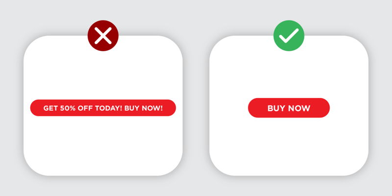
Clarity, specificity, and visibility are the pillars of a strong CTA. Use simple words that don’t leave room for doubt and you’ll connect better with your audience. Good CTAs say exactly what to do, like “Sign up now” or “Learn more today”; these quick commands tap into a sense of immediacy. Action verbs and a dash of urgency can go a surprisingly long way.
Clear CTAs don’t just sound nice, they get results. HubSpot found that straightforward, direct language can lift click rates by as much as 20%. If you want better conversions, start by saying exactly what you mean.
Clarity and Specificity
There’s no substitute for being clear and direct. Action-focused CTAs. Think “Download our e-book now” or “Join our newsletter today”. They spell out exactly what’s expected. Notice how these phrases don’t beat around the bush? That’s intentional; specific language spurs people to action.

The value of clarity goes beyond getting your message across. It’s rooted in how people make decisions: the easier a choice feels, the more likely someone is to act. Nielsen Norman Group’s research backs this up; when CTAs are clear, users finish more actions and feel better about the experience.
Placement and Visibility
Where you put your CTA matters almost as much as what it says. Make it visible, use a pop of color, and don’t bury it below endless paragraphs. Otherwise, it’ll disappear into the background. For example, placing a bold button above the fold with a contrasting shade can lift click rates by 25%. Subtle design tweaks like white space and thoughtful typography can also pull eyes to your CTA and make it more inviting.
It’s not just about standing out for the sake of it; visible, well-placed CTAs are proven to perform better. HubSpot’s data shows that these visual improvements can drive up click-through rates by 20%. Sometimes, the simplest design adjustments pack the biggest punch.
Types of Calls to Action
CTAs aren’t one-size-fits-all. You’ll find them as buttons, links, or even simple lines of text. Each with its pros and cons. The style you choose should match your campaign and audience. For instance, landing pages often rely on bold buttons, while email campaigns might favor clean, text-based CTAs. Never underestimate the power of clear wording and a well-chosen color; together, they can turn a simple prompt into a conversion magnet.
Button and link CTAs work best when designed with action words and eye-catching colors. MarketingProfs notes that this combo can raise click-through rates by 15%. It goes to show: sometimes it’s the details that make all the difference.
Automate Conversions, Instantly Turns Traffic Into Leads & Sales
Don’t let visitors slip away! Quickly grow your subscriber list, attract more leads, and drive up sales with our AI-powered lead generation solution
Buttons and Links
Buttons and links are everywhere, and for good reason. They work. Action-packed words and striking colors grab attention and guide users along. Think about it: would you rather click a dull, generic link or a vibrant button urging you to “Get Started”? The choice is clear. Specific language and a hint of urgency can move people from interest to action before they even realize it.
Good design and smart copy go hand in hand. Nielsen Norman Group found that clarity in button or link CTAs helps users complete tasks, making the whole process smoother. When navigation feels intuitive, you’re likely to see those conversion numbers climb.
Text-Based CTAs
Don’t overlook text-based CTAs. They punch above their weight in places like emails or social feeds. Short, energetic commands such as “Subscribe now” or “Discover today” can be just as powerful as fancy buttons. A personal touch or a conversational twist often makes these CTAs feel welcoming, not pushy.
Used wisely, text CTAs can guide readers toward your goal while building rapport. HubSpot’s research shows they can boost click rates by up to 20%, sometimes, a few well-chosen words are all it takes.
Common Mistakes to Avoid
No one wants a muddled, hard-to-find CTA. Common missteps: vague language, clutter, or poor visibility: can drag performance down. Stick to clear, direct language, put your CTA where people can see it, and let it stand out with contrast. Often, a simple rewrite or a change in placement can breathe new life into your results.
Small mistakes can have big consequences. Ambiguous CTAs might leave users confused, while overcrowded layouts can bury even the strongest message. According to Nielsen Norman Group, clarity is key: when CTAs are obvious and easy to find, users are far more likely to act. Clean, focused design goes hand in hand with better engagement.
Crafting Compelling CTA Copy
Great CTA copy turns interest into action. Mix action words with a hint of urgency or a promise of value, and you’ll catch the eye, and the click, of your ideal customer. Phrases like “Join now for 20% off” or “See how we do it” work because they speak directly to the reader’s desires or curiosity. A casual, friendly tone can help too; after all, nobody likes to be barked at.
CTA copywriting isn’t just about choosing word. It’s about knowing what motivates your audience. HubSpot notes that layering in personalization and urgency can push click rates up by 25%. When your language feels natural and genuine, people respond.

Design Tips for High-Impact CTAs
Design can make or break your CTA. Smart use of color, clear fonts, and plenty of room to breathe are the building blocks of a standout prompt. A bright button in a sea of muted color will always draw the eye first/ Sometimes, that’s all it takes. Well-chosen design elements do more than look nice; they guide the user’s journey in subtle ways.
Never underestimate how design choices affect results. Research from Nielsen Norman Group found that users who encounter clear, well-designed CTAs are more likely to take the next step. Good design offers more than just curb appeal; it drives real engagement.
Testing and Optimizing Your Call to Action
If you want better results, start testing. Compare different CTA formats, colors, or copy using A/B tests; let the numbers show you what works. Maybe a red button outperforms blue, or “Get Started” wins over “Sign Up.” Heat maps and analytics can highlight where users are drawn, or where they stumble. Data-driven tweaks often yield surprising gains.
Testing reveals what your audience actually responds to, not just what looks good on paper. HubSpot reports that optimized CTAs can drive clicks up by 25%. A little experimentation can pay off. Sometimes in ways you didn’t expect.
Measuring Call to Action Success
Once your CTAs are live, it’s time to measure what matters. Track click-throughs, conversion rates, and even the revenue each prompt brings in. Noticing a low click rate? It might be time for a fresh approach. Sometimes the smallest change can turn things around; that’s where data becomes your best friend.
Clear metrics show whether your CTAs are pulling their weight. Nielsen Norman Group’s findings reinforce this: users are more likely to act when CTAs are visible and direct. Regular measurement lets you build on what works and fix what doesn’t.
Conclusion
Effective calls to action drive conversions, plain and simple. Use clear words, prime placement, and eye-catching contrast to get noticed. Test, refine, and use real metrics like click-through and conversion rates to measure progress. The right blend of action words and urgency can make a world of difference. So why wait? Start building and fine-tuning your CTAs now; you might be surprised at how fast your results climb.
Looking ahead, the CTA landscape will evolve with new trends and tools. Stay curious, keep testing, and don’t be afraid to try something new. The possibilities are vast and your next big win could be just one well-placed button away. If you’re ready to unlock lasting success in digital marketing, there’s no better time to start refining your CTAs.
 13 Lead Generation Strategies That Actually Work
 Convertful Update #36