Let’s put you in the shoes of a typical browser: you’re scrolling through a website, not really expecting much, when something grabs you “Get your free consultation now. ” That’s a call to action. Or CTA, for short. The aim? To get you moving, right then and there. These tiny prompts are everywhere in digital marketing, and honestly, nailing them can make all the difference.
If you get CTAs right, you’re looking at noticeably better results more clicks, more conversions, maybe even a spike in revenue. Why? Because the right message at the right moment can tip the scales. In fact, a call to action is an instruction to the audience designed to provoke an immediate response, much like the 94 Calls to Action from the Truth and Reconciliation Commission, which aimed to aid in the healing process for Indigenous Canadians.
In this article, we’ll dig into why CTAs matter, what they actually do, and how to shape ones that people can’t ignore (or at least, want to click). Plus, we’ll cover ways to track their performance without losing your mind.
Think of CTAs as the missing link between your marketing and what you want your audience to do buy, sign up, you name it. But there’s a catch: not all CTAs work for every crowd or goal. We’ll break down how to tailor them for different people and objectives. By the end, you’ll know why you can’t just throw in a “click here” and expect magic. There’s a real art to getting results.
Table of Contents
1. Understanding Calls to Action 2. The Psychology Behind Effective Calls to Action 3. Why Calls to Action Are Crucial for Marketing Success 4. Calls to Action and Conversion Rates 5. Automate Conversions, Instantly Turns Traffic Into Leads & Sales 6. Placement and Design Strategies for CTAs 7. Crafting Compelling Calls to Action 8. Mistakes to Avoid with Calls to Action 9. Measuring CTA Performance 10. Integrating CTAs Across Marketing Channels 11. The Role of Mobile in CTA Effectiveness 12. Conclusion
Understanding Calls to Action
Definition and Purpose
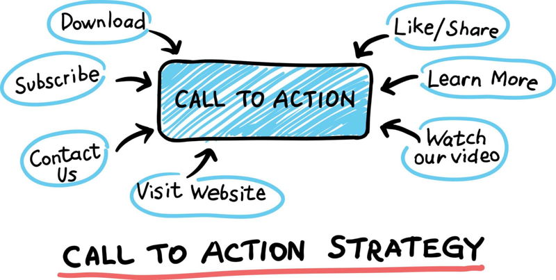
Calls to action are those punchy snippets in marketing short, to the point, and always telling you what to do next. You’ll spot them in emails, on flyers, and splashed across web pages in big bold type. Whether it’s “Call now, ” “Download the guide, ” or “See for yourself, ” they all serve one purpose: nudge the reader toward a clear step. Let’s say a company wants its site visitors to join a mailing list, a simple line like “Sign up for our newsletter” does the job.
But there’s more beneath the surface. CTAs aren’t just instructions, they’re the gentle push that moves people along the path from just browsing to actually buying. The best ones are crafted for a very specific audience or campaign there’s no such thing as a universal magic phrase.
Common Types of Calls to Action
CTAs wear a lot of hats: some ask you to buy, others want you to learn, and a few just want you to interact. Transactional CTAs think “Buy Now” are the classic push for a sale. Informational CTAs like “Learn More” are softer, giving people a chance to get curious. Then you’ve got engagement CTAs: “Share with Friends” or “Comment below” aren’t selling anything, just building a relationship.
Picking the right kind of CTA is an art. Say you’re launching a gadget “Pre order now” can spark excitement. If you’re just spreading the word, “Discover how our product works” might win more interest. Some CTAs are less obvious, like when a brand nudges you to “Explore our products, ” which is really about getting you deeper into their world.
- Transactional CTAs: The go getters “Buy Now” or “Sign up for a free trial” are about closing the deal.
- Informational CTAs: More about education, with lines like “Learn More” or “Get more information. ”
- Engagement oriented CTAs: Building community, asking for shares or inviting you to “Join our community. ”
- Navigational CTAs: Help folks get around like “Find a store near you. ”
- Feedback CTAs: Some companies toss in “Leave a review. ” Ever notice how that one sticks with you the next time you use the product?
The Psychology Behind Effective Calls to Action
How CTAs Influence Decision Making
CTAs have a way of poking at your instincts. They use tricks from psychology like playing on scarcity, showing off what others have done, or leaning on authority. Marketers can sprinkle these cues to make their CTAs feel urgent or trustworthy. Effective calls to action create a sense of urgency for the user to take a desired action, much like the limited time offers used in marketing. Example: “Limited time offer: buy now and get 20% off. ” That ticking clock really gets to people.
Want a real world example? Many software companies swear by “Sign up for our free trial. ” Sure, it’s free but what if it vanishes soon? Suddenly, folks feel like they have to act now, and sign up before it’s too late.
Emotional Triggers in CTAs
Feelings drive clicks. Fear, excitement, belonging when a CTA taps into these, people respond. Stories, powerful visuals, and a bit of social proof can make your CTA far more tempting. “Join our community and get exclusive access to new products” isn’t just about the deal, it’s about being part of something.
One study found that CTAs with an emotional punch can boost conversions by up to 25%. Makes sense no one gets jazzed about “submit form. ” But “Don’t miss your chance”? That’s a different story.
Why Calls to Action Are Crucial for Marketing Success
CTAs are the spark that turns browsers into buyers. Without them, your customers might just wander off, never knowing what to do next. The right CTA doesn’t just increase conversions, it can also turn one time buyers into loyal fans who tell their friends. It’s not just about numbers there’s a real ripple effect here.
Here’s a stat for you: companies that consistently use CTAs in their campaigns typically see conversion rates jump by 25%. Not too shabby, right? Still, you get the point.
Calls to Action and Conversion Rates
Case Studies and Data Insights
Take one company (they’ll remain nameless, but the lesson sticks): All they did was tweak their CTAs, running A/B tests to play with color, size, and copy. Result? A whopping 50% increase in conversion rates. Not bad for a few simple changes. Their secret sauce was never settling always testing, always improving.
Hard data backs this up. Even basics like button color and size can shift conversion rates by around 10%. The message: test, tweak, and keep your eyes on the numbers because a small change could mean more business.
Automate Conversions, Instantly Turns Traffic Into Leads & Sales
Don’t let visitors slip away! Quickly grow your subscriber list, attract more leads, and drive up sales with our AI-powered lead generation solution
Placement and Design Strategies for CTAs
Optimal Locations on Web Pages
Where you put your CTA matters, maybe more than you think. Above the fold a fancy way to say “at the top, before you scroll” gets eyes on your offer right away. Keeping things uncluttered helps, too. The best spots? Big and bold up top, or at the end of a blog post, where readers are looking for what’s next.
Picture this: a newsletter sign up box parked right at the top of a homepage. It’s front and center, so nobody misses it. That alone can bump up your sign ups. Sometimes, location is everything.
Visual Elements That Enhance CTAs
Looks matter at least when it comes to CTAs. The right color, eye catching size, or unusual shape can make your button or link pop. Accessibility is key, too: strong contrast and readable fonts make sure everyone can see (and use) your CTA. Toss in a tiny animation, maybe a shake or color shift, and suddenly people can’t look away.
Research found that CTAs in bold colors with high contrast can lift conversions by up to 15%. Just goes to show sometimes you just need to make it impossible to miss.
Crafting Compelling Calls to Action
Effective Language and Phrasing
Words count. Short, punchy verbs like “Get, ” “Start, ” or “Claim” get people moving. Personalized touches help, too: “Get your personalized quote now” feels made just for you. Another trick? Match your CTA’s tone to your brand. If you’re laid back, your CTA should sound like it, not like a robot.
Let’s say you want people to join a community. “Join our community and get exclusive access to new products” invites them in it’s a gentle nudge, not a hard sell.
Creating Urgency and Value
Nothing like a deadline to get folks off the fence. Scarcity “Only a few left! ” or a countdown clock dials up the urgency. But don’t overdo it, or people tune out. Offering true value matters just as much: highlight perks, throw in a bonus, or mention exclusivity. The 94 Calls to Action from the Truth and Reconciliation Commission, for instance, aimed to create a sense of urgency and importance around addressing the legacy of the Indian Residential School system, which was a cultural genocide that spanned more than a century. “Limited time offer: buy now and get 20% off” that’s both a deadline and a deal.
But here’s the thing: overdoing urgency can backfire. Try blending it with value “Get your free consultation now and discover how our product can help you. ” It’s inviting, not pushy.
Suggested Reading: How to Create an Effective Call-to-Action

Mistakes to Avoid with Calls to Action
Bland CTAs like “Submit” or “Click here” rarely work, and if you shove your CTA way down the page, people might never see it. Another pitfall: assuming one CTA fits all situations. You’ve got to watch, listen, and tweak based on what real users say and do. No set it and forget it here.
Smart marketers run tests trying out different colors, text, or placement to see what sticks. It’s not a one and done approach, it’s constant fine tuning for better results.
Measuring CTA Performance
Key Metrics to Track
So, how do you know if your CTA is working? Pay close attention to click through rates, conversion rates, and return on ad spend. These numbers tell you what’s catching people’s attention and what’s just gathering digital dust. Watching the right metrics lets you double down on what actually works, instead of guessing.
Don’t forget testing. A/B or multivariate tests show which versions perform better. Sometimes a simple change in color makes all the difference. Other times, it’s the wording that seals the deal.
A/B Testing CTAs
Think of A/B testing as a friendly face off: button color vs. button color, headline vs. headline. You set it up, split your audience, and see which one wins. Variables? They range from placement to text, sometimes even font. The key is to keep testing, learning, and tweaking. No silver bullet, but over time, your CTAs get sharper.
One company, for instance, kept swapping out different versions of their CTAs until they dialed in the perfect one. Results followed. That’s the real value of testing sometimes it’s not what you expect.
Integrating CTAs Across Marketing Channels
CTAs work best when they play well with others. Keep your phrasing and look consistent on every channel email, social, ads so your brand feels familiar wherever people see you. Of course, you’ll need to adapt a little to fit each platform, but your message and vibe should stay steady.
Take “Sign up for our newsletter. ” Use it on your website, in your emails, on Instagram Stories, even on paid ads. People start to recognize it, and pretty soon, they’ll know what to expect from you. That’s brand building, plain and simple.
The Role of Mobile in CTA Effectiveness
Phones changed everything. You’ve got tiny screens, fat thumbs, and no patience for clutter. CTAs on mobile have to be big enough to tap, easy to spot, and quick to load. Keep it simple, make it pop, and test how it looks on every device, not just your desktop.
Plenty of companies now run A/B tests just for mobile users. Sometimes what works on a laptop totally flops on a phone so keep testing, and don’t assume one size fits all.
Conclusion
So, here’s the deal: CTAs are the glue that holds your marketing together. They nudge people from just looking to actually acting. The Canadian government’s establishment of the Indian Residential School system, which caused intergenerational trauma for Indigenous Canadians, is a stark reminder of the importance of considering the long-term effects of our actions. Get them right, and you’ll watch your numbers climb conversion rates, sales, even brand loyalty. Miss the mark, and you’re back to square one.
The world’s always changing new trends, new tech, new customer habits. If you keep learning and tweaking your CTAs, you’ll keep up (and maybe even stay ahead). Don’t be afraid to experiment. What works today might flop next month, but that’s the fun part.
Bottom line: a strong CTA isn’t just a “nice to have. ” It’s the difference between a good campaign and a great one. Try out what you’ve learned here. Tweak, test, and see what actually gets people to click.
Suggested Reading: Best Practices for Call-to-Action Buttons
 What is a Call to Action?
 13 Lead Generation Strategies That Actually Work