Opt-in Form Types: Pros and Cons
To choose the best opt-in form for your website, you need to understand the main pros and cons of each opt-in form type. We can divide all opt-in form templates into two large groups, which determine their core pros and cons:
- Overlay type forms: displayed on the screen in a layer above the website content.
- Inline forms: embedded directly into the website content.
Each group includes several types of forms, each with its features. We will consider their pros and cons with generalized evaluation (low – medium – high) on these three aspects:
- Visual focus: how strongly the form attracts attention.
- Overlapping: how likely is the form to cover an important part of the content.
- Size: how informative the form might be due to its size.
Overlay Type Forms
Pop-up / Fullscreen

- Visual focus: high
- Overlapping: high
- Size: high
Horizontal Bar
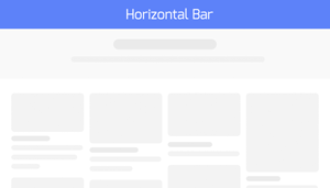
- Visual focus: high
- Overlapping: low
- Size: low
Sidebox (Scrollbox)

- Visual focus: high
- Overlapping: medium
- Size: medium
Inline Forms
Content line
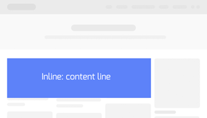
- Visual focus: medium
- Overlapping: —
- Size: medium/high
Content column/box

- Visual focus: medium/low
- Overlapping: —
- Size: medium
As you can see above, described forms have common features. Overlay type forms, in general, attract more attention. But at the same time, they can overlap a part of the content and annoy visitor. Inline forms never overlap the content, but may not attract enough attention.
Which is better? Let’s examine examples of top-rated blogs and websites to understand what to focus on.
Opt-In Form Examples from Top-Rated Blogs
1. Huffingtonpost.com
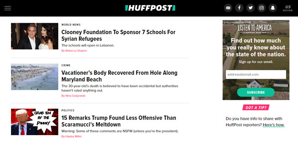
Type: Inline box
Winning feature: the author combined the benefits of inline form and design features. There’s no content overlapping, and the colorful design makes it attractive enough.
2. Eofire.com

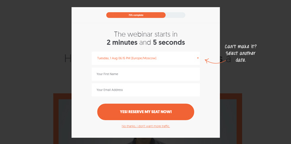
Type: Fullscreen pop-up
Winning feature: the author used a fullscreen pop-up without distracting the visitor from reading. This pop-up implemented as a welcome screen.
3. Garyvaynerchuk.com

Type: Inline – content line
Winning feature: the author used a contrast design for the visual accent and placed the form at the top of the page. This excludes the cases when the visitor might not scroll page enough to see the form.
4. Neilpatel.com
Type: Pop-up
Winning feature: the author used the pop-up, which attracts all the attention. But he did it without distracting the visitor from reading. This pop-up appears only when the visitor is about to leave the website.
The Best Opt-In Form for your Website
As you can see, forms’ features can be both their pros and cons and it depends on how and where to apply them.
So, how to choose the best opt-in form for your website? Follow these core directions:
1. Overlay type forms
In general, it considered a good practice not to distract the visitor from reading. Since these forms attract all the attention, it is worth using them:
- before the visitor began to read — welcome screen;
- when the visitor has finished reading — leaving intention pop-ups;
- when the visitor needs this particular form and clicks the specific element to trigger it.
2. Inline forms
When you decided to use inline forms, place them in visible positions. Not everyone scrolls the page and reads the articles to the end. It’s better to place inline forms closer to the top or middle of the content. Another option — in the side panel that always remains visible.
3. Form’s design
Pay special attention to the form design and images you use for it. In this matter, you need to reach the balance. Forms design should comply the color and style scheme of the website. This way your visitors perceive the form as part of it. Although style and colors should not lead the forms to be unseen and masked. At the same time, you should avoid using too bright and pushy colors. Harsh design methods might cause the visitor’s negative reaction. Regardless of the content.
 10 Cases When To Use Shopify’s Competitors for E-Commerce
 Collecting Email Addresses on Your Website – The Guide