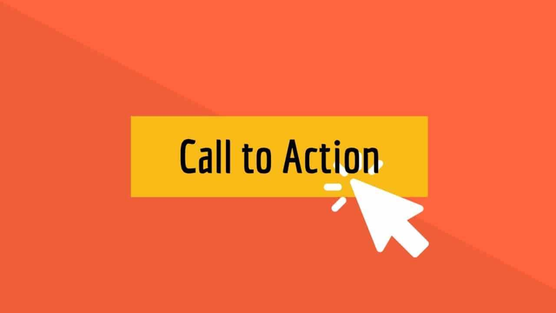
Call to action buttons those little clickable nudges are the unsung heroes when it comes to converting website visitors into customers. A smartly designed button can bump up your conversion rates by as much as 25%. Wild, right? Over time, these buttons have been through some changes: think back to the first clickable images, and the slow march toward designs that actually work on every device. These days, the stakes are higher. Most businesses depend on these buttons to escort users smoothly through their sites or apps.
This article digs into how to make call to action buttons that actually work. We’re talking design tips, where to put them, what to say, and how to test if they’re doing their job. There’s a bit of art and a sprinkle of science to all of it. Anyway, let’s get going.
Table of Contents
1. What Are Call to Action Buttons?
2. The Importance of Effective Call to Action Buttons
3. Understanding User Intent for CTAs
4. Design Principles for Call to Action Buttons
5. Placement Strategies for Higher Engagement
6. Wording Your Call to Action Buttons
7. A/B Testing Call to Action Buttons
8. Mobile Optimization for CTA Buttons
9. Accessibility and Inclusivity in CTA Design
10. Visual Hierarchy and CTA Prominence
11. Common Mistakes with Call to Action Buttons
12. Measuring CTA Button Performance
13. Examples of High Converting Call to Action Buttons
14. Adapting CTA Buttons for Different Platforms
15. Conclusion
What Are Call to Action Buttons?
Call to action buttons? They’re those clickable little prompts you see on sites and apps, guiding you to do something maybe sign up for a newsletter or finish a purchase. They take all sorts of shapes and forms: a bright orange “Buy Now” button, a mellow “Subscribe, ” or even a barely there “Learn More” at the bottom of a page. Their main goal is to nudge folks toward a specific action, without being too pushy well, if they’re designed right.
Think of the “Sign up” button plastered across a popular social media homepage. It’s bold, obvious, and leaves zero room for doubt. Millions click every month, and that’s really no accident.
- Sign up buttons
- Purchase buttons
- Download buttons
- Subscribe buttons
- Learn more buttons
Suggested Reading: What is a Call to Action?
The Importance of Effective Call to Action Buttons
If you want better conversions, you need strong call to action buttons. There’s real data behind this: a button that’s designed with care can boost conversion by up to 30%. But it’s not just about numbers a good button keeps the user journey clear and frustration free. Mess it up, though, and you risk users wandering off, annoyed or confused. That’s money left on the table.
One online retailer, for instance, noticed their sales lagging. Their buy button was a tiny ghost hiding at the bottom of the page. When they made it stand out bigger, higher up, and impossible to miss their conversions took off. Sometimes, it really is that simple.
Understanding User Intent for CTAs
Knowing what your users actually want now that’s half the battle when it comes to designing effective call to action buttons. Are folks there to shop, to browse, or just to poke around? Each intent might need a different nudge. A shopper will look for a “Buy Now”, a reader just wants “Learn More. ” Get this wrong, and users might bounce before you even notice.
Want to know what makes your users tick? Try a bit of research. Watch how they use your site, listen to their struggles, and keep an eye on those patterns. Sometimes, the way people interact with a page isn’t what you’d expect at all. That’s what shapes better buttons.
Design Principles for Call to Action Buttons
Designing a call to action button isn’t rocket science, but it does take some thought. The basics: size, shape, color, and typeface all matter. Your button should stand out, but not shout over everything else. The message? Short, sharp, and crystal clear. If it’s confusing, people won’t click end of story.
Picture a big, bold button in a vibrant color. You notice it, right? Now compare that to a tiny, washed out button almost blending into the background. Which one gets clicked? Exactly. Still, you get the point.
Size and Shape Considerations
Getting the size and shape right isn’t just a design choice it can make or break your button’s usefulness. Too tiny, and it might as well be invisible. Too huge, and it could scare people off. The trick is to make it feel important but not overwhelming.
I once saw an e commerce site switch their “Add to Cart” button from a small pill shape to a larger, rounded rectangle. Clicks jumped. The change wasn’t even that dramatic, but suddenly everyone wanted to buy.
Strategic Use of Color
Color is a game of psychology when it comes to call to action buttons. Get it right, and you’ll draw attention. Get it wrong, and people might never see it. Different hues trigger different reactions red for urgency, green for go, blue for trust. But hey, don’t just copy what everyone else is doing.
One business swapped their blue button for a fiery red. Clicks soared, to their surprise. Sometimes you don’t know what works until you try it out for yourself.
Placement Strategies for Higher Engagement
Where you stick your call to action button matters a lot. Put it too far down, and users miss it. Too high, and maybe they’re not ready to commit yet. The sweet spot? That’s up for debate, and often the answer is: try a few places until you find what clicks.
There was a fashion retailer who moved their “Buy Now” button right above the fold, front and center. Sales immediately jumped. Sounds simple, but it works. Placement is one of those things you need to tinker with.
Wording Your Call to Action Buttons
The words you choose for your call to action button can make or break your conversion rate. Action verbs are your friend here “Sign up, ” “Buy now, ” “Start free trial. ” Skip the fluff and vague language. People want to know exactly what happens when they click.
A classic test: “Sign up for our newsletter” vs. “Learn more about our newsletter. ” The first one brings in way more signups. It’s clear, direct, and says exactly what’s going to happen next. Give it a try.
Automate Conversions, Instantly Turns Traffic Into Leads & Sales
Don’t let visitors slip away! Quickly grow your subscriber list, attract more leads, and drive up sales with our AI-powered lead generation solution
Action Oriented Language
Want users to act? Use language that pushes them forward. Verbs like “Get started” or “Discover more” can make people feel like it’s time to do something, not just think about it. That sense of urgency sometimes it’s all a button needs.
There’s a reason “Get started today” beats out “Learn more, ” almost every time. It tells folks they’re about to take the first step, not just read another page.
Clarity and Brevity
Keep it simple. Avoid jargon. If your button reads like a legal disclaimer, you’ve lost them. Short and sweet wins every time.
“Sign up” it’s direct and to the point. “Subscribe to our newsletter and receive exclusive updates” that’s a mouthful. Users won’t finish reading it, let alone click. Sometimes less really is more.
A/B Testing Call to Action Buttons
If you’re not A/B testing your call to action buttons, you’re leaving results up to chance. Try different colors, sizes, and words. See what sticks. Sometimes the tiniest tweak can turn a dud into a winner. And sometimes, what you expect to work just doesn’t.
I’ve seen companies swap out a blue “Buy Now” for a red one and double their clicks. Or change “Learn more” to “Get started” and suddenly the page lights up with activity. The only way to know? Test, test, and test again.
Mobile Optimization for CTA Buttons
With so many folks scrolling on their phones, your call to action buttons need to work on tiny screens. Big enough to tap, not so big they hog the page. Simple, readable, and easy to use with a thumb that’s the ticket.
An online store made their button font bigger and ditched the clutter for mobile users. Guess what? Sales on mobile shot up. Sometimes it’s just about making things obvious and painless.
Accessibility and Inclusivity in CTA Design
If your buttons aren’t accessible, you’re shutting people out. Make sure everyone, no matter their abilities, can interact with your site or app. High contrast colors help. So do simple designs and clear labels. Accessibility isn’t just a box to tick it’s basic respect.
I remember a case where a store swapped low contrast pastel buttons for bold, black and white ones. Suddenly, more users stuck around. Turns out, making things easier to see is good for everyone.

Visual Hierarchy and CTA Prominence
If your call to action button blends in, it might as well be invisible. Your design should guide the eye right to it through size, color, and placement. The most important thing should pop, not hide in the corner.
On one website, the team boosted the button’s size and switched to a bold color. Instantly, more clicks. It’s all about making the main action obvious. You don’t want your users playing hide and seek.
Common Mistakes with Call to Action Buttons
Plenty can go wrong with call to action buttons. Some folks use confusing phrases, some hide the button so well even Sherlock couldn’t find it, and others never bother to test if it’s working. Each mistake is a missed opportunity.
Take the difference between “Learn more about our product” and “Buy now. ” The first is vague, the second is crystal clear. The clearer button wins every time. Of course, you need to test this stuff, too. Relying on gut instinct can sometimes get you nowhere.
Measuring CTA Button Performance
Want to know if your button’s doing its job? Look at the data. Click through rates and conversion rates tell you if people are actually taking action. If the numbers are low, something’s probably off maybe the button’s buried, or maybe it just doesn’t stand out enough.
I’ve seen sites boost clicks just by moving their button up a few notches or changing the color. Sometimes, you have to play around and keep tabs on the numbers. If you never measure, you’ll never know.
Examples of High Converting Call to Action Buttons
Want inspiration? Check out the call to action buttons that rake in the clicks. They usually have a few things in common: bold colors, large readable text, and language that makes you want to act not just think. There’s no single formula, but some patterns do stand out.
I once found a site using a bright green button with chunky text. It looked a little goofy, but that thing converted better than anything else they tried. Sometimes you need to break the mold a bit.
Adapting CTA Buttons for Different Platforms
Don’t forget not every user is on a laptop. Your buttons need to work just as well on tablets, phones, and even those massive monitors some folks use. That might mean changing up the size, color, or message. There’s no “one size fits all” here.
One company I know designed a button that looked perfect on desktop, but on mobile it was a nightmare. They adjusted for each platform, and guess what? Their click rates climbed across the board. Adapt or get left behind.
Suggested Reading: Creating an Effective Call to Action
Conclusion
Call to action buttons aren’t just decoration they’re one of the biggest levers you have for lifting conversions. Nail the design, placement, and message, and you’ll see results. Ignore them, and users slip through your fingers. That’s just the way it goes.
All the advice here? Give it a try, see what works for your brand. Some changes will surprise you, others might flop. The only real mistake is never testing at all. So ready to roll up your sleeves and see what an improved call to action button can do for you?
 Convertful Update #36
 13 Lead Generation Strategies That Actually Work