What connects your visitors’ decision to take action and the moment they complete it? A form. Every brand’s website wraps up the user journey with a form that visitors fill out before moving forward. But is offering just a generic form enough? Not quite.
Requesting a demo is different from making a donation. Scheduling a callback is not the same as placing an order. Each interaction on your site should present a form that collects only the most relevant details. This approach keeps users interested, makes it easy for them to submit information quickly, and wraps up their experience smoothly. To achieve this, your forms should match the purpose users have. We’ve outlined several essential forms every website should include. Explore them below.
Suggested Reading: What’s an Online Form? A Beginner’s Guide
11 types of online forms
1. Contact form
Contact forms are created to transform general interest into quick and reliable communication. These forms provide a space for visitors to share their information so that you can reach out to them. People who use these forms are genuine prospects on your site, so it is important to gather their details quickly and efficiently.
Where should it be:
-
Add the contact form to the designated contact page.
-
Include the contact form within both the site’s navigation menu and the footer area.
-
Consider a floating button or quick-access option on mobile devices to make support easier to find.
What should it contain:
-
It is optional to ask for a name. Always request the user’s email address and phone number,
-
Include a message field that encourages users to describe their needs, for example, “Tell us how we can assist you”
-
Insert a checkbox for cookie consent, a brief privacy note near the submission button, and a clear call to action.
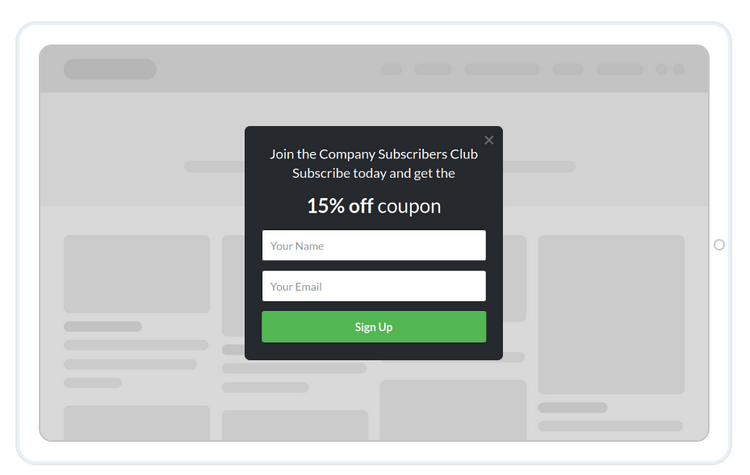
2. Lead capture form
As a business owner, it’s important to think strategically when gathering leads. You’ll want a form that collects all the necessary details from your visitors without overwhelming them. This is where a well-designed lead capture form comes in. The main goal of these forms is to secure potential customer information. They are quick to complete, focused on collecting what you need, and encourage users to submit their details by making the process worthwhile.
Where should it be:
-
Feature one prominently near the top of your homepage, paired with a compelling incentive.
-
Add it within blog articles after the opening and once more as readers finish the post.
-
Use a sticky banner or a slide-in form on essential sections such as pricing and features pages.
-
Trigger an exit-intent pop-up only if you have a truly appealing offer.
-
Include a straightforward field in your website’s footer for visitors who reach the bottom.
What it should include:
-
Request only the user’s email address or phone number as a mandatory field.
-
Feature a concise headline with a clear promise of value and a single benefit statement.
-
Incorporate a straightforward call-to-action such as “Send me the guide” or “Sign up for updates,” based on the primary purpose of the form.
-
Allow users to choose how often they receive updates or select their preferred topics to help minimize opt-outs.
-
Place a consent checkbox and a brief privacy note close to the submission button.
-
Display a confirmation message after submission, and send users to a follow-up page that encourages further engagement.
3. Newsletter sign-up form
Newsletters play a crucial role when establishing your brand. They offer a direct connection to your audience that isn’t tied to social platforms or paid promotions, and help you earn credibility as time goes on. Newsletter sign-up forms convert casual visitors into dedicated subscribers. These forms set expectations by offering practical advice, exclusive offers, or timely updates, and they let readers know how frequently you’ll reach out so they feel comfortable joining in.
Where should it be:
-
Add newsletter forms to your landing pages and sign-up sections.
-
Include them on content-rich pages that deliver value, such as blogs, case studies, and similar resources.
-
Feature a minimal sign-up form in the footer across your website.
-
Highlight a dedicated version on the homepage with a straightforward offer.
-
Introduce a subtle sliding form once a reader reaches the middle of an article.
-
Display a form on thank-you pages after someone completes a download, makes a purchase, or registers.
What should it contain:
-
Request only the user’s email and ensure the email input keyboard pops up on smartphones.
-
Collect the user’s first name to make the emails more personal.
-
Use a clear and direct call to action such as “Subscribe” or “Send me newsletters.”
4. Feedback form
Feedback forms reveal what’s successful and what needs attention right away. They give users a space to share quick opinions without much effort, letting you address problems and refine the experience. Keep the form brief and simple for higher participation.
Where should it be:
-
Include a compact feedback button on every webpage.
-
Add the button to confirmation pages after customers complete purchases, sign up, or download content.
-
Display the button in your support center when live chat or assistance is unavailable.
-
Add a feedback link in follow-up emails sent after purchases or during onboarding.
-
Feature the button on important documentation or product pages where users often have questions.
What should it contain:
-
The form should start with a star rating option.
-
Include a separate field for users to type their comments or suggestions.
-
For lower ratings, display a follow-up question asking for more details.
-
Allow users the option to upload screenshots or other files.
-
Provide a dropdown menu for categories such as bugs, information, support, and others.
-
Include a brief privacy note and a prominent “Send feedback” button.
5. Registration form
Registration forms allow individuals to reserve their place for an event, sign up for a subscription, or join any activity you are hosting. Users visiting this form are already interested in participating. Its main purpose is straightforward: enable quick sign-ups, send immediate confirmation, and encourage attendance without the need for follow-up.
Where should it be:
-
Position the form at the top of your event or webinar page for maximum visibility.
-
Add a compact version to your homepage or features section when highlighting a new launch or beta release.
-
Include the form in blog articles that share event news, and feature a prominent “Save my seat” call to action.
-
Display the form in the site header or on a sticky bar throughout live campaigns so it remains accessible at all times.
-
Feature the form on referral and partner pages as well.
What should it contain:
-
Collect basic details such as the visitor’s name, email, and phone number.
-
If the form is related to event registration or booking, be sure to include options for selecting a time slot.
-
Offer an integration with calendars so attendees can easily add the event to their schedule.
-
Once the form is completed, provide the user with a direct link to the event access or their ticket.
6. Survey form
Survey forms are a great way to understand your users’ opinions and preferences, allowing you to make informed improvements to your product, content, or service. These forms primarily serve your goals, not the user’s, so it is essential to make them interesting and straightforward to encourage participation. Aim for concise and easy-to-understand questions, and send them at the right time so responses are accurate and sincere.
Where should it be:
-
Include a link in follow-up emails sent a day or two after a purchase or registration.
-
Show it within your app once a user has interacted with a major feature several times.
-
Add it to thank-you pages or after resolving customer support requests.
-
Offer a brief exit survey when users cancel a subscription or unsubscribe.
What should it contain:
-
Wherever you add the form, design it to stand out with engaging content and eye-catching visuals so visitors are encouraged to participate. Highlight how quick it is by using phrases like “one-minute survey” and emphasize its brevity.
-
Limit the form to 5 to 7 fast questions, opening with an easy rating or single-choice question to make users comfortable.
-
Favor mostly multiple-choice questions, including just one short “why” textbox, display a subtle progress indicator, and let users skip any question that may feel too personal.
-
Place an optional email field at the end for those who wish to receive a response, and state any incentives clearly if you are providing one.
-
Wrap up the form with a confirmation of successful submission and a note of appreciation.

7. Checkout form
Checkout forms play a vital role for any website with online sales, whether it is a store or e-learning platform. They are the gateway from a filled cart to a confirmed purchase. When designing these forms, focus on making them fast, straightforward, and trustworthy. Limit the number of steps, display the full price upfront, and offer payment options that fit customer preferences.
Where should it be:
-
Position the form as a clear single-page process or break it into two concise steps following the cart.
-
Add a “Buy now” shortcut that lets ready-to-purchase users bypass the cart.
-
Include a compact cart drawer across your site, always with an easy-to-find “Go to checkout” button.
-
Display trust badges, cookie policies, customer support, and return policies close to the payment button.
What should it contain:
-
Request the delivery location, offering autocomplete suggestions as they type.
-
Ask for a contact number or email address to send order updates. Consider adding autocomplete for convenience.
-
Present delivery methods, providing clear information about dates and charges.
-
Show all available payment methods, such as UPI, credit or debit cards, digital wallets, and cash on delivery if offered.
-
Include a field for users to enter a promo or discount code.
-
Allow shoppers to check out as guests for those who prefer not to create an account.
8. Request a quote form
Every website that offers services should feature a request a quote form. These forms let visitors quickly find out the price for a particular service or package without back-and-forth communication. People who complete the forms are usually ready to buy. Make the experience straightforward and transparent so customers receive accurate pricing and you get all the details needed to respond efficiently.
Where to position it:
-
Add it to pages with high conversion potential such as pricing, product or service details, as well as sections for “Enterprise” or “Custom plan” options.
-
Use a sticky “Get a quote” button that remains visible as users scroll, both on desktop and mobile devices.
-
Feature it on the primary landing pages used for your marketing campaigns.
What information to request:
-
Make the email field mandatory and ask for a phone number only if you intend to call the prospect back.
-
If you provide several services, include a drop-down menu so users can select the relevant option.
-
Request a location if it influences shipping or tax calculations.
-
Place a short privacy disclaimer and a consent checkbox close to the submission button.
9. Job application form
If your website features a separate careers section, it is essential to provide a form for applicants to submit their details. Job application forms make the application process quicker for candidates and allow you to identify the best matches without repeated communication. Aim to keep the form straightforward, welcoming, and accessible to encourage more qualified individuals to complete it.
Where should it be:
-
Position the form on each individual job posting, ensuring it appears before users need to scroll.
-
Add a prominent “Apply now” button to the job listings page that scrolls directly to the form section.
What details should you request:
-
Collect the applicant’s name, email address, and provide a field for uploading their resume.
-
Since LinkedIn is widely used as a professional profile, add a space for candidates to share their LinkedIn URL.
-
Present 3 to 5 targeted questions to gauge relevant skills and experience.
-
Offer the option for a brief cover note rather than requiring a traditional cover letter.
-
As application forms often involve several steps, show progress with a bar indicating how much has been completed and what remains.
-
Once submitted, display a confirmation message to inform the applicant of successful submission.

10. Support ticket form
When visitors require assistance on your site, it is important to let them know support is readily available. A support ticket form allows users to notify you about an issue and receive a prompt resolution. Prepare a form in advance, so users can submit all the necessary information to create a support ticket.
Where should it be:
-
Include it in the footer section.
-
Add it at the top of the customer support page.
-
Display it on the order or history page, allowing users to “Report an issue” for any purchase.
-
Integrate it into the dashboard for quick submissions by logged-in users.
What should it include:
-
When a user submits from their dashboard, only display a feedback field in the form. Skip collecting personal information.
-
For submissions from visitors, request both their email address and phone number.
-
Allow users to upload a screenshot or document and provide an order or reference number if available.
-
Automatically record the current page link, app version, device details, and browser information behind the scenes.
-
After submission, show a confirmation message that includes the ticket number.
11. Download form (for gated content)
Do you use gated content as a way to generate leads for your brand? If so, consider using a download form. These forms allow visitors to receive valuable materials such as ebooks, templates, case studies, or checklists after they provide their information. They are most effective when the benefits are obvious and users get immediate access after submitting the form. Once the details are entered, the content becomes available right away.
Where to place it:
-
Add it to a dedicated resources page and include a brief preview of the content.
-
Include it on campaign-specific landing pages as well as partner pages.
-
Use it on thank-you pages to offer an additional guide related to the original topic.
What to include:
-
Gather business email addresses from your visitors.
-
Request the company name when it is necessary.
-
Ask for the phone number if it is required.
If you’re still deciding which platform to use for creating your forms, we’ve got a helpful resource for you. Take a look at our in-depth guide to the best online form builders, where we review tools designed to help you build high-converting, user-friendly forms in just a few minutes. Whether you prefer simple drag-and-drop editors or need advanced integrations with CRMs and marketing automation tools, these platforms make it easy to apply the strategies from this guide and begin capturing quality leads quickly.
 What is an Online Form? A Beginner’s Guide
 The 5 Best Popup Builders in 2026