Struggling with forms that lose potential customers? You’re not alone. Many businesses see high drop-off rates and missed opportunities simply because their forms aren’t optimized. In this article, we’ll explore 12 practical, actionable strategies to transform underperforming forms into high-converting tools, helping you capture more leads, increase sales, and create a smoother user experience for your audience.
Advice on how to improve your online form’s performance
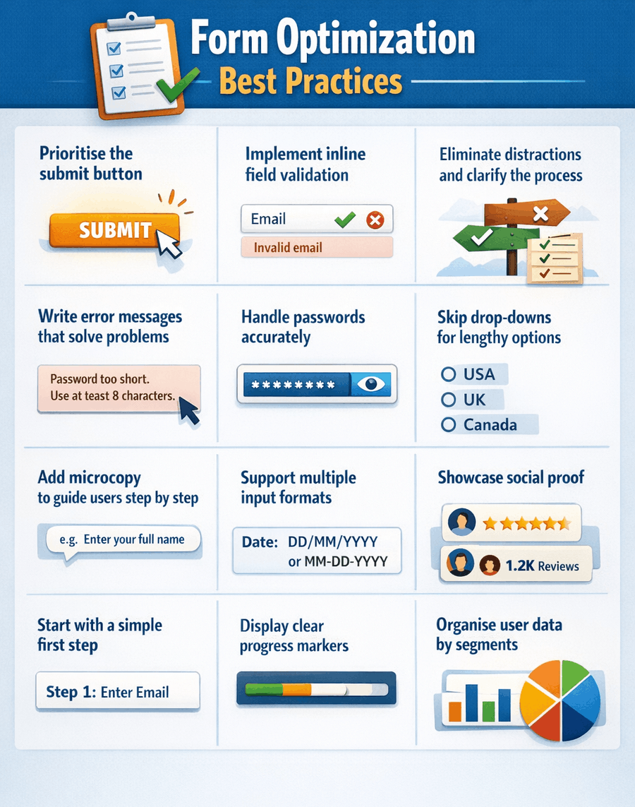
Every form presents its own challenges, so a one-size-fits-all solution does not exist. Still, these are our top recommendations to help enhance your form’s performance:
- Pay special attention to the submit button
- Implement inline validation
- Minimize distractions and give clear guidance
- Ensure error messages are genuinely useful
- Handle password fields carefully
- Steer clear of drop downs for lengthy lists
- Use microcopy to guide users step by step
- Allow for various input formats
- Incorporate elements of social proof
- Begin with a simple first step
- Display progress with indicators
- Divide user information into segments
1. Prioritize the Submit Button
It’s incredibly frustrating to miss out on easy revenue. This occurs every time a user fills out your form, hits submit, and still fails to complete the process.
When analyzing your checkout or form performance, your first step should be reviewing those who clicked submit but didn’t finish. Look for insights by asking questions such as:
- What specific error notifications appeared after submission?
- Which fields did users revisit?
- Were there sections users kept coming back to while attempting to correct their input?
- Did a post-submission pop-up interrupt their process and lead them away from the form?
- How many submission attempts did they make before giving up?
Reviewing this information will reveal the obstacles users faced when trying to finish the form, allowing you to make targeted improvements and capture those easy conversion opportunities in the future.
2. Use Inline Validation
Inline validation is a technique we have touched on previously, but it continues to be an essential feature. Few things are more aggravating for users than having to scroll back and forth through a form, searching for mistakes and unclear errors.
Let users know right away if their response won’t be allowed, and you’ll boost their experience significantly. Research highlighted that providing instant feedback within forms leads to:
- a 21% boost in completed conversions
- a 23% reduction in user mistakes
- a 32% improvement in user satisfaction
- a 43% drop in time needed to finish the form
3. Eliminate Clutter, Offer Clear Guidance
Once visitors arrive at your form, they are generally prepared to make a purchase. Avoid distracting them with unnecessary visuals or alternative links. Streamline the page to keep their focus solely on completing the desired action.
4. Make your Error Messages Helpful
Everyone has come across frustrating error messages that do little more than cause confusion.
Take this one, for instance: a glaring red X appears, but there are no clues on what went wrong or how to resolve it.
When crafted properly, error messages can support users and help them reach their goals, rather than leaving them irritated and stuck. To improve your error messaging, keep these guidelines in mind:
- Make error messages noticeable – they should be easily distinguishable from the rest of the form and instantly recognizable as mistakes. Using red text, just like teachers marking homework, is a simple and effective choice.
- Ensure they are clear and instructive – your messages should clearly describe the problem and give straightforward guidance on how to resolve it.
- Don’t expect users to remember corrections – keep error messages next to the related field instead of placing them at the very top or bottom, so users can address issues without having to scroll around the form searching for where to fix things.
- Stop mistakes before they occur – give users clear instructions for each field upfront. Even better, implement inline validation as mentioned earlier so users can get things right before any error message even appears.
If you want a more in-depth explanation, have a look at our comprehensive guide on crafting effective error messages.
5. Get Passwords Right
Passwords remain one of the most common frustrations for people filling out forms online, with many considering password rules a major hassle. To avoid discouraging users, avoid making password requirements unnecessarily strict. Our research shows that even with the most optimized forms, around 32% of users end up revisiting the password field to make corrections.
Check out our article on preventing passwords from driving users away from your form. In summary:
- Keep password requirements to a minimum. Obviously, something like “123456” or “pa$$word” poses a security risk, but don’t swing too far in the other direction by requiring a complicated mix that’s impossible to recall. Users won’t benefit if they can’t remember what they set. Instead, the UK’s Information Commissioner advises blocking only the most easily guessed passwords. Provided your system encrypts passwords well, it’s unnecessary to force special characters.
- Provide real-time feedback as users type their passwords so they can instantly see if they meet the criteria or need to make further changes.
- Avoid making users re-enter their password for confirmation. This step can lower your completion rates.
- If you absolutely need users to confirm their password, give them the option to show the password as they type. Studies show that hiding passwords can actually reduce security and increase mistakes.
- Think about using magic links, third-party logins like Google or Facebook, or sending verification codes to phones as a modern alternative to traditional passwords.

6. Avoid drop downs (for long lists)
It seems like an easy fix: you have a set number of options but the list is too lengthy for radio buttons. So why not just use a drop down menu?
In certain cases, this approach might work well for your form, but it’s not always ideal, particularly if most users are accessing it from their phones. Imagine having to scroll through a century’s worth of years to choose your birth year, or wading through nearly two hundred country options just to find your own.
Carefully consider before adding a dropdown menu, as it could easily drive users away in annoyance. For more information about the challenges of dropdowns and alternative solutions, take a look at our dedicated article on this topic.
7. Use microcopy to guide users as they complete the form
Unlike error messages, microcopy serves to clearly explain to users why certain information is needed and how it will be used. When crafted thoughtfully, it blends seamlessly into the form and can help boost completion rates with little extra work.
Microcopy is often used for the following purposes:
- Pre-form guidance: Tell users what they should prepare in advance to avoid unnecessary delays (for example, make sure you have your passport ready).
- Accurate field labelling: One frequent problem with forms is unclear field names. For instance, users may be unsure about the difference between “Current Address”, “Home Address” or “Delivery Address”. Well-written microcopy clarifies exactly what’s required and the reason behind it.
- Instructions for input: When a field requires data in a specific format (although it’s best to minimize such requirements—see point 8), microcopy can explain exactly how to fill it in (for example, “Type all 13 digits of your card number without any spaces”).
- Encouraging text: Subtle messages can motivate users to act (for example, “Sign up now to speed up future checkouts”).
- Handling sensitive information: When requesting personal details, it’s important to be transparent about why the information is needed and how it will be used. A good example is provided further below.
8. Allow for Different Formats
Phone numbers. Postal codes. Credit card numbers.
Throughout all the forms we analyze, these particular fields repeatedly cause more unnecessary barriers and drop-offs than almost any other elements.
But why is this the case? Surely users remember their phone number and postcode, right? It should also be simple to read their card number without issue?
Absolutely.
The issue stems from the form itself, not from the user.
How often have you tried to type your phone number only to be prompted to include the country code? Or told not to add it? You might have been asked to drop the initial zero, or perhaps to keep it in place.
Maybe you have had a payment declined simply because you entered your credit card number with spaces in the wrong spots.
For each of these cases, the input allows for several equally valid formats. Yet many companies demand that users twist their data to fit a rigid layout, penalizing anyone who doesn’t follow the exact pattern required by the form.
While clear instructions and helpful error messages can ease these frustrations, there is a better approach: accept all legitimate input variations and take care of any formatting on the server side, making the process seamless for the user.
9. Add Social Proof
Multiple studies have repeatedly found that one of the most effective ways to encourage people to take action, such as completing your form, is to show them that others have already made the same choice, which makes the decision feel safer and less risky.
It may seem like a small detail, but people are naturally inclined to follow what others are doing. Leveraging this tendency can be an excellent way to boost your conversion rates.
Showing users things like testimonials, customer reviews, company logos, trust symbols, social media mentions, awards, or even statistics about customer numbers can reassure visitors and often results in a significant increase in successful form submissions, sometimes improving results by as much as 400%.

10. Make the First Step easy
Here’s another trick rooted in psychology. People naturally like to finish what they begin, a tendency described by the Zeigarnik effect for those interested in psychology. If analytics reveal that visitors rarely start filling out your form, try easing them in by requesting just a single, simple detail at the beginning, such as their email address. This small request increases the likelihood that users will go on to complete the entire form.
11. Use Progress Indicators
Progress indicators, such as bars or steps, can provide reassurance to users and give them a motivational boost. By demonstrating how far they have come and how little is left, you help lower any stress and encourage them to see the process through to the end.
These work hand in hand with point 10 above, leveraging the natural desire to complete tasks that have already been initiated. We have previously discussed different approaches for using progress bars, but the main considerations are as follows:
- Clearly indicate what each step involves. Specify exactly what details the user should provide in every section.
- Allow users to navigate backward by clicking on the progress bar. This avoids the need for a “back” button which might erase information already entered, reducing the risk of user annoyance.
- Ensure your progress bar honestly reflects the actual completion level. Do not overstate progress by showing 80% done if only 20% has been finished. Misleading users will only result in disappointment!
12. Segment your User Data
This suggestion is a bit more specialized and assumes you have access to a form analytics platform capable of in-depth audience segmentation, like a custom attributes option.
Many customers approach us after noticing a sharp drop in their form completion rates, unsure about the cause. Their first suspicion is usually the form itself, but more often the real issue lies with their audience. Launching a fresh marketing campaign might attract a large number of casual visitors who never plan to finish the form, pulling down the overall conversion rate.
This is where segmentation proves its value. By leveraging form analytics to separate audiences, you can pinpoint the sources of your traffic and examine each segment on its own. Your new marketing efforts may be bringing in low-quality leads, while your core organic users could be performing just as well as before, or even improving thanks to tweaks in your marketing or form design.
With segmented insights in hand, you can take your analysis further. Different types of users tend to drop off at different points or might react differently to certain questions or wording. By segmenting, you can tailor your form experience for each audience, which boosts total conversions.
Start Working on your Form Optimization right now
We have provided some tips to help boost your form’s conversion rate, but now it is up to you to analyze your own form or checkout process. Identify the steps you need to take to decrease cart abandonment and enhance your results.
Start off by taking advantage of a free trial with an analytics platform. This will allow you to gather valuable, actionable insights quickly and easily, helping you to decide if you want to investigate further.
Dig deeper by splitting your data into segments and observing how various audience groups interact with your form. Focus on identifying which parts of the process are causing users to drop off.
After you have formed your hypotheses, implement your changes and monitor the impact they have. For more robust results, consider using an A/B testing solution like Google Optimize, Optimizely, or Convert to trial different versions of your form. This way, you can confirm which changes actually improve your conversion rate before applying them to all users. As you continue to refine your form, you should notice your conversion rates improving.
12 Ways to Boost Your Form Conversion Rates
Increasing conversions on your web forms or checkout pages becomes much easier when you’re guided by useful insights. If you’re searching for a practical checklist, here’s what you need:
Apply these strategies to raise your form completion rates or lower cart abandonment, making the heart of your conversion journey more effective.
Don’t have a form builder yet ? Explore our guide to the top online form builders. From easy drag-and-drop editors to solutions that sync seamlessly with your CRM, these picks are designed to help you start capturing high-quality leads right away.
 The 11 Different Types of Online Forms
 Best Practices for Creating High-Converting Online Forms