Creating CTAs, or calls to action as they are also called, is an important task for every marketing strategy. You need them in your emails, in your ads, in your landing pages… They call on your customers or prospects to carry out a specific action, for example making a purchase or signing up for a subscription.
As it often happens with content marketing, it’s not really what you say – that tends to be similar from one place to another – but the way you say it. That’s why not all CTAs are created equal. You need to know who you’re talking to, why you are talking to them, how your product or service helps this specific demographic, and what advantages users can expect from your offer. Remember, it’s not about features. It’s about the benefits for your customers.
Let’s define what a CTA is in the next section.
What is a CTA?
A CTA usually takes the form of a button, but it can also be just a link in your content. It can be placed anywhere: in an email, in a form, in a landing page, in a blog post… What matters is that the action you want users to take is obvious.
A call to action incites readers to take the next step: whether it is to subscribe to your newsletter, to purchase your products, to register for a webinar…
The context of the CTA is entwined with the rest of the content, so make sure you create relevant calls to action.
Types of CTAs
Every piece of content you create needs to have a purpose. This purpose is developed in your CTA. Now, there are a few types of CTAs you can find and use. We’ll show you.
Website Buttons
These CTAs come in the shape of a button and can be placed anywhere in your website. This is an example from Firefox:

Here, it’s quite clear what the page “wants” users to do: get the Free Download. This kind of button works better when it is alone, i.e. you shouldn’t have several CTA buttons on the same page.
Why? Because it’s easier to focus when the options are limited. Several buttons with different calls to action will compete with each other and get visitors confused. Which action should I take first? Do I need to click both buttons? What are their purposes?
These questions should not pose themselves. The required action should be clear. Make your button pop with a contrasting color, as you can see in the example.
Here is another example of a CTA button, inviting readers to give our optin form builder a try:
14-Day Free Trial + 14-Day Money Back Guarantee
Opt-in Buttons
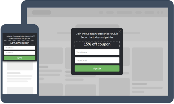
Opt-ins are common on websites, usually as a way to get the visitor’s email address or contact details. This popup has a simple purpose: sign up to get access to this 15% off coupon. Of course, your goal is to get the emails so you can confirm the opt-in. The coupon is just a lead generation tactic.
Also, the button CTA is short and to the point: “Sign Up”. No need to write a lot for your CTA: the easier it is to understand what users should do, the more likely your CTA is going to be successful.
In-Text Links

Links in the text, or inline, are not as easy to notice as a button. However, they are considered to be less intrusive. They are usually similar to a simple hyperlink – the difference being the content shown.
In this case, the CTA being “take security into your own hands”. It’s long, but it’s not intrusive but rather it forms part of the email content . Nonetheless, it does imply urgency and highlights the importance of online safety. This is a great example of how to create a CTA that is not canned, and it sounds honest to readers.
CTAs in Emails

We couldn’t write an article on CTAs without mentioning calls to action in email marketing. Every email you send should have a call to action – marketing emails are totally geared towards conversions, and one of the main KPIs (key performance indicators) for email marketing is the click-through rate. It measures how many people clicked on the CTA button, therefore, getting to your landing page.
When adding a CTA on your email message, we recommend making it a bold button with a contrasting color. If none of your readers take action, you wasted your time and money crafting a message. Therefore, you should make your call to action clear and simple. Get those readers in your sales funnel with an email CTA!
CTAs in Social Media Posts
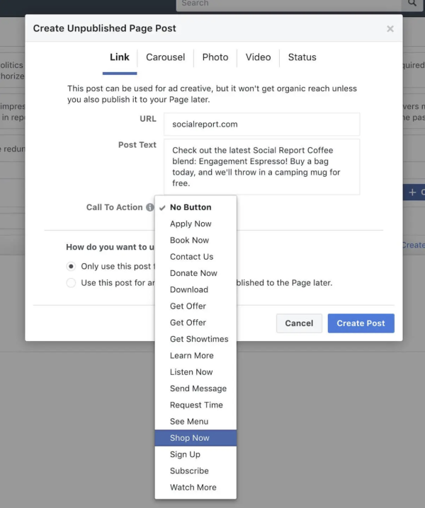
If you use social media in your marketing strategy, you definitely need to add CTA to your posts. You don’t even need to run ads: your posts can be a source of conversions for your brand, even if it’s just signing up for a newsletter or downloading an ebook you prepared. Every action counts.
Facebook, as an example, allows page owners to select their CTA button text from some standard options. You don’t get to add your own CTA to the button, but you can add a custom CTA in the content, as inline text.
Now that you have an idea of the main kinds of CTAs you can use, we’ll go through our top tips for creating awesome calls to action that sell.
How To Create A Powerful CTA
1. Focus on Benefits
As we mentioned previously, customers want to know what’s in it for them – how are they improving their life by taking the action that you ask of them in the CTA. A common way to achieve this is through using the word “free” or “now only x$”.
These words signal a benefit to the reader: other people might have paid in full for this product or this service. However, they are getting it for free or at a discounted price.
We all like to feel that we’re at an advantage. This CTA tactic focuses on your customers’ interests and makes sure they feel lucky to have gotten this special offer.
2. Power Words
The way you word your call to action is very important. One of the tactics you can use to get users to sign up or buy from you is to use words that incite an action through emotion. Power words like “Now”, “Today” or “Join” can be very helpful in creating FOMO (fear of missing out) in your reader.
When we make a purchase, our emotional “side” is in charge. We might have rational reasons to buy something, but what drives us to go through with the purchase is emotion. This can be achieved through customer testimonials, ratings on Google and on your website, but, especially, with how you create your call to action.
3. Leverage FOMO
Fear of missing out, or FOMO, can be leveraged in your CTAs to increase sales and subscriptions.
A way to use this is to make readers curious about your product. What about it makes it unique? What is your main selling point?
You can also use scarcity to create FOMO. There are a few ways to go about this: “Limited Offer”, “Subscribe Today”, “Limited to X Units”, “Offer Ends in X Hours”… Scarcity makes the product even more valuable, as customers don’t want to miss out on this opportunity.
We recommend having a popup, a welcome message, or a floating bar with a countdown. This will create urgency, which is a powerful emotion. If time is running out, you’ll want to get it – whatever it is – now.
4. CTA Button Design
The way you design your CTA button can make a huge difference. Its design must match its surroundings, while standing out at the same time.
A way to make your CTA stand out is to use contrasting colors, while using the same font as the headings and body text. An example you can refer to is the Firefox landing page we show in the first section of this article. The background is navy blue, while the button contrasts with a light green. The CTA in the button uses a white font, which also contrasts with the button itself.
You might want your CTA to stand out in your website. You can achieve this by using a welcome screen:
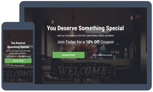
This kind of CTA puts the offer ahead of everything else, and keeps the users’ attention on the action you want them to perform.
The CTA is simple: “Sounds Good”. However, the other button says “No, I Hate Discounts”. It’s easy to understand that this plays with the user’s goals, as saying you hate discounts is kind of silly. The only reasonable option is to click the CTA to join the mailing list and, therefore, get a 10% off coupon.
5. Test, Test & Test Again
We cannot stress this enough: you have to test different combinations of colours, fonts, CTA copy and more. It’s essential to have data to justify your decisions. And the only way to know what’s best for your campaign is to measure results.
To optimise your campaign, try out different combinations of each element using A/B testing. Once you have a winning combination, keep on fine tuning. Sometimes, some CTAs are better for a specific demographic than others, but you know your business better than anyone. You might be surprised, though: and that’s why testing is essential for your CTA strategy.
If you need to create an opt-in, Convertful is the way to go. You can create all sorts of forms like welcome screens, popups, and many other options:
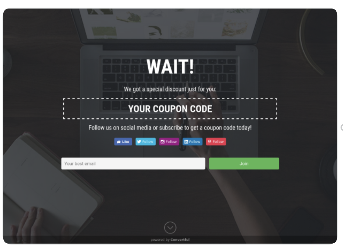 Convertful allows you to adapt templates according to your needs – including the call to action buttons in the widgets.
Wrapping Up
This is a quick guide that you can use as a reference to create your CTAs on your website, landing pages, social media and email marketing.
We recommend using CTAs with care; they can increase sales, but you shouldn’t overdo it. Keep it clear and simple.
What do you think? Did we forget something? You can find us on Facebook, Twitter, and LinkedIn.
14-Day Free Trial + 14-Day Money Back Guarantee
 Convertful Update #36
 120 Marketing Quotes To Get Inspired