Every business wants both new and returning customers to visit their website and interact with them. There is valuable insight to be gained from each visitor, particularly when analyzing form conversion rates. But if your website forms are poorly designed, you risk driving users away before they ever reach out.
Frequently, forms are simply overlooked because most people do not enjoy filling them out. However, the real problem may lie in the way these forms are presented. Your audience might avoid reaching out to your business simply because the forms on your site look unappealing or are confusing to use.
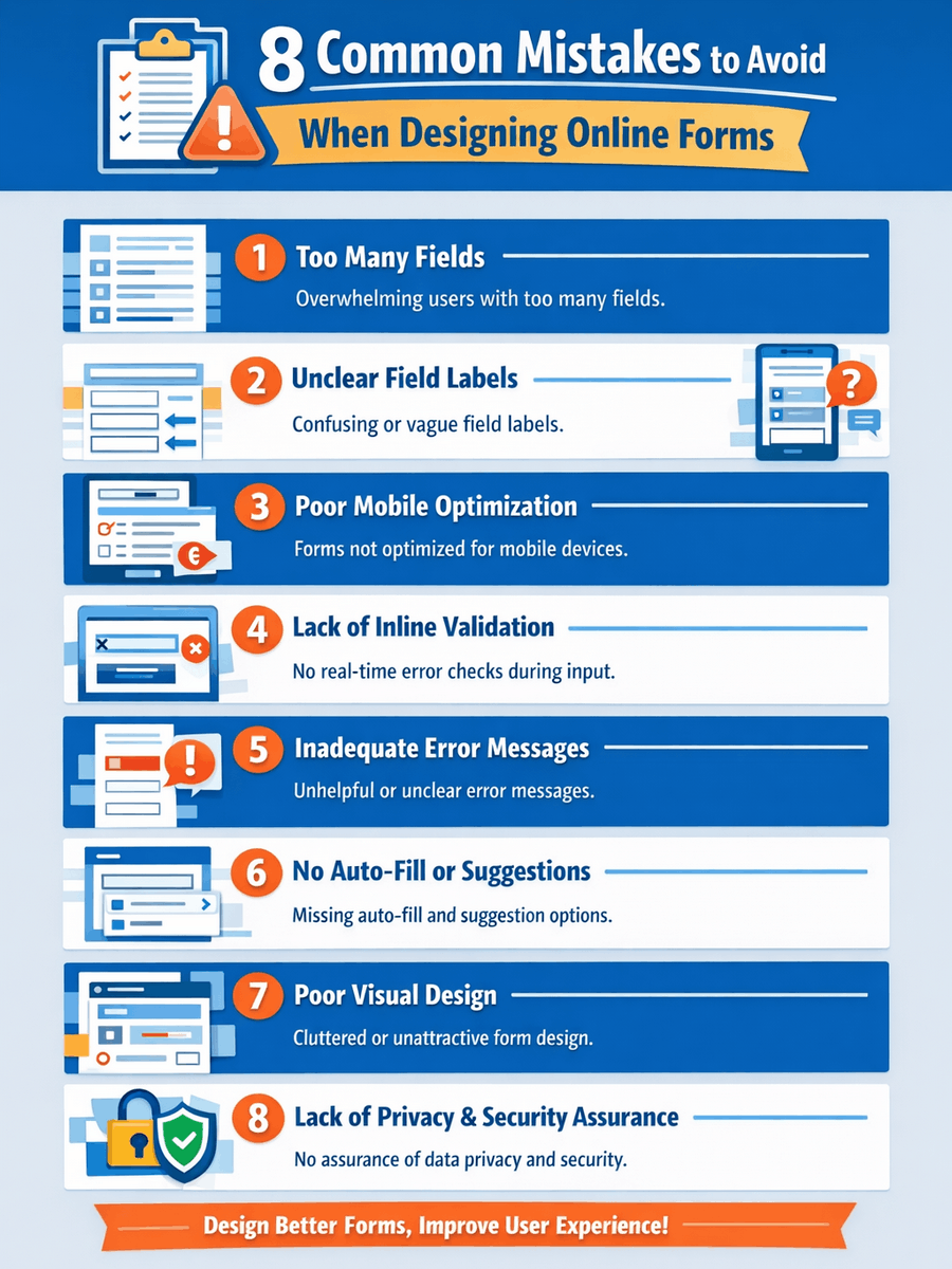
This article will highlight the most frequent errors companies make when crafting web forms. Following each mistake, we will provide actionable advice and share proven strategies to improve your form design. With these tips, your website and its forms can better support your goals and help engage more customers.
Mistake 1: Too many fields
Imagine being pressed for time or simply trying to complete a task, only to be faced with a form that asks for far too much personal data. In many cases, people decide not to bother with it and look for services elsewhere. When forms are cluttered with excessive fields, it can create confusion and drive users away. Consider the frustration when filing a complaint or submitting a claim online and you’re met with pages of questions. This sort of hassle can reflect poorly on a business. If you were responsible for creating online forms for your company, how would you approach it?
Solution: Reduce the number of fields to only what is absolutely necessary. You might be surprised that most issues can be handled or transactions completed with just a few key details. To streamline your form, consider these points:
- What specific outcome do you want from the form?
- Who are the users filling it out?
- Which pieces of information are truly required?
- Are any fields absolutely critical to submit?
- What steps will follow once the form is received?
Consider using progressive disclosure to show more fields only when necessary.
Hold on. Are you wondering what progressive disclosure actually is?
Progressive disclosure is the method of only revealing certain sections of a form when they become relevant for completion. This technique helps reduce the pressure on users by keeping the form brief and easy to navigate. A common instance of progressive disclosure is seen in e-commerce checkout pages when collecting shipping information. Usually, there is an option at the end of the section to indicate if the billing address differs from the shipping address. Selecting this option causes an additional set of fields to appear for entering the alternate address. All of this data is then transferred to your business’s CRM system.
Mistake 2: Unclear field labels
Even more frustrating than lengthy forms packed with questions are those with field labels that are ambiguous or confusing. Fancy fonts, trendy color schemes, and technical terms might seem appealing for your survey or questionnaire. However, unclear labels or industry jargon can leave users puzzled, just as decorative fonts or bold color contrasts can. Always consider your target audience and reflect on these points while designing your site’s forms:
- How should you accommodate users with limited vision?
- How can form completion be made easier for older adults?
- What happens if someone gets easily confused about where to enter each detail?
- How does an incorrectly completed section affect the process?
Solution: Opt for straightforward, easily understood wording when creating form labels for your online shop. Let customers know exactly what you need by keeping language direct. This approach encourages clear, direct responses you can actually use.
Another approach is to integrate placeholder text for extra guidance. How do placeholder texts contribute to effective forms? Think of the entry fields on digital forms. These fields often show a brief prompt inside, describing what should be entered. For instance, in a field marked PASSWORD, you might see: 8 characters, 1 uppercase letter, 1 special character. This lets users know exactly what is expected.
Mistake 3: Poor mobile optimization
Like it or not, mobile devices have become a crucial part of daily life. The sheer number of tasks a single person can accomplish using just a smartphone is remarkable. To keep your business up-to-date and maintain visibility, it is important to keep pace with modern trends. Forms that are not tailored for mobile use can be challenging to navigate on compact screens. This is a common online form error to steer clear of. Always consider how important mobile access is for many users when you are crafting website forms. You want to spare visitors the frustration of squinting or struggling to interpret the questions in your forms.
Solution: Build forms that automatically adjust to different devices and incorporate input fields that are easy to use with touch screens. This is especially important for forms used in sales or to process orders. Take care to avoid causing irritation among your users by making these online form blunders. Test your forms thoroughly before launch to confirm they are both user-friendly and accessible. Check that all elements remain clear and properly aligned, even if someone zooms in or out. Creating seamless online forms can greatly enhance your brand’s reputation and success.

Mistake 4: Lack of inline validation
Picture yourself spending time on a long and detailed online form. You can’t move forward until it’s completed. After finally filling in your details and hitting “Submit,” you are met with an error message. Now you have to scroll back through the entire form to figure out what went wrong. Without instant feedback while filling in each field, users may not realize they have made a mistake until everything is done, which can cause a lot of annoyance. Who wouldn’t feel like putting it off at that point? It’s already taken up much of your day.
Solution: Use inline validation so users receive real-time feedback as they complete each field. A classic illustration of this is when you create a new password online. As you enter your password, the field might turn a light red shade, and a message will appear beside it to show whether your chosen password is weak, moderate, or strong. You can adjust your entry on the spot to meet the password criteria before submitting the form.
Mistake 5: Inadequate error messages
Running into error messages during form completion is frustrating, though it is a common part of the process. It becomes even more annoying when the source of the problem is unclear, making it harder to resolve the issue quickly.
Many error messages fail to provide enough detail to guide users. Sometimes, the guidance is so minimal that people are left guessing what must be fixed. Consider finishing a lengthy online form, hitting “Submit,” and only receiving an error that reads: “Please fix the errors,” without any further explanation.
Solution: When building website forms, make sure to include clear and actionable error messages that direct users toward a solution. This reduces the frustration that comes with vague or poorly marked errors. As a result, users can enter their information quickly and accurately, making your forms stand out as easy to use. This approach helps you collect the data you need without putting your visitors through unnecessary stress caused by confusing form feedback.
Mistake 6: No auto-fill function or suggestions
Picture yourself facing a lengthy online form, only to find out there are no auto-fill options available. On top of that, there are no smart suggestions to help speed up the process. Now you’re stuck re-entering the same details multiple times in one sitting. It’s a tedious and exhausting experience, and it eats up valuable time.
Solution: Activate auto-fill capabilities to streamline the process and offer a smoother experience for users. This small upgrade is especially valuable for returning visitors, who will notice and appreciate the saved effort. Allowing information like names, addresses, and phone numbers to be auto-filled not only adds convenience but also maintains user trust and privacy.
Your online forms can be optimized to offer users suggested responses based on what they type, making the submission process more efficient. For fields where users frequently provide similar information, you can have the form automatically present popular choices. This enables people to simply select the appropriate suggestion, helping them complete the form more quickly.
Mistake 7: Poor visual design
Trying to navigate a messy or unattractive online form is frustrating and can lead users to abandon it altogether. A visually chaotic layout often discourages people from moving forward. Most individuals scan an online form briefly before deciding if it looks straightforward enough to fill out. While it is important to collect all the details you need, whether for processing orders, gathering marketing data, or expanding your list of contacts, it is just as important to keep the design inviting and visually pleasing.
Solution: Keep the layout minimalistic, use generous white space, organize fields with clear labels, and structure the content in a way that feels natural. Here are additional ideas for improving your form’s appearance:
- If your form starts getting lengthy, consider dividing it into manageable parts before organizing them into individual slides. This way, visitors are less likely to feel daunted or lose their way.
- Choose a color palette that works well together. Remember that some users may be sensitive to intense hues, specific textures, or strong contrast. Leveraging knowledge of color psychology, if available, can enhance the overall user experience.
- Try to avoid excessive empty areas, and if you do have them, make sure their size and placement are deliberate and balanced.
- Pay attention to balance across all elements, from text fields to images and other visuals. Incorrect proportions can disrupt the visual appeal of your entire form.
If you’re unsure about the appearance of your digital form, try viewing it from your audience’s perspective and ask: “Would I want to fill out a form like this?”
Mistake 8: Lack of privacy and security assurance
These days, online scammers are relentless, and their activities pose a serious threat to businesses. Incidents of fraud are widespread, with thousands falling victim every day. Unless you clearly communicate how you protect their data and value their privacy, users might hesitate to share any personal details.
Solution: Here are a few suggestions you can apply! Consider using the following practices when creating forms on your website:
- Clearly communicate your privacy guidelines and outline the steps you take to protect user data
- Display trust indicators like SSL certificates and statements about privacy protection
- Mention that your platform does not collect or retain sensitive details, for example, financial information
- Provide users with a dedicated email address for any additional questions or feedback
Many people are highly concerned about online security, so it is essential to address this issue carefully to build customer loyalty and present your brand as trustworthy and secure.
Still deciding on a form builder? Check out our guide to the best online form builders. Whether you need a simple drag-and-drop editor or a tool that integrates with your CRM, these recommendations will help you capture high-quality leads immediately.
Frequently Asked Questions
What are the common mistakes in website form design?
Frequent errors in designing website forms include:
- Including excessive input fields
- Field labels that are not descriptive
- Forms that do not work well on mobile devices
- Missing real-time validation for form entries
- Unhelpful or vague error feedback
- Absence of auto-fill options or predictive text
- Unattractive or confusing visual layout
- Not providing clear statements regarding data privacy or security
How can I make my website forms more user-friendly?
To enhance the usability of your website forms, consider the following approaches:
- Limit the form to only the most important fields
- Sequence fields in a way that matches how users naturally think
- Choose straightforward and brief wording
- Ensure forms are responsive and display well on any device
- Add instant feedback to users with live field validation
- Show clear, actionable error messages when needed
- Allow users to take advantage of browser auto-complete functions
- Design forms with a clutter-free, straightforward layout
- Be transparent about how user data is protected and used
What are the best practices for designing effective website forms?
Key recommendations for creating user-friendly website forms include:
- Clearly mark which fields are mandatory and which are optional
- Be concise and direct, including with error notifications
- Design your forms to be usable by everyone
- Organize fields for a logical, intuitive progression
- Focus on the needs of the person filling out the form
How can I ensure my website forms are secure?
To keep your web forms safe, consider the following actions:
- Apply SSL certificates so all form data is sent securely.
- Add CAPTCHA to block spam and prevent submissions by bots.
- Protect the data users provide by using encryption when storing and transferring it.
- Limit the information you request to only what is essential, minimizing exposure.
- Perform routine checks and assessments to find and fix security issues.
- Display your privacy and data handling practices clearly on the form page.
 The 11 Different Types of Online Forms
 Best Practices for Creating High-Converting Online Forms