Neglecting form design best practices can seriously impact your revenue potential.
Although forms might not be the most exciting part of optimizing conversions, they are often directly tied to your main goals and transactions. Taking the time to refine your forms could lead to some of the most valuable improvements you make.
Of course, what works for one site might not work for another. The right approach depends on your specific context. Still, applying broadly effective form design strategies is a smart way to begin.
The good news is there’s an abundance of information out there about what makes forms perform better. You can find insights in business case studies, blog articles, A/B testing reports, usability studies, eye-tracking analyses, and plenty of other resources.
This article covers several widely accepted best practices for designing forms. If you’re beginning your optimization journey, consider these tips a solid starting point.
When updating your forms, applying these strategies can help you achieve immediate improvements.
What is form design?
Forms on websites allow visitors to share information with you. This can include personal details such as their name, email, or age. It might also involve feedback about your offerings, for example, their thoughts on your product or suggestions for enhancements. Online forms can be used to gather a wide range of data.
Suggested Reading: What’s an Online Form? A Beginner’s Guide
Designing a form involves crafting each part with intention. As you build a form, there are several aspects you need to keep in mind:
- The specific details you require from users.
- The way you ask for those details.
- The path users will take as they complete the form.
- The methods you’ll use to check the accuracy of the input.
- How to ensure the process is as straightforward as possible.
Why should I care about optimizing my forms?
Completing forms is often tedious and unexciting.
Poorly designed forms only add to user frustration. They cause people to feel tired and annoyed as they attempt to complete the required fields. This often results in users making errors, or in some cases, giving up and leaving the form altogether.
In contrast, well-designed forms make the process much simpler. Users can focus on providing information without dealing with distractions. They are able to move through the questions without confusion or irritation. As a result, people are less likely to get worn out or lose patience before finishing.
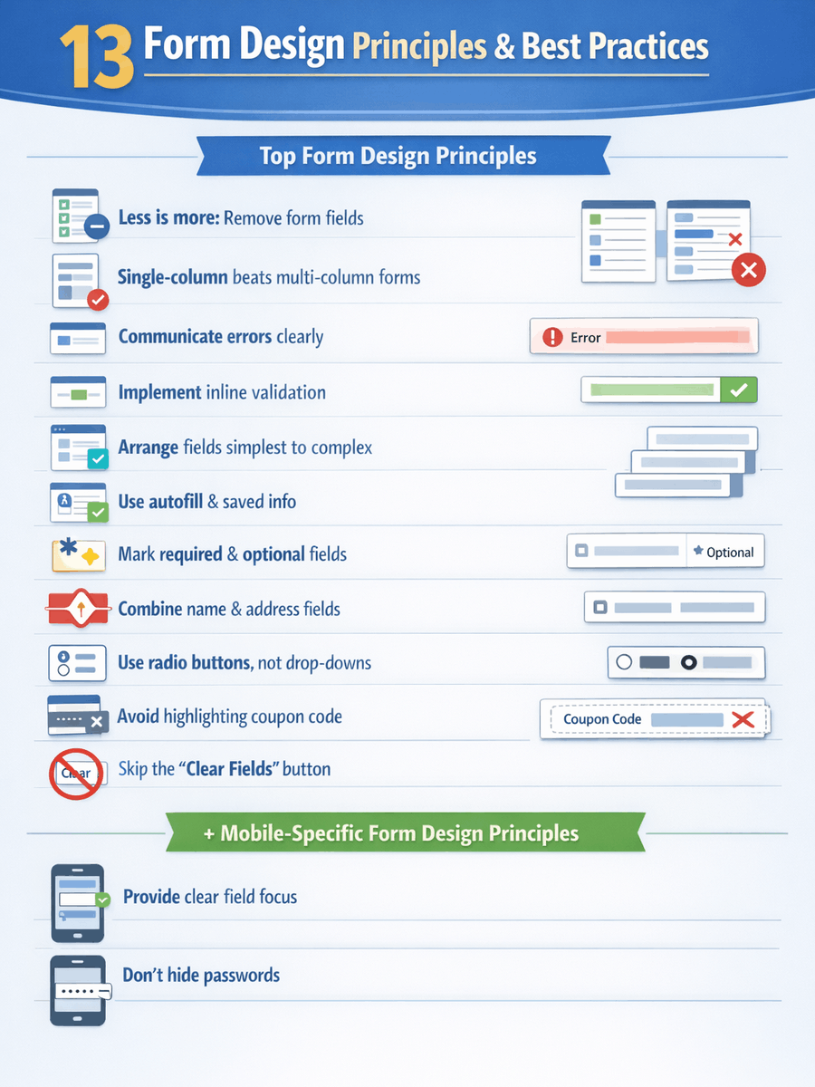
13 Form Design Principles & Best Practices
1. Less is more: remove form fields
Every additional field in a form makes the process harder for users. If you want more people to complete your forms, the most effective step is to eliminate any unnecessary fields.
Forms are often overloaded with too many questions. This happens because marketers tend to want as much information as possible, even if it’s not all essential.
Research from Baymard Institute shows that the typical checkout form asks for 11.8 pieces of information. Their usability studies revealed that most websites could cut down the number of fields shown by default by 20% to 60%.
In short, most checkout forms ask users for double the amount of information that is truly required.
Reducing the number of fields in your forms is the starting point for optimizing conversions at the bottom of your funnel. This is where you can achieve some of the fastest improvements. It takes minimal effort and resources, yet the possible results are significant, particularly as your numbers grow:
- How many different forms are you currently using?
- How many users interact with these forms?
- What impact would a 10% boost in completion for each form have on your business?

Collect only essential information
Consider this: Each extra field can turn away potential customers. Is the value of the added information greater than the cost of losing interested users? Is it necessary to capture every detail immediately, or can you gather more information later?
When refining your form fields, consider the value of each piece of information you request. Is it essential to ask for a phone number, fax, or physical address? Would a company name matter if you’re selling home décor like candles? Limit your questions to only what’s necessary. For example, when Expedia eliminated the Company field from their reservation form, their profits rose by $12 million annually.
The most effective registration forms are concise:
Of course, there are situations where this doesn’t apply. Fewer fields won’t always guarantee more conversions. Also, gathering more details about users can sometimes improve how you market and reach them.
Overall, the best guideline is to cut out any form fields that don’t serve a real purpose.
Alternatives to long forms
Data privacy is a legitimate issue, particularly for B2B businesses that rely on generating leads and handing them off to the sales department. Ensuring these leads are actually valuable is essential; otherwise, collecting more leads just adds unnecessary workload and drains resources.
To qualify your leads, you might try a tiered approach based on available budget. In practice, this means asking prospects how much they plan to spend. By establishing a minimum acceptable amount, you can quickly filter out people unlikely to become serious customers.
It’s also important to remember that, in the B2B space, there are data enrichment providers such as Clearbit. With just an email address and a first name, these services can often supply additional details, including the prospect’s company, its size, and social media profiles.
2. Single-column beats multi-column forms
Extensive eye-tracking research, numerous case studies, and multiple A/B experiments all point to this conclusion: if you’re choosing between a single-column form and a layout with multiple columns, always lean towards the single-column approach.
According to results from a recent study, participants finished the straightforward, single-column version of the form on average 15.3 seconds quicker compared to those completing the multi-column version. This time difference was statistically significant with a 96% confidence interval.
This recommendation isn’t recent. In fact, it’s been suggested for quite some time, but our study provided some of the first solid quantitative data to support it. Professionals working in conversion rate optimization have likely come across many convincing user experience and A/B testing results that reinforce the idea that single-column forms are easier for users.
There might be rare cases where this doesn’t hold true, like any general rule, but I haven’t seen any concrete evidence to contradict it.
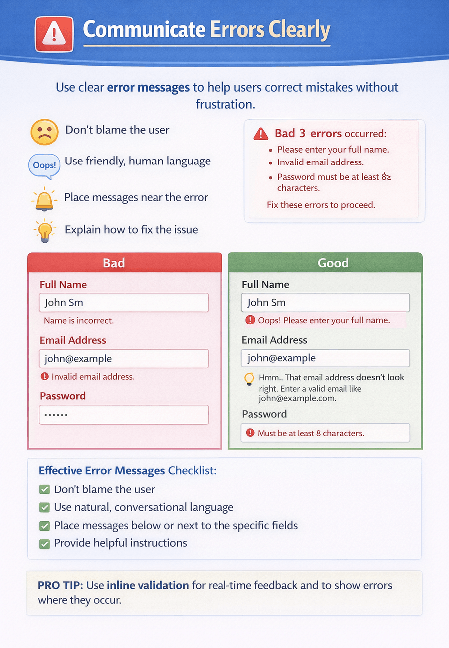
3. Communicate errors clearly
People are bound to make errors. It’s unavoidable. No matter how perfectly you craft your forms following all the best guidelines, users will still trigger error notifications. The way you present these messages is crucial.
The goal when designing error messages is to reduce the annoyance users feel when interacting with your form. If users get too irritated, their stress levels rise. As cortisol increases, there’s a tipping point where they abandon the process and choose a rival website instead.
Absolutely, conduct your own usability testing, but begin by following these guidelines for creating effective error messages:
- Avoid placing blame on the user.
- Use natural, conversational language instead of sounding mechanical.
- Ensure that error notifications are straightforward and placed where users expect to see them.
- Provide users with clear instructions on how to resolve any issues.
- Refrain from displaying every error at the top of the page. Inline validation works well for this.
4. Implement inline validation for form fields
How you inform users about the success or failure of their form input is closely tied to error messages. Form validation is a broad subject on its own, but we can discuss some important points here.
Inline validation offers an elegant solution for detecting, notifying, and fixing mistakes as they occur. Rather than making users wait until they click “submit,” any issues are flagged immediately, allowing for instant feedback.
Here is a strong illustration of how inline validation works:
Considerable data backs up the use of inline validation. For instance, in 2009, Luke Wroblewski compared inline validation to traditional validation that occurs after submission. Although his study involved a limited number of participants, he observed these outcomes with inline validation:
- Success rates improved by 21%;
- Errors made were reduced by 23%;
- User satisfaction ratings went up by 32%;
- Completion times dropped by 41%;
- The number of eye fixations fell by 48%.
I’m happy with those numbers. I’ve observed comparable patterns in A/B tests conducted on various ecommerce platforms.
Setting clear expectations and effective communication are key. Users shouldn’t be left wondering which actions will succeed and which won’t. The more straightforward you make it for people to know what’s required, the fewer mistakes they will make and the higher your form completion rates will be.
5. Arrange fields from simplest to most complex
According to Robert Cialdini’s “commitment and consistency” principle, once a person starts with a small, easy action, they are more likely to complete the process. That’s why it’s recommended to begin your forms with the simplest questions.
Hold off on requesting anything that might create resistance, like billing details or sensitive information, until a later step. Let users fill out their shipping address first. Since shipping and billing addresses are frequently identical, they can simply reuse what they’ve already entered.
6. Leverage stored information and smart autofill
The key guideline for designing effective forms continues to appear: Keep the process simple and straightforward for users, which is especially important for forms on mobile devices.
Reduce the amount of manual input required from users when they are completing a form. For instance, booking.com requests that users provide their full address, city, and postal code details.
A better approach is to implement a geolocation tool that suggests addresses as someone enters their information, which minimizes both the number of form fields and the effort needed to finish the process.
Adding features like autosuggest and autocomplete also helps in another way: they lower the chances of users submitting incorrect or fake addresses by mistake. Since the suggestions are drawn from existing, verified entries, they function as a built-in form of validation.
Autofill vs autosuggest
Autofill pulls information directly from the visitor’s browser to populate your form fields. If someone has previously saved details like their address or phone number in their browser, those pieces of information can be automatically entered into the form. This feature helps reduce manual typing and speeds up the process.
Autosuggest operates in a different way. Instead of relying on stored browser data, it presents suggestions based on general information. For instance, when entering an address, the form can display a list of addresses that correspond with the initial input. While autosuggest and autocomplete are sometimes thought to be the same, there is an important distinction: autocomplete usually shows a single prediction within the field as the user types, while autosuggest often provides a dropdown menu with several possible matches.
What to think about
Here are some important questions to consider when selecting autofill options. Do you have:
- Are there standard selections that users often choose?
- Do you have previously stored information about the user that could be utilized?
- Which fields usually appear in browser autofill and are routinely completed automatically?
- Is there a tool available that can autofill or suggest longer entries, such as full addresses?
Proper autoformatting makes a big difference. Let people type details like phone numbers, postal codes, or payment info however they wish. Adjust the input behind the scenes so it fits your system’s format.
7. Make it clear which fields are mandatory and which are optional (unless every field is mandatory)
Before adding optional fields, consider whether you truly need them. Often, they add no real value. For instance, why request a middle name or title? There’s no need to expand a single field into several unnecessary ones.
Ask only for the details essential for users to begin. Avoid leaving users at home puzzled and wondering why certain information is necessary.
Show clearly if a field must be filled out or if it’s up to the user. This helps those in a rush focus on what’s truly needed and skip the rest.
8. Combine name and address fields
Nothing frustrates me more with a form than being asked to enter my whole address in separate boxes. Splitting given and family names can be justified, but expecting people to break up their address is outdated. The same goes for dividing phone numbers into multiple boxes.
Replace the separate first and last name fields with a single “full name” input. Likewise, use one line for the address instead of breaking it into several parts.
Splitting information across multiple fields adds unnecessary work. Users have to figure out what each field is asking for, switch between them, and adjust to the required format each time. Click or tap to the next field, read the instructions, type, and repeat the process over and over.
Combining fields reduces the steps and attention needed to complete a form. This streamlines the process, making it simpler for users to move through the form with less hassle.
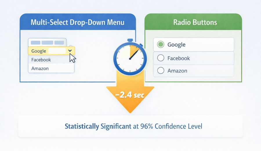
9. Use radio buttons in place of drop-down menus
UX Movement suggested that users often abandon forms containing select menus because they “demand more time and effort” to fill out.
They further argued that these menus disrupt the user’s process, are difficult to scan, and require precise mouse movements, potentially causing frustration. However, they did not present any data to back up these points.
Fortunately, this is straightforward to evaluate. During the rollout of our large survey on perceptions of online trust, we took advantage of the situation to alter the survey format and compare responses by showing some users multi-select menus and others radio buttons for the same questions.
What did we find? The radio button version was completed in less time. Participants finished the form with radio buttons on average 2.4 seconds quicker than those using multi-select menus. This time difference was statistically significant at the 96% confidence level.
10. Don’t highlight coupon code fields
When shoppers notice a space for entering a coupon code, it can make them feel left out. They may wonder, “Why haven’t I received a code?” and start to feel like they are missing out on a deal.
Often, they will head over to Google to hunt for a discount code. If they find one on another website, it eats into your margins. Sometimes they get distracted and never come back to finish their purchase.
Searching for coupon codes during checkout is a major factor behind abandoned shopping carts.
Rather than using a big banner, provide a subtle text link such as “Have a coupon?” When clicked, this link can reveal a coupon entry field. Because text links do not draw much attention, fewer visitors will notice or interact with them.
Shoppers who possess a coupon code will typically search for somewhere to input it, so as long as the option isn’t too hidden, they’ll find it and redeem their discount. Alternatively, if a customer received a coupon by email, you can automatically apply it for them and show the savings.
11. Skip the “clear fields” button
No one filling out your form has any interest in emptying all the fields. If someone chooses not to complete the form, they can simply exit without submitting it.
If users happen to fill out the form and then accidentally erase their entries, many of them will likely decide not to try again.
Mobile-specific form design principles: best practices
Most of the guidelines above also apply to mobile forms, but small screens introduce unique challenges. People using mobile devices tend to be less tolerant of delays, and typing or navigating on a phone is generally more cumbersome than on a computer.
We’ve dedicated an entire article to this subject, so check that out for a comprehensive overview. If you’re just looking for a few tips to get started, consider the following suggestions.
12. Provide clear field focus
When your form contains several fields, it’s easy for users to lose track of where they are. This can become even more challenging on mobile, as the limited screen space gives users less control over what they see.
Ensure that the field currently being filled out stands out and is easy to identify.
13. Don’t hide passwords
Although it might appear safer to conceal passwords during entry, revealing them actually improves the overall experience for users.
When users are only given a line of dots or asterisks as feedback while entering passwords, it leads to usability issues. In most cases, obscuring passwords does little to enhance security but often results in lost customers because of login errors.
Caveat: Run your own experiments
The fact that something is labeled a “best practice” does not guarantee it will always be the best fit. There are times when these guidelines do not produce the desired results.
Each website operates within its own unique context. A strategy that succeeds on one platform might not deliver the same outcome on another.
Your organization’s needs might also differ. For example, collecting a middle name could be essential for your process. That decision is entirely up to you.
So keep in mind that these insights should be viewed with some skepticism. Everything here is backed by research and experimentation, but what truly counts is how it performs on your website and within your unique business situation.
Consider these as recommendations rather than strict rules.
Conclusion
While best practices in form design tend to be effective, they are not one-size-fits-all. There is no guaranteed solution, so you must run your own tests to find what works best for you.
However, if you’re building your forms from the ground up, these design guidelines offer a solid foundation. Consider them as an initial step in your process, not the final destination.
If you’re still exploring options for building your forms, we’ve put together a helpful resource. Our comprehensive guide to the best online form builders highlights top tools that make it simple to create effective, user-friendly forms in minutes. From easy drag-and-drop editors to platforms with powerful CRM and marketing automation integrations, these tools can help you implement the strategies from this guide and start collecting high-quality leads right away.
 What is an Online Form? A Beginner’s Guide
 The 11 Different Types of Online Forms