What it is About
A call to action is a text styling approach, that you can use for the action button of your lead magnet. (Learn more about lead magnets here).
This approach based on motivating the visitor to perform an action with specific words or details. For example:
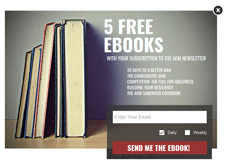
Image source: http://www.artofmanliness.com
Why it is Important
The basic idea behind the call to action is a perception of your website or blog by the visitors. Most of the readers first perceive information through visual accents. They pay attention to colors and sizes of clearly visible (contrast) design elements.
Your visitor’s attention will switch between form’s elements with the following or similar sequence:
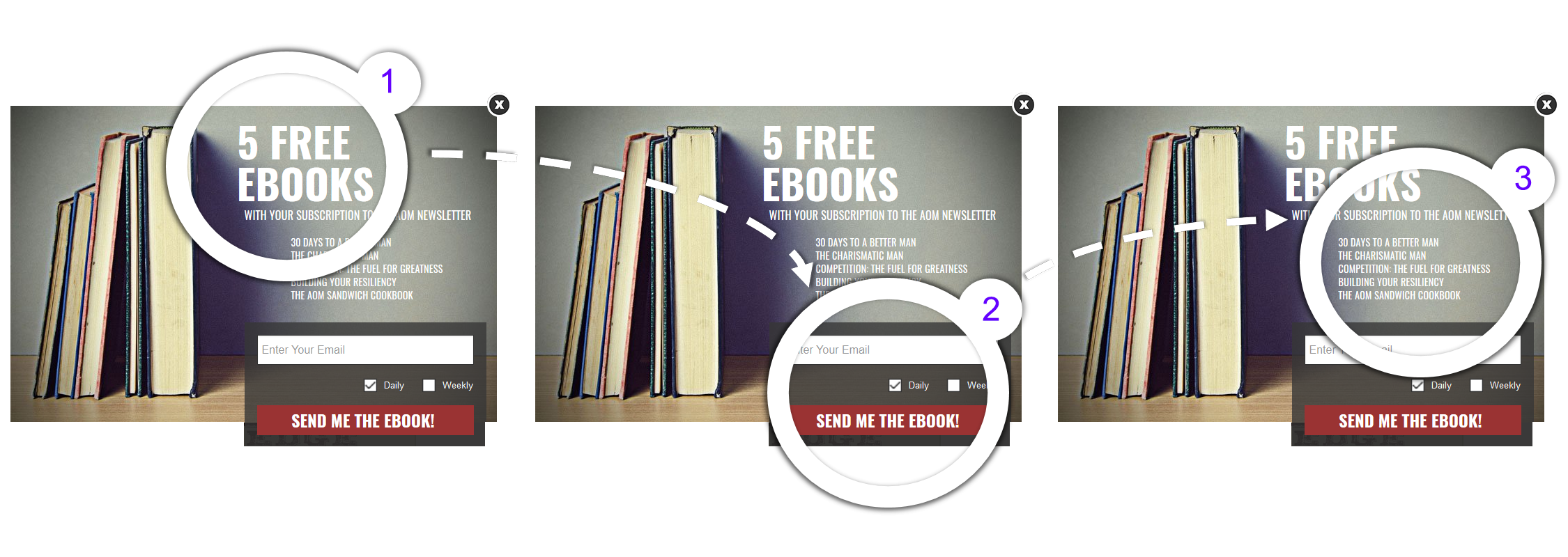
An important thing to remember: the button’s text is among the first two elements, that your visitor will see. So it should be attractive and relevant enough to keep visitor’s attention, to inspire him to further action.
How Exactly it Works: Case Study
Now let’s take a look on how exactly you can make the button text more interesting and attractive to your visitor.[/vc_column_text]
Case 1: “Get Access Now”
What’s good:
- It emphasizes the value, that visitor is about to receive. Not the action, that author wants the visitor to perform. This is a nice and attractive approach (much better than standard “Subscribe” or “Follow”).
- It describes the value’s details: immediate gratification, getting what you want right now.
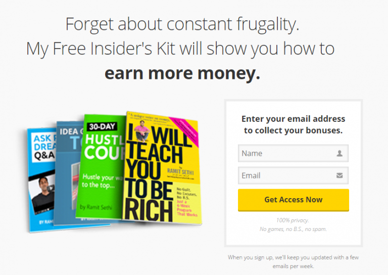
Image source: http://www.iwillteachyoutoberich.com/insiders-kit/free-tools/
Case 2: “Send My 4 FREE Resources!”
What’s good:
It describes the benefits of the offered value:
- Amount: 4 resources.
- Details: FREE.
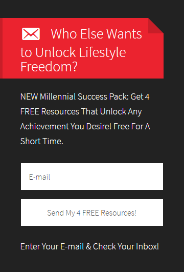
Image source: https://motiveinmotion.com
Case 3: “SEND ME THE EBOOK!”
What’s good:
- It is relevant: text is strictly connected with both the title and preview image.
- It describes the value’s details: format, electronic book.

Image source: http://www.artofmanliness.com
Case 4: “YES, SEND ME THE FREE GUIDE” / “NO, I’VE GOT ENOUGH CLIENTS”
What’s good:
Semantic accent: not only subscription button, but also a closing button text is connected with the offered value.
The idea is simple. Pressing such closing button requires attention to the offered value. Thus, this attention might still bring the visitor back to performing “Yes” action.
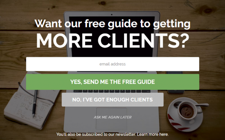
Image source: http://millo.co
Case 5: “Join 29,309 Folks”
What’s good:
- It describes the offered value details: joining the big and active community.
- It shows the friendly attitude as the author uses non-official language.
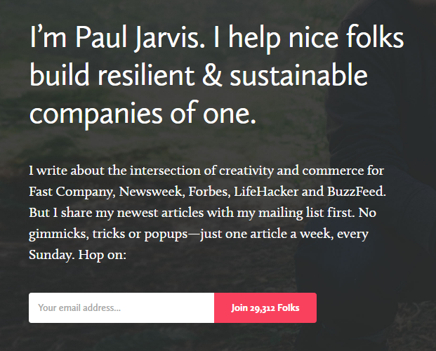
Image source: https://pjrvs.com
Case 6: “GO TO THE VIDEO”
What’s good:
It is action-inspiring and relevant. It both answers the title question and describes the offered value type.
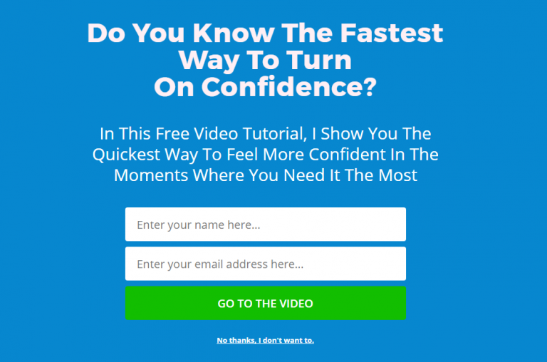
Image source: https://motivationgrid.com
Summarizing the Checklist
To create a high-conversion lead magnet follow the simple ideas below. These will help you to add an attention-attractive call to action:
1. Encourage the action
Concentrate on the action-driven words. Keep the text more interesting for your visitors. Emphasize the value received with the action, not the action itself.
2. Add attractive details
Keep in mind that the button text is one of the first things that a visitor will see. So do your best to attract attention. Include details, benefits or references to the offered value inside this text.
3. Keep it relevant
The button text is a part of the form, not its independent element. Keep it connected with the title, description, and images. Use them all together to inspire your visitor to perform a success action.
 120 Marketing Quotes To Get Inspired
 Convertful Update #36