Floating bars are a great lead capture tool. From growing your mailing list to increasing ROI, you can use a floating bar for many different purposes. However, one thing that stands out with floating bars, is the fact that it does not interfere too much with user experience.
But is it possible to have a non-disturbing type of popup that is high-performing as well? In this article, you’ll see how floating bars match both those criteria and offer plenty of customization options.
Convertful allows you to set up a few different kinds of floating bars. We’ll go through how to use our tools to create the right floating bar for your business.
End-Page Bar Offers
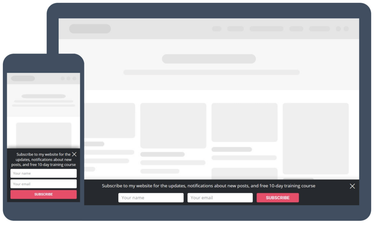
This floating bar is conveniently placed at the bottom of the page, and as the user scrolls, the bar moves along with the scroll. Unlike a popup, this type of bar does not prevent the user from reading the page content, but it does slide further down as you read.
The end-page bar is inconspicuous, and offers your users a chance to subscribe. Once they’re done reading your content, they will notice the bar – if the user liked your content, they will happily subscribe to your updates.
This is a great tactic to find subscribers while not interrupting your users’ browsing experience.
Deadline Bars
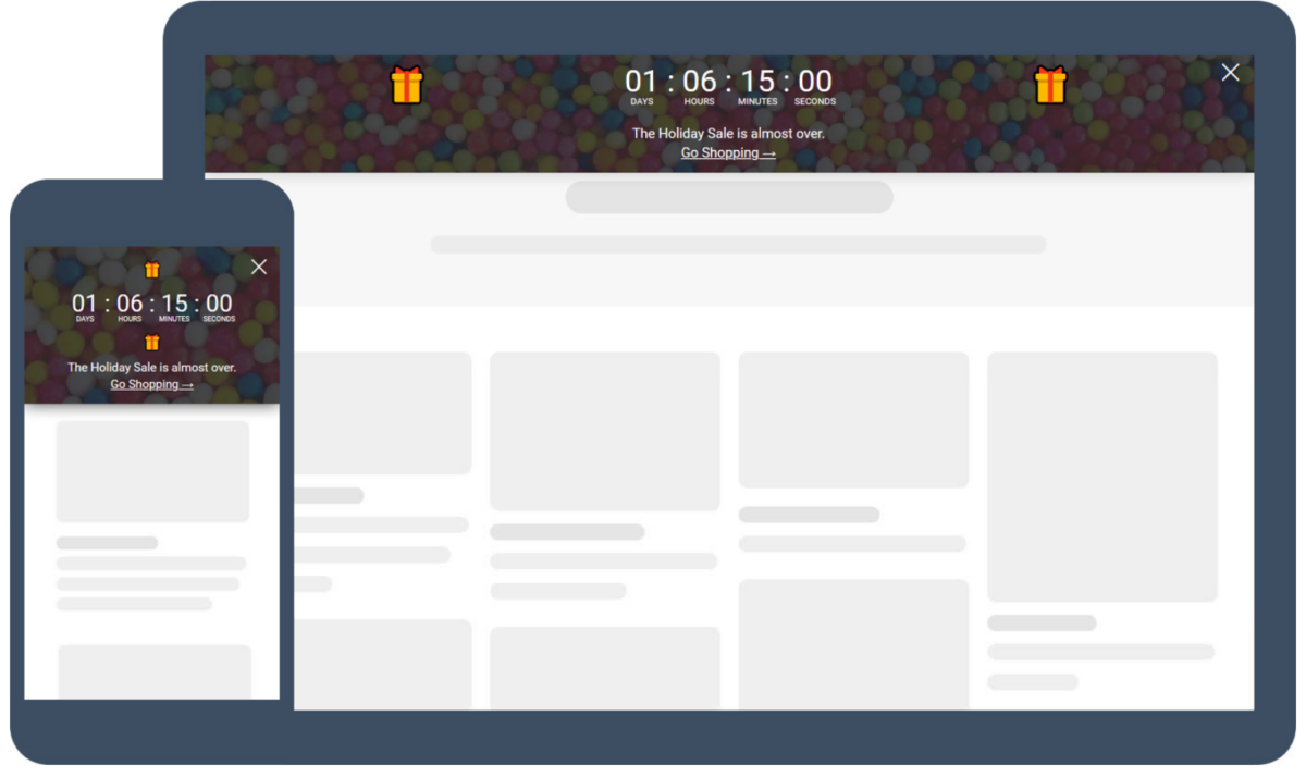
If you want to add some urgency to your offer, we recommend a deadline bar. Deadline bars capitalize on fear of missing out, and are quite commonly used for short-term offers. The deadline gives the user an incentive to buy now, since the offer is running out. This creates a sense of urgency for the visitor, who might be more inclined to purchase.
You can use a deadline bar with the same date, or start the timer whenever a user comes onto your website. If you use the same date as a deadline for all users, some of them will have more time than others.
If, on the other hand, each user starts with the same amount of time until the end of their flash sale, they will all have the same amount of time to act.
Nonetheless, this tactic cannot be overused. If you have a “Subscribe” button only, without a timer, you can leave it on for as long as you want.
Deadline bars require there to actually be a special offer, and they should show up only once to each user. If a user comes to your website several times, and every time there’s a new deadline, they will feel that you are scamming them to get the sale.
So, in short, deadline bars are quite effective, but you need to tread carefully when using them.
Personalized Return Welcome Bars
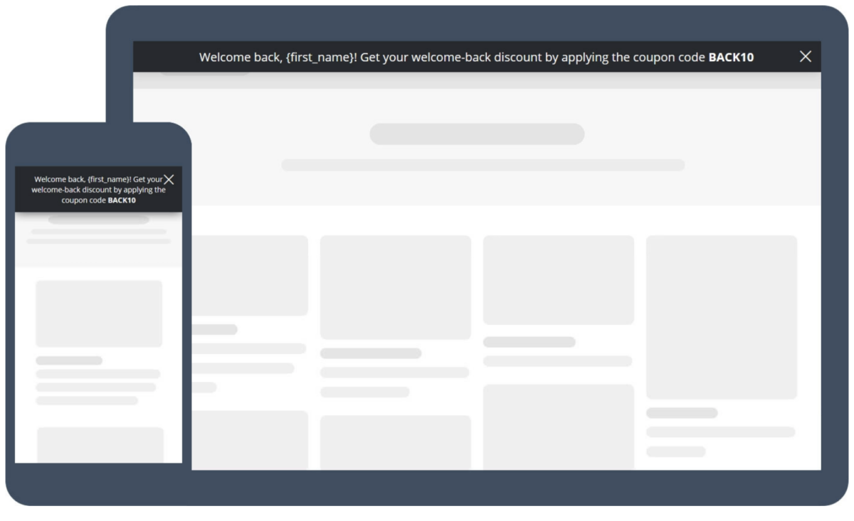
Unlike the previous bar, this one can be used as often as you want. As the name suggests, it will show to every user that comes back to your website.
You can use this for all your returning customers, just the ones that have already purchased from you, or even for users that just visited your website but never made a purchase.
This bar will give your repeat visitors that slight push into buying from you again. Sometimes, those users might be interested in a product but won’t buy it because it is expensive in their eyes. Or maybe they feel that the shipping costs are too high for that particular product.
Personalized return welcome bars will help you overcome buyers’ reservations, by giving those users a coupon code or any possible offer. They are also discreet and will not affect the user experience (UX).
Welcome Discount Bars
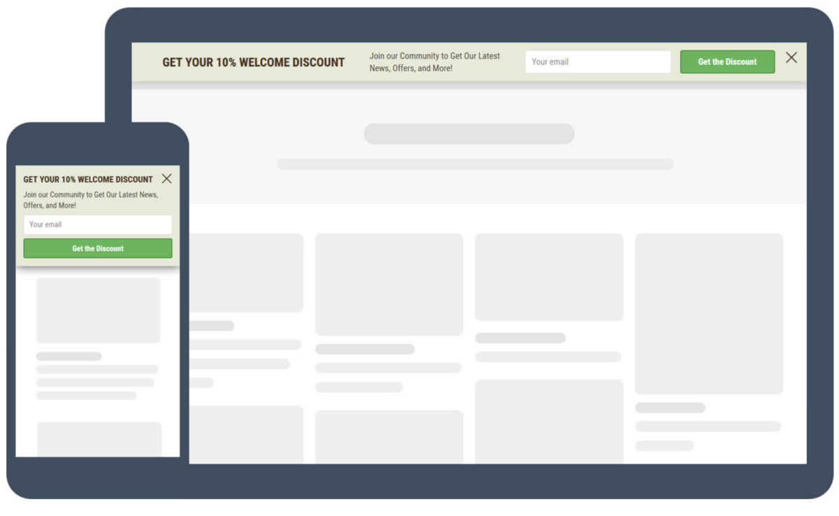
On the other hand, you might want to give a discount to the users that are visiting for the first time. Why not grab your users’ attention on the first contact?
To achieve this, you can ask for your users’ email addresses. The reason behind this is twofold: you offer a discount that will pique their interest for an early purchase, and you also get their contact.
The contacts you collect from this first touchpoint can be used to send product news, limited-time offers, anything in your niche that might interest your visitors.
As your contact list grows, you need to leverage the power of email marketing to your advantage, and that is why Convertful integrates with Platformly.
There are many advantages to integrating these two services, the biggest one being a seamless connection between what shows on your website and what your subscribers will get in their inbox.
Segmentation Survey Bars
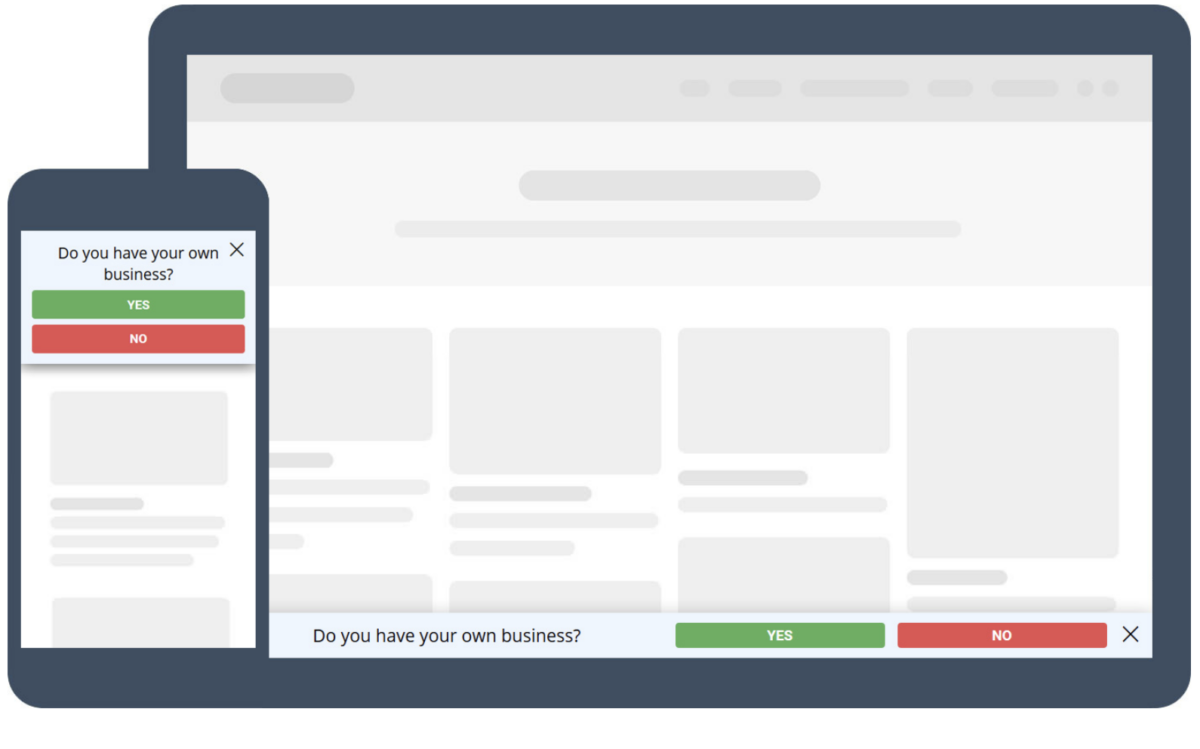
Segmentation surveys can work in various ways. You can ask a question that will help you understand your users better for proper segmentation – this template is a great example since it allows you to understand if your clients are business owners or employees.
This will help you design your marketing campaigns according to your user profile.
Usually, the way these bars work is by requesting a “yes or no answer”. We don’t recommend adding open questions or long surveys. Users are in a constant rush.
If it takes longer than 5 seconds for your page to load, the probability that a user will leave your page is quite high.
The same thing happens when filling out a survey. If your form has more than four or five fields, your users will give up quickly. Make it short and sweet.
Gamification Bars
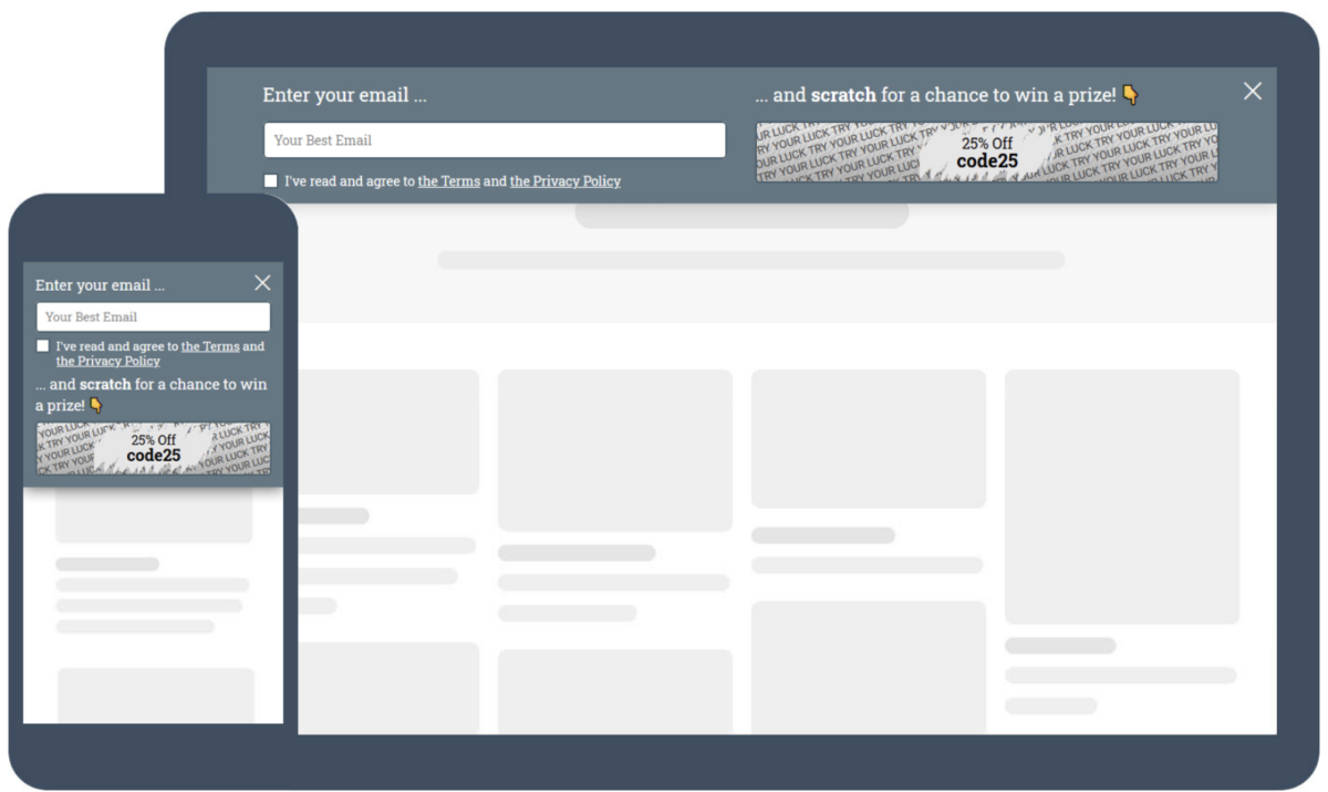
Gamification bars have, in many instances, replaced common subscription forms. What makes them so appealing is the way they work: rather than showing an offer immediately, you have to spin a virtual wheel or “scratch” a virtual ticket first before the offer is revealed.
This makes it fun for users: they never know which offer they are going to get. It’s more interactive than a simple popup form and very effective.
The gamification trend will not go away so easily!
Simple Subscription Floating Bars
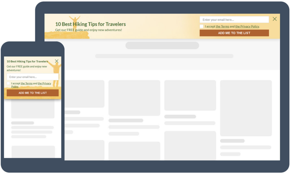
To finish our list, we’ll show you the most common floating bar: the simple subscription floating bar.
To say that it is simple does not mean that it is less effective. Actually, if your goal is to grow your mailing list, this is one of the best ways to achieve it. This floating bar is not intrusive, it follows the user scroll, and offers an easy way for your visitors to subscribe to your updates.
In this case, the CTA (call to action) is “Add Me To The List”, however, you can edit the template for this bar as much as you need to.
This is the perfect template for website owners that are just starting out on online lead generation.
Wrapping Up
As you can see, Convertful offers you plenty of options when it comes to floating bars. You can choose any of these templates according to your preference, and there are many other examples included in these categories.
If you’re in doubt about using popups for lead generation, floating bars are a great way to start.
Do you have any questions about floating bars? In that case, simply type your question in the comments section or visit us on Facebook, Twitter, or LinkedIn.
 13 Tactics To Improve Your Conversion Rate
 Convertful Update #36