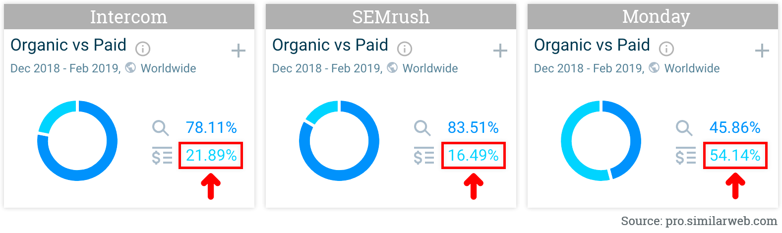
Intercom has grown from $1 million in annual recurring revenue to $50 million in just three years. SEMrush has tripled its revenue in less than 2 years. Monday has recently reached 350,000 users in 141 countries.
What do these so different fast-growing companies have in common?
The answer is: all of them strongly rely on the paid traffic.
 And if you check their top ads, you can see that they lead to landing pages, created specially for these ads.
It is no accident. Just 30-180 minutes spent on a good landing page can increase your conversion rates from an average 2% [*] to 5.31% [*] or even higher!
Check our simple guide to landing pages and learn how to rock your landing page.
Table of Contents:
- What is a Landing Page
- The 6 Essential Landing Page Elements
- Types of Landing Pages
- Landing Pages Copywriting
- The 8 Rules of Landing Page Design
- Conclusion
What is a Landing Page
Landing Page is a single web page, (a) designed to “land” people coming from a specific marketing/advertising campaign; and (b) focused on convincing these people to do the next single action (e.g., buy a product or leave an email address).
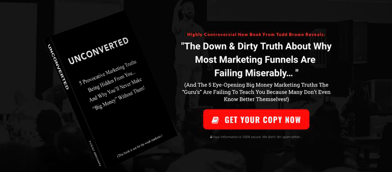
This is an excellent example of a landing page that promotes e-book ‘Unconverted’ by Todd Brown.
In short: A Landing page is a bridge between an AD and a required action.
By “AD” we mean Paid Traffic … But in today’s marketing landscape, paid traffic carries a hefty price tag.
For example, if you want to display a Google AD to a visitor who searches for a “landing page builder,” it would cost $16 per click.
Think about it; every single visitor who lands from such an AD costs $16!
The landing page should do its best to convert such visitors.
There are several vital features to achieving this.
A Landing Page is Complementary to an Ad
When a visitor clicks on an Ad, he/she is already attracted to the offer. Your Ad’s copy and image/video have done their job.
The primary goal at this point is not merely to attract, but to keep the attraction.
That’s why a landing page should be an extension of an Ad: same offer, same colors, same images.
The visitor needs to instantly feel: “I’m in the right place.”
Check this example.
A person clicks on this ad from Digital Marketer and lands to this page:
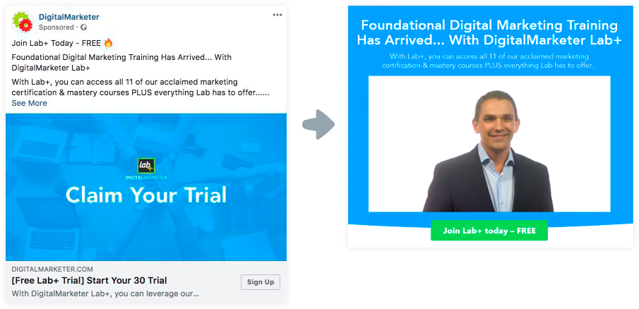
Once the visitor clicks on the Ad, they see similar copy and words.
CTA is also compatible: Join Lab+ today – FREE.
There is also a single clean design.
We’ve got a perfect match!
A Landing Page is Focused on a Single Goal
Users visit traditional websites for different reasons all the time.
Some need to check business hours, learn more about the company and specific products, read a blog article, or they’re simply curious.
A traditional website is bound to serve multiple goals at the same time. Pretty standard, right?
But when it comes to a landing page, visitors come for one reason: to learn more about the Ad offer.
So a landing page has one goal: to prompt visitors to take the next step.
A landing page should be 100% focused on this goal, and this can be achieved by removing all distractions.
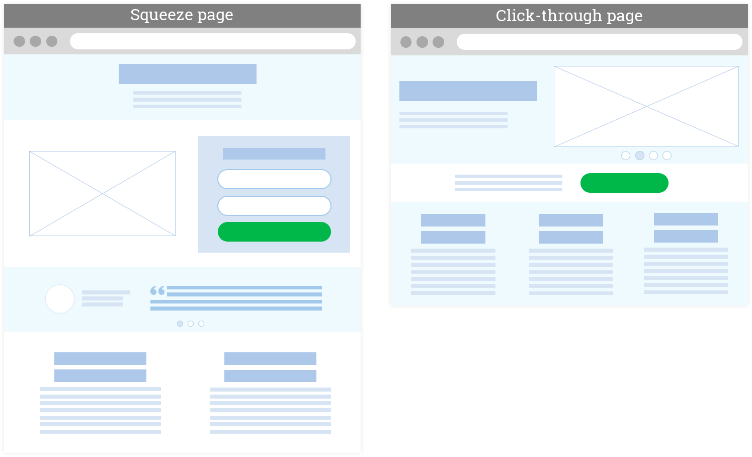
What does this mean? The best way to show you is to compare a site homepage with a landing page:
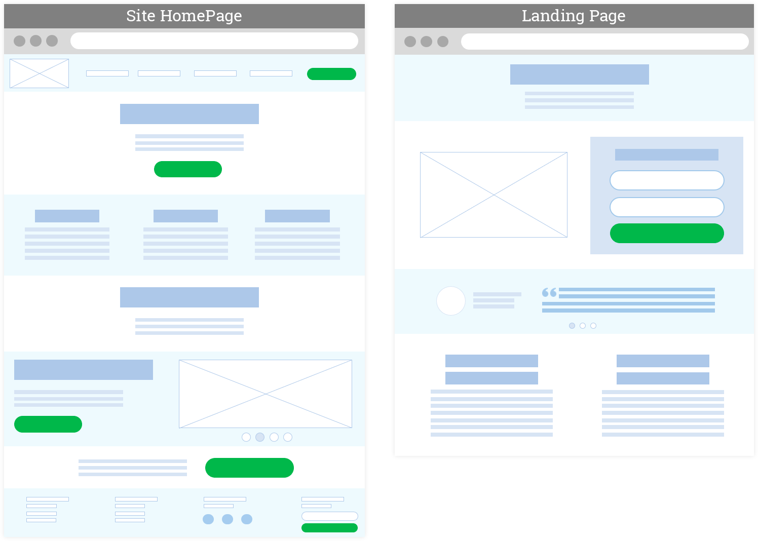
Notice the difference – the site homepage has multiple buttons and links, including site navigation. A landing page has only one button (call-to-action). You can learn more about their difference in this article.
Why so? Because the removal of other links and buttons increases conversion up to 100%.
And the same applies to everything else: keep 100% focus on the goal while eliminating excess information.
The 6 Essential Landing Page Elements
The best high-converting landing pages have many differences.
But they have something in common: all of them are based on these six essential elements.
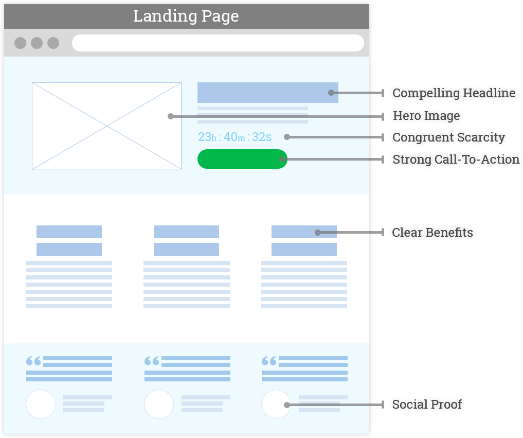
1. Compelling Headline
On average, 80% of visitors will read the headline; and only 20% will read the rest.
This makes your landing page headline the single most crucial element on the page.
Some of the best copywriters even say: “Spend half of your time crafting a headline when creating a landing page.”
The goal is to create a clear, concise, favorable headline that grabs visitors’ attention and tells them they’ve come to the right place.
You should focus on the “4 U’s” of attention-driven headlines: be unique, ultra-specific, urgent and useful. Learn more on how to craft a killer headline here.
Here are a few examples of great headlines:
- How To Ethically “Hijack” Human Nature And Consistently Attract Waves Of High-Quality Leads… Even If You Don’t Spend A Dime On Advertising
- Shift Confusion & Conflict To Deep Connection
- The 5-Step Master Class Husbands Use To Win Their Wife Back (while not giving up their manhood)
2. Hero Image
‘We are visual by nature. In fact, 90 percent of information transmitted to the brain is visual,’ – states the research from Thermopylae.
You praise your product and say how much value your customer will gain, but they are still bored. However, once you’ve shown your product, the customer is yours.
A Hero Image does precisely this – it is a photo or video that shows your product in the most beneficial way.
Check the example from Nimb – A smart ring with a panic button.
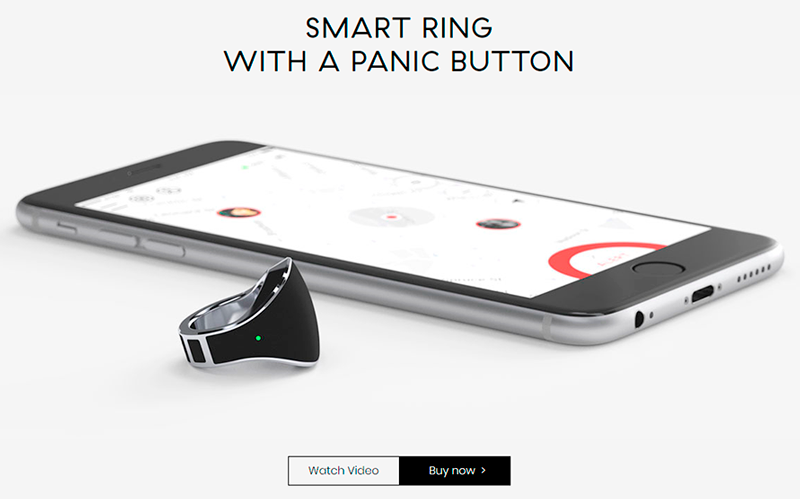
There are images of both the ring and the app. You can switch the image to a video to see how the product works.
To learn how to create a Hero Image that drives conversions, check this article.
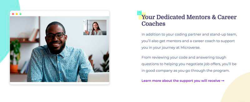
3. Clear Benefits
Gary Chapman describes in his book ‘The Five Love Languages’ how different people experience, express, and receive love. If people speak different love languages, they will fail to connect. He talks about personal relationships, but this refers to customer relationships, as well.
Speak the language of your customer. Don’t tell them about the features of your product – they aren’t visiting your landing page to hear about them. Tell them about the benefits of your product.
Features include the product’s characteristics. It’s color, size, and functionality.
Benefits include the results of the features. It’s about the value that your product adds to the customer’s life: saves time, earns money, and delights.
That’s why it’s crucial to focus on the benefits. Make it clear as to how you can solve the customer’s problem.
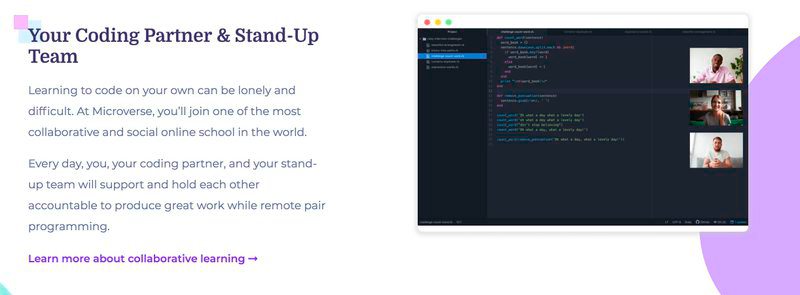
Let’s look at the example of Microverse.
They firstly present the benefits…
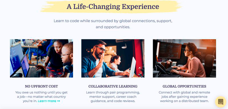
… and show the features after.
Check our Product Features and Benefits Cheat Sheet to learn how to describe features as benefits.
4. Social Proof
As Brian Halligan said in Inbound 2018, we live in times of a trust crisis; no one trusts marketers or salespeople anymore. Customers only trust other customers.
That is why it’s crucial for the landing page to show that your product has brought value to others. When visitors see that others are interested, they are more likely to engage. This phenomenon is called Social Proof.
The most common type of social proof is a testimonial – the review from a client posted on the landing page that stresses how much you’ve helped them.
No matter how good your marketing team is, no one will sell your product better than your customers. Here’s an example from ManyChat:
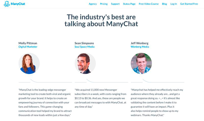
Their customers say great things about the product but from a different angle. One is giving examples of numbers; another is talking about the ways to use the bot.
5. Congruent Scarcity
While reading ‘Romeo and Juliet’, have you ever wondered how such intense feelings could develop in such a short period? A romantic may blame it on perfect love. But scientists have another explanation.
People are programmed to want things they don’t have. Dr. Robert B. Cialdini in his book ‘Influence’ calls it the principle of scarcity explaining how you can effectively use it in your marketing strategy.
The things that are in short supply are most desirable. Scarcity increases the perceived value of your product pushing customers to purchase faster.
Here are two main techniques to achieve this:
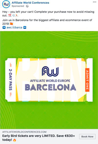
A limited amount of product. The product is in short supply, and won’t be available after it runs out. A limited-edition product presents that only the first 100 customers will get it.
Look at the ad from Affiliate World Conference– they provide the limited amount of early bird discounts that are believed to be one of the best promotional methods for an event.
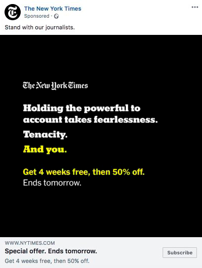
A limited time to purchase. The product is only available during a specific timeframe, and won’t be available after a set date.
A limited-time offer could be a deal, a special gift, or a reward to a buyer. When consumers think they have exclusivity and can get their hands on something special before missing out, they are often enticed to make a purchase decision. Here’s a great example of subscription limited offer from The New York Times.
6. Strong Call-To-Action
According to Microsoft research, people have a shorter attention span than a goldfish – (only 8 seconds!). You have a minimal amount of time, and you need not only to explain your offer but also what you want your visitors to do before they leave the page. Call-to-action plays a critical role here.
Call-to-action explains precisely what will happen after you click on the button. Stay away from generic phrases like ‘Submit’ or ‘Apply.’ The call-to-action should continue the client’s thought ‘I want…’.
That’s how e-commerce retailer Fab.com tested their ‘Add to Cart’ CTA.
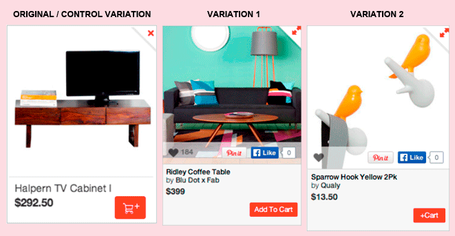
Variation 2 with ‘+Cart’ increased conversion by 15% compared to the original first button. But clear and simple ‘Add To Cart’ beat them all, increasing conversion by 49%!
Types of Landing Pages
Squeeze Page
A Squeeze page is made with the purpose of capturing visitors’ personal information.
Its goal is to get their contacts, push through the funnel, start to nurture with valuable information leading the visitor towards the purchase.
But you won’t get far simply by asking for info! Make a fair exchange. Provide visitors with great content; make them happy to leave their email behind. After reading your content, visitors should be enticed to learn more and purchase your product.
The exchange could be anything that is valuable to your target audience – eBooks or guides, quizzes, and registrations for webinars.
Here are some great examples of squeeze pages.
The Ebook ‘How to get Gmail work as a help desk’ from Hiver.
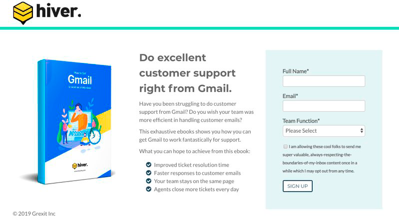
This landing page isn’t pushing the product onto the customer. It is simply providing value to the user without talking about the brand. They have one goal in mind: get the name and email address of the customer. Selling will come later – exchange information for now.
Here goes the landing page for the masterclass ‘How to Develop A Super Memory’ from Mindvalley.
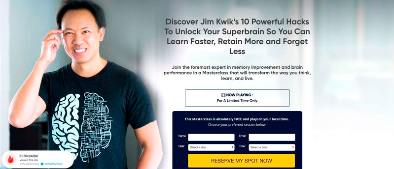
This squeeze page is designed to gather leads and sell the product through the free webinar. If the product isn’t sold on the webinar, he’s got the customer’s email address to nurture further later. This page kills three birds with one stone!
Click-Through Page
A Click-Through page is a link from your ad to the check-out page.
It provides all the information about the offer and the value that the customer will gain while leading them to the check-out page.
It’s the last touchpoint for your customer before the purchase. It has to be super informative.
You can usually see click-through pages in e-commerce purchases or registrations for a trial of service.
Check the example of Code Academy:
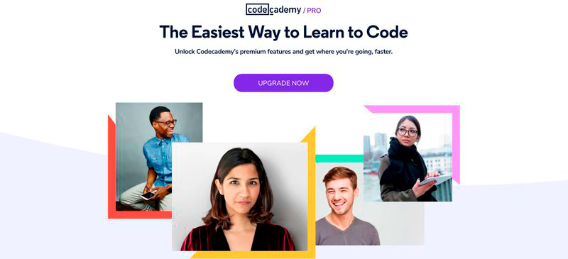
On their PRO Membership landing page, they have all the info about the program, it leads directly to check-out.
Another example from Mindvalley. That’s how looks their click-trough page for the Mentoring Program.
It is long, very informative and have one call-to-action for a free trial.
Landing Pages Copywriting
No matter how you choose to sell your product, one thing that remains constant is that you will need great copy.
Let’s explore five ways to optimize your landing pages to ensure the right message is delivered with each touchpoint.
1. Be Specific
Describe your product or service clearly and specifically. Tell your reader exactly what they will learn (if your offer is a content piece) or exactly what the benefits will be when they purchase the product.
👎 Bad: “We create unique projects.”
👍 Good: “Full business analysis, concept creation, interface development, complete code and, on-going support.”
2. Use Facts And Numbers
Prove your words with concrete figures via stats.
👎 Bad: “For the last several years our pizza delivery guys were late just a few times.”
👍 Good: “For the last five years, our pizza delivery guys were late a total of 8 times – four times less than the delivery of “The Main Competitor”!
3. Keep it Short and Simple
Every word has to carry meaning. The fewer superlatives, the better. Delete redundant words and focus on delivering value with each message.
👎 Bad: “Because of our new amazing interface and latest technology, it’s easy to order delivery!”
👍 Good: “Make orders in a single click!”
4. Talk Benefits, Not Features
Show the value that you bring, not how great your product is.
👎 Bad: “Our pizza restaurants are located no more than within 2 km from your house.”
👍 Good: “Deliver pizza in 60 min.”
5. Avoid Clichés
Behind every cliche, there is a more effective and concrete message designed to help sell a product.
👎 Bad: “You won’t notice how time will fly in the air.”
👍 Good: “Our planes have an entertainment system. During flight, you can watch movies, listen to music, or play games.”
The 8 Rules of Landing Page Design
Landing page design is a critical part of your message, providing visitors with a snapshot of your product and offer.
Consider eight critical rules when designing a landing page.
1. Have Your Unique Value Proposition (UVP) Above the Fold
The Compelling Headline, The Hero Image, The Social Proof and The Strong CTA should be seen instantly, without the need to scroll. Above the fold is the section your visitor sees immediately as they land on your page.
2. Make Sure the Design Matches the Ad
Colors must be seamless, along with the copy and all images.
3. The Message Needs to be Readable
The text must be readable, no matter how and where images are placed.
4. The Landing Page Must be an Attention Magnet
You need to ensure that there is a contrast in button color, testimonials, and visual cues. Keywords need to be highlighted; every part should be bold and clear.
5. There Must be Style Consistency Throughout
Everything must be uniform; same fonts and same colors. Headers need to be prominent, and there must be consistency in spaces/rows between each field.
6. All Section of the Design Need to be Logical
Each section should incorporate one core message.
7. Simplicity Always Wins
Simplicity is most effective when we design landing pages. There needs to be limited navigation and a limited amount of form fields.
8. The Landing Page Must be Mobile-First
Always make your landing pages mobile-friendly!
Conclusion
The number of advertisers is growing rapidly; the paid traffic is constantly getting more and more expensive.
The only way to win is to convert your visitors much better than before.
And this is where landing pages come into play.
They serve as a bridge between the ads and your required actions. Build a solid one from the start, don’t let your visitors sink in the flow of a white noise!
Create a separate landing page for each marketing campaign, follow the simple rules for optimization – and you will rock your industry. 🚀🚀🚀
 How To Create A Hero Image That Drives Conversions
 120 Marketing Quotes To Get Inspired