When content has engaging images, it gets 94% more views.
After all, 90% of all the information sent to our brain is visual– it’s simply how we’re wired.
That’s why great visuals are key to high conversion rates. And of all visual tools at our disposal, the Hero Image may just be the most essential.
What Is A Hero Image?
Also known as a Hero Shot, a Hero Image is an image or video that dominates your landing page and presents your product. It’s the first thing your visitors will see, and it’s your first chance to convey exactly what your page is all about.
A Hero Image is an oversized banner image at the top of a website [which] serves as a user’s first glimpse of your company and offering.
3 Types Of A Hero Image
Different products require different types of Hero Images. What you choose will depend on your company values.
1. Product-focused
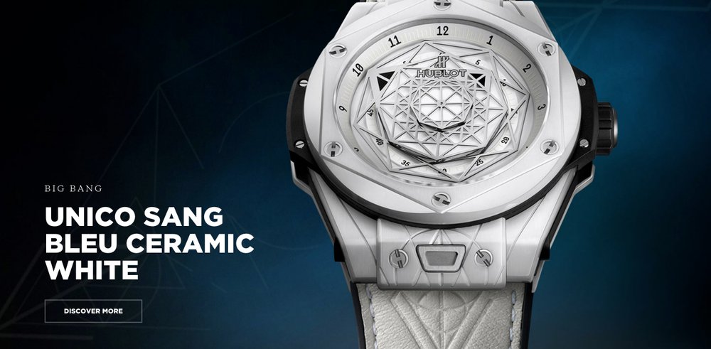
The main goal of this Hero Image is to showcase your products. This is a useful approach in industries where product design is crucial (think: furniture, accessories, gadgets, etc.).
For instance, take a look at Hublot’s landing page. The very first thing you see is the elegant, stylish design of their luxury watches. Without reading a word, you know exactly what to expect.
2. Process-focused
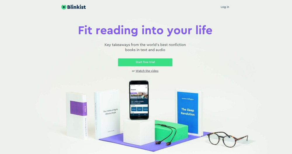
If it’s more important to show how your product works, not how it looks, you can use a video Hero Image to demonstrate your product in action.
Blinkist’s landing page is a great example; it shows photos of the product, but also offers the option to view a 30-second video explainer. When you watch the clip, you get thorough insights into the product’s value.
FitRadio’s landing page has another great example of video use:
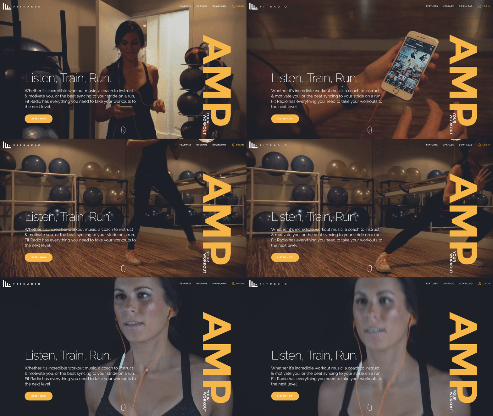
Their video displays a woman happily using the FitRadio app through her entire workout. When you watch her, you can see exactly how the product creates such an enjoyable experience.
3. Outcome-focused
This type of Hero Image centers on results. Instead of showing how it looks or how it works, here you demonstrate the transformation your product will bring.
An important note on this approach: Focus on the value you provide, not the problems you solve. People are much more interested in the eventual payoff than their current issues.
Consider this example from Honor, a home care network that connects families with caregivers.

Rather than focus on their online platform or caregiver training, they highlight the desired end result: a happy senior citizen.
5 Rules of Great Hero Images
You’ve decided on your Hero Image strategy. Now, it’s time to make sure you do it the right way.
With the following checklist in mind, you’ll be able to avoid falling for the most common marketing mistakes.
1. Make It Product-Related
The Hero Image should be a visual explanation of your product, not just a pretty picture. Take a look at Pristine Rainforest Tours’ page.

The background image is certainly pleasant, but it doesn’t convey actually convey anything meaningful about their product.
Let’s check another example.
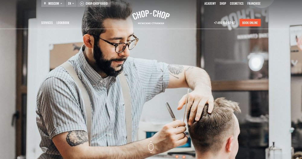
Even with minimal words on the screen, you know that Chopchop is a barbershop. Their product illustration leaves no room for ambiguity.
Key Takeaway
Your Hero Image has to speak for your product. If you’re unsure, ask yourself: Without any text, will the image still clearly convey your product?
2. Align It With The Copy
By aligning text and illustration, you can give your Hero Image the power to convert visitors.
But without a relevant connection, you may create confusion. Take a look at this page on S7 Airways’ site, which combines a photo of a snowboarder with unrelated text. Could you tell that they were trying to promote special winter holiday discounts? Probably not.

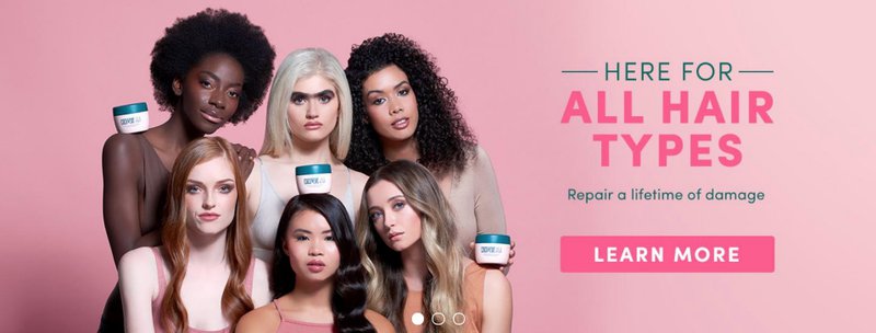
On the other hand, Coco and Eve’s page demonstrates a perfect match. The copy says ‘for all hair types,’ and the illustration of various hairstyles clearly complements it.
Key Takeaway
Stick to one specific idea. This means treating your copy as an extension of your Hero Image.
3. Guide Your Visitors
Human beings have a natural tendency to follow the gaze of others, and we have been coached since birth to follow arrows directing us to where we should be looking/going.
Neil Patel, the world-renowned marketing guru
This research backs it up:
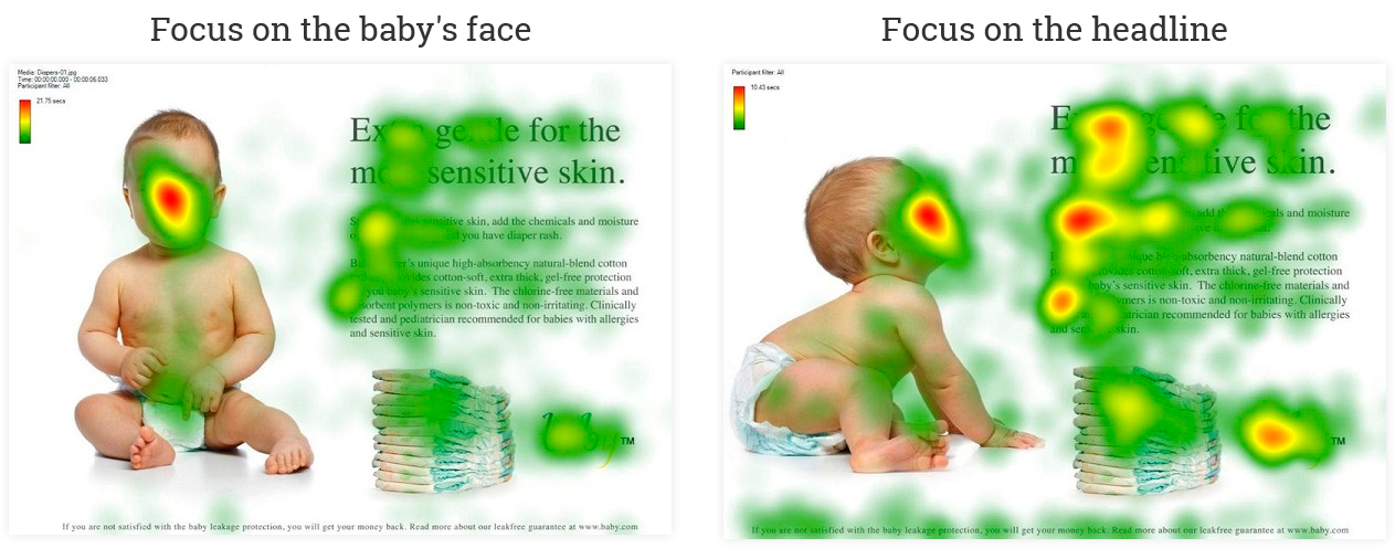 In the first image, the baby looks directly at us. And according to the heat map, his face gets most of the attention. As a result, though, the important copy doesn’t get noticed.
Now check the second picture. With the baby looking at the copy – bam! – both the baby and the text get a considerable amount of attention.
Key Takeaway
Use the Hero Image as a directional clue. With it, you can guide attention toward your desired action.
4. Avoid Stock Photos
Stock photos reduce authenticity and trust; they can be spotted a mile away, they are used by thousands of other businesses. Experiments show that you can increase your conversion by 45% if you remove stock photos and add images of your own staff.
Talia Wolf, founder of GetUplift and specialist in emotional targeting
In other words, show your products and let them sell for you.
Otherwise, your site will look like the example below, with an image that was clearly taken from an Internet stockpile.

Every industry is filled with companies overusing stock photo templates. Don’t join them.
Key Takeaway
Leave those fake happy people in the 2000s and keep your products out of the stock storage shadow. Instead, bank on authenticity.
5. Use Metaphors With Caution
Metaphors are a great way to illustrate your service in an exciting way, but using them can be tricky. Connections that seem obvious to you may be very complicated for others to understand.
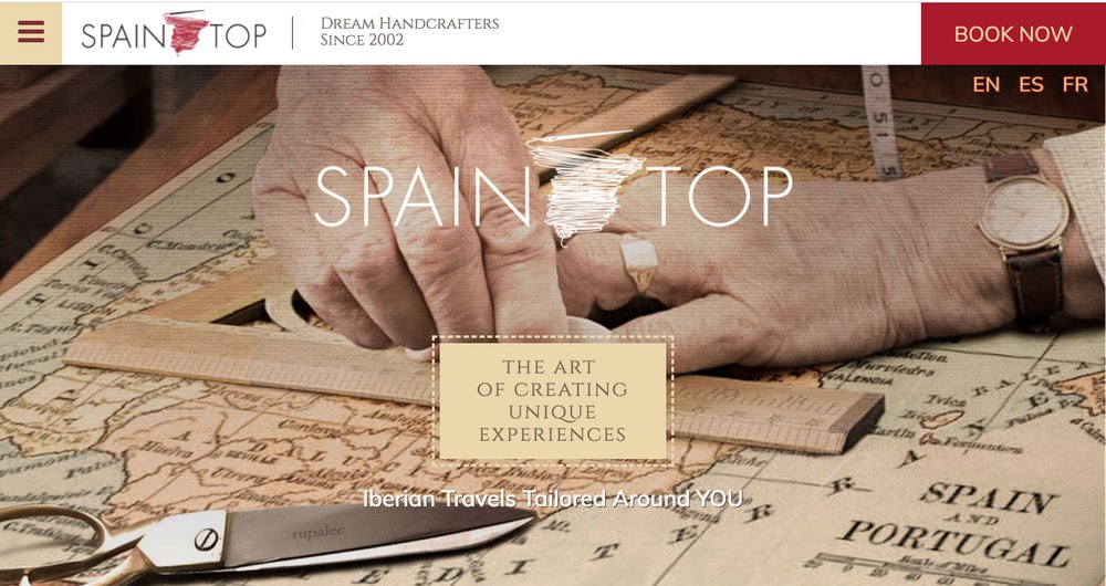
For instance, SpainTop tried to play with the sub-headline ‘Iberian travels tailored around you’ by illustrating the hands of a tailor over a map. And while it may be clever, solving this riddle takes time that visitors don’t have. Plus, it doesn’t do much to promote their travel tours.
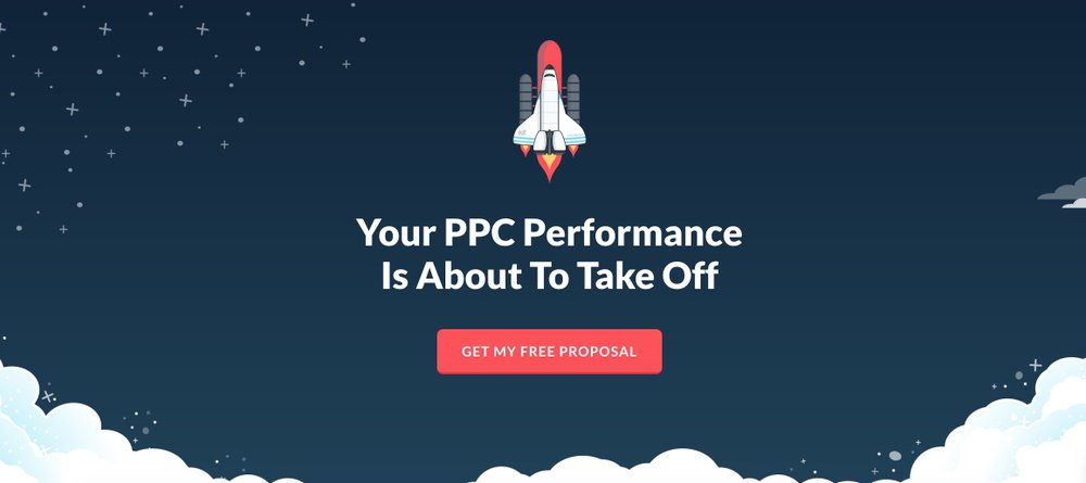
Better use of metaphor can be seen on KlientBoost’s page. They use a rocketship analogy to demonstrate value; with their product, clients will see results “take off”.
Key Takeaway
The idea that explaining a joke kills the joke applies to metaphors as well. Show your landing page to people who don’t know your product and if the messaging isn’t clear, simplify it.
Conclusion
5 to 10 seconds – that’s the maximum amount of time you have to persuade visitors to keep scrolling through your site. And for most of that time, they’re looking at your Hero Image.
So – hire a professional photographer, run some A/B tests, and really put some thought into creating a short yet powerful message. If done correctly, your Hero Image will quickly become your company’s Super Hero!
![10 Types of Digital Marketing [with Examples]](https://convertful.com/wp-content/uploads/2019/03/types-digital-marketing_136db1be596b5712e0570f045c1585b0_2000.jpg) 10 Types of Digital Marketing [with Examples]
10 Types of Digital Marketing [with Examples] A Product Features and Benefits Cheat Sheet