“Calls-to-action are the number one way to drive conversions” – Neil Patel.
When it comes to conversions, the call-to-action is your golden ticket. It’s the ultimate reason to create a landing page in the first place.
Typically, it takes the form of a button that precisely explains what’ll happen after you click it. If done well, the call-to-action will naturally continue the following thought for visitors:
“I want to…”
Every landing page has a call-to-action that tries to answer that very question. If the answer is compelling, it can push the visitor inside the sales funnel and get them one step closer to conversion.
But it’s worth asking: Is the call-to-action you’re using actually the right one for your business?
To help you find out, we’ve broken down call-to-actions into these distinct industries:
E-commerce
When it comes to your online store, there are really 2 main approaches to powerful call-to-actions. The difference simply lies in how narrow or general the action that you’re pushing is.
Let’s take a look at how the top brands convert people:
For The Shopping Page
1. Shop/Buy Now
These call-to-actions may be quite basic, but they can still be quite effective. In fact, if you browse around the web, you’ll find that many of the biggest online shops opt to stay on the safe side with these buttons.
Major outdoor sports retailer REI is certainly no exception, as they use the slight variation “Start shopping”:
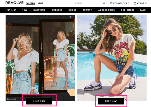
Their low-key call-to-action fits great with the website’s sleek, clean vibe. REI smartly offers a nice discount and then gently nudges you to take advantage of it.
No frills here, but more importantly: There’s nothing at all to turn you away.
2. Shop [Your Product]
If you want to put more of a spotlight on your products, use this call-to-action. With it, you can even help site viewers find exactly what they’re looking for.
As an example, take a look at this screenshot from American Apparel’s homepage:
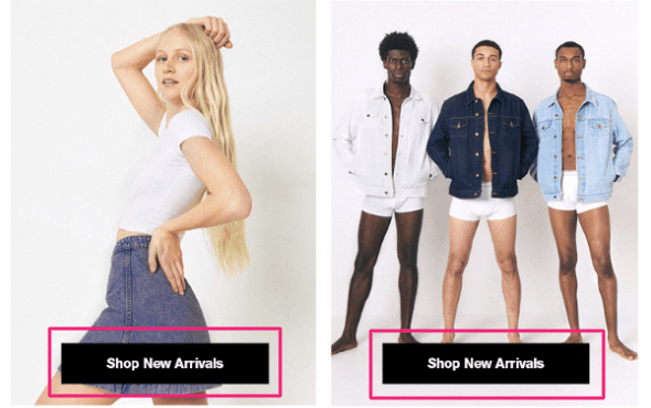
Their use of the “Shop New Arrivals” call-to-action allows users to easily navigate their way to the appropriate clothing category. And like with the previous example, the buttons themselves are simple yet inviting.
For The Checkout Page
3. Add to Cart
We know what you’re thinking: This one’s pretty generic.
And you may be right… But that doesn’t stop it from being incredibly powerful.
Oftentimes, people try to experiment and get creative with the “Add to Cart” button to add some excitement. But it turns out that with this call-to-action, excitement doesn’t work.
How do we know? Because split tests have proven it to be true:
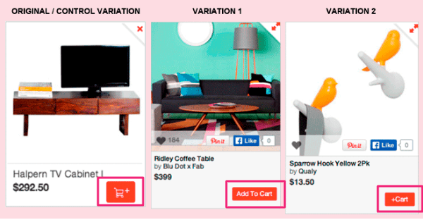
The original tried to get a little funky with the grocery cart icon, but the simple “+Cart” variation turned out to be 15% more effective.
And, as promised, the bare-bones “Add To Cart” variant outpaced both of them by a mile with a 49% surge in conversions. This call-to-action truly is a testament to simplicity.
4. Buy NOW with 1-click
One of the main reasons that people abandon their carts is a lengthy checkout process. With this call-to-action, you can quickly assure your visitors that they won’t face such a problem on your site.
Even Amazon heeds this advice on their Kindle eBook page. Their famous “Buy now with 1-Click” option effectively expedites the sales process.

Before clicking onto the item, customers have the ability to buy it. Even just removing that extra click works to shorten the checkout process in their favor.
Essentially, this makes it as easy as possible to complete the purchase instantly.
Blog/Media/Magazine
For these businesses, the goal is slightly different from that of e-commerce. Here, everything revolves around a subscription.
In this day and age, that’s how companies in this sphere grow. They can’t rely on immediate retail sales; instead, they must focus on building lists of recipients.
Email Marketing
If you’ve created some killer content, you may want to give your viewers the option of getting more of it directly in their inboxes. That’s what these call-to-actions are for.
5. Subscribe for Updates
This one’s fairly straightforward: The value of your content speaks for itself, and viewers have the option to sign up for it.
Take a look at the banner atop The New Yorker’s website, which offers two distinct “Subscribe” buttons.

And if you further hover over “Newsletter,” a third subscribing option will pop up:

It’s not spammy or in your face, but they manage to make it abundantly effortless to add your email to their list.
6. Join The [How You Describe Your Community]
This call-to-action gives you the chance to spread your creative wings to really create a connection with your audience.
Here, you can mold the text to make your company feel like a more exclusive community.
To see what we mean, take a look at what EmpowerWomen does:
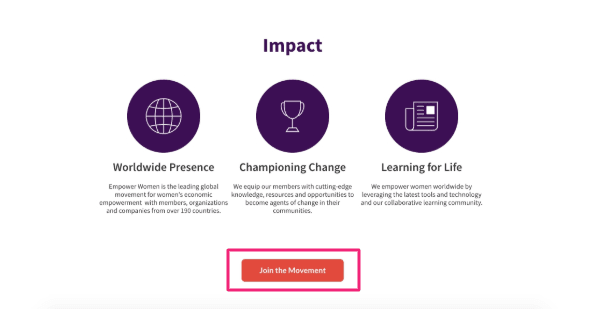
The describe their community with the powerful word “Movement,” which aptly fits with their social justice platform.
Compare that to the more common “Join us” approach, which works perfectly well but just wouldn’t capture the same essence.
Lead Magnet
Another way to turn your visitors into leads is to propose they download some of your useful materials. Basically, you’re leveraging your business’s valuable content as an incentive for prospects to convert.
And of course, there are tried-and-true call-to-action for doing so.
7. Grab/Get/Download [The Copy]
This is the classic.
You have content your users want, and you offer it to them for nothing more than their some of their personal info.
Sales funnel expert Russell Brunson does this by extending a link to one of his best-selling books on his homepage. For free, you can access something that has sold tens of thousands of copies.
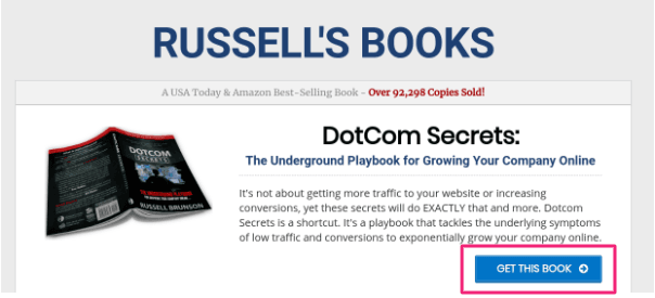
Why do this? Because then he can email you to purchase his next book. And if the free one was any good, there’s a decent chance you’ll become a customer.
The call-to-action itself is simple, but judging by Brunson’s success, it certainly provides viewers with compelling enough encouragement to buy future copies.
8. Yes, I want [The Copy]!
The beauty of this call-to-action is that it actually puts words into the customers’ mouths.
Instead of instructing or asking anything, you provide them with an answer to an unasked question. In other words, regardless of what they’re thinking, you’re planting the seeds to make them want what you have.
Check out how Asian e-commerce “content library” Global From Asia does it:
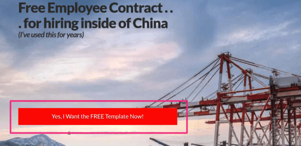
They could ask, “Do you want our free template?”
Instead, they jump ahead to your answer – your perspective – and make it a resounding “Yes!” Just by reading that copy, it’s hard not to agree; you really do want that free template!
Software
When it comes to purchasing software, people care about one main thing: Seeing how it works. And confirming that it works.
The two main methods of proving this on your end are free trials and demos. With the appropriate call-to-actions in hand, you’ll get your visitors hooked and transform them into paid customers.
Free Trial
This should come as no surprise: People love receiving free stuff.
Any time you give your site visitors a goodie bag, they feel that you’re providing value. And, as a result, they’re more inclined to pay you back for your generosity.
9. Try For Free
If you’ve seen this basic call-to-action from a SaaS company before, it’s because they really do work.
That’s why you see free trials offered by many of the biggest names in software, such as MailChimp:
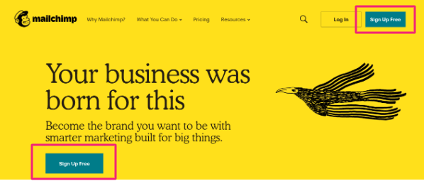
The word “Free” is typically strong enough on its own. So it doesn’t hurt that MailChimp pairs it with vibrant colors, striking graphics, and a catchy tagline.
Plus, they cleverly draw the eye to the call-to-action buttons by giving those boxes highly contrasting colors that stand out.
10. [Desired Action] Free for 30 Days
Here’s a call-to-action that easily adapts to your business.
By choosing a verb phrase that connects to your services, you can send a more powerful message. Case in point: 1Password.
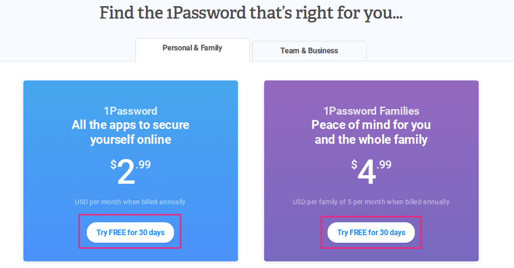
They start with some text that proposes the action you’re interested in – keeping your passwords secure. And then they add persuasive buttons that throw in the 30 free days.
That right there is the strength of this call-to-action: It simultaneously satisfies customers’ desires and provides additional value.
11. Give [Your Product] A Try
If you don’t have a free version and only want to extend a super low-paid trial, this call-to-action can do the trick. It also lends itself well to simply getting to the meat of the matter and signing your visitor up.
See how Prezi puts it in action:
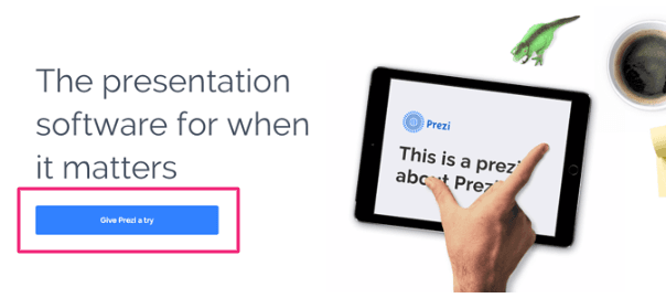
It’s simple, yet plenty appealing. Even without a free trial, it give the customer a little push and a means of trying the product instantly.
Demo
“Seeing something once is better than hearing about it a hundred times.”
If this proverb applies to your product, you may want to add one of these call-to-actions to your page.
12. Request A Demo
Demos’ main purpose is clarification. They exist to explain the “How?” of your product.
But an additional advantage is personalization. By allowing users to request or schedule the demo on their own time, you emphasize that this is for them. This is their demo; not just some generic walk-through.
Zendesk hits this on all cylinders with a pop-up window that promises a live demo in which they’ll “walk you through the product” and “answer any questions.” You can see they’ll hold your hand through it all.
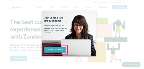
And just for good measure, if you click out of that window, their homepage features four (!) of the call-to-actions we mention here:
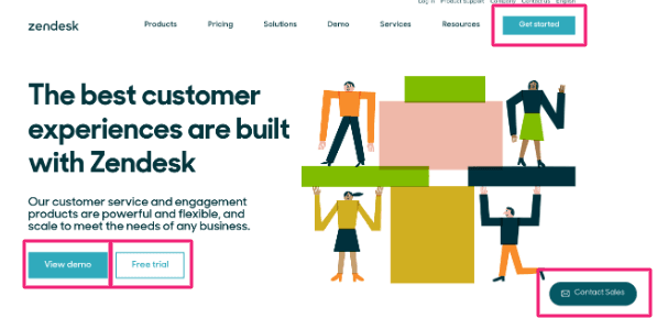
Admittedly, this may be overkill. But we have to give them credit for trying to appeal to as wide an audience as possible.
13. See [Your Product] in Action
Use this call-to-action if you want to lead to a video showcasing your product. This approach works perfectly if you have complicated software that requires some visual aid.
Take a look at how Kissmetrics does it on their homepage:
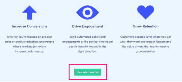
The blurbs abstractly explain Kissmetrics’ customer engagement services as a sort of teaser. And then the call-to-action naturally offers a chance to get the fuller picture of what they do.
All in all, they present their complex software without being at all intimidating.
Professional Services
If you run an agency or any other business that provides services for customers, you may need a slightly different call-to-action option.
This will depend on what your goals are. You may want to give content or incite action or, perhaps, establish a line of communication.
No matter what your need, we’ve prepared a few call-to-action that have been proven to increase your conversions.
14. Get My Proposal
Use this one if you’re confident that your landing page has a compelling hook. It needs to adequately warm up visitors so that they leave their contacts in exchange for your detailed proposal.
Essentially, the text on your actionable button relies more on how convincing everything around it is.
You can easily see this at work on the homepage of MarketFire:
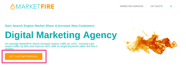
They lead with an enticing hook and cool visual. Then they make sure to demonstrate the value they can provide with cold hard data. All of this – prior to the actual call-to-action.
Only then do they offer the option to get the proposal.
15. Book a Call/Consultation
Here’s a call-to-action that works if you have a service that requires a more personal approach. Utilize it if you want one of your consultants to close the deal.
There are many reasons you’d want to do so, and custom e-commerce service provider Miva is a great example of a specific use case. They put this call-to-action on a page designed to convert users of Lemonstand, a similar company that’s currently shutting down.
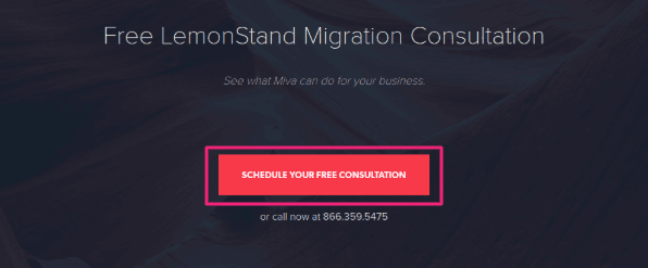
Their service is quite technical, and transitioning to it can certainly be a complex matter. Offering a consultation alleviates that pain point and goes the extra mile in accommodating their prospects.
16. View The Report Now
If you have annual insights or any data that your customers might value, this is your chance to share it with them!
For example, Wordstream’s analysis of paid Google Ads entails metrics that easily translate to a report form:
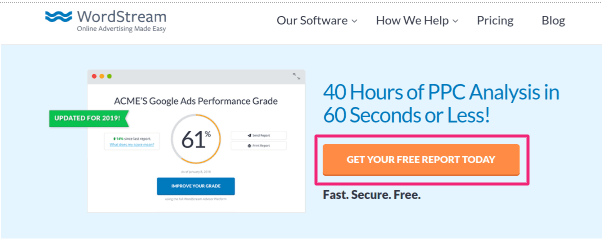
They’ve designed this landing page to quickly highlight the worth of their analytics. And if you want to dive even deeper, the call-to-action button immediately gives you the option to do so.
17. [Make] An [Action]
If you want to make your call-to-action a bit more personal, this formula can help. It encourages you to shape your copy around actions related to your brand.
Take a look at what entrepreneur Marie Forleo does at the bottom of her website:

She first insists you become one of her “insiders,” and then she gives you the option to answer affirmatively. Not only is this text specifically relevant to her, but “Make it happen” sounds considerably more human than, say, “Sign up.”
As a result, she endears herself to readers by making it seem like she’s speaking directly to them.
18. Get My Quote
This one works well… But it can be tricky.
The call-to-action itself doesn’t really explain what will happen after a visitor clicks the button. Will they receive an email mail? Will they need to fill out extra forms to get the quote?
It’s not entirely clear. So – you have to explain everything before they will click the button.
Allstate uses this call-to-action to offer quotes on their insurance plans. And though it’s subtle, they do make sure to hint at the “few clicks” awaiting viewers beyond this landing page:

Conclusion
Creating an unclear call-to-action is one of the worst mistakes that marketers make. Unfortunately, it’s also one of the most common.
Copying these call-to-actions or adapting them to your own product is a surefire first step to avoiding a similar pitfall. But most importantly: You have to make sure to keep them simple.
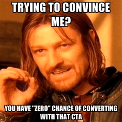
So don’t let Ned Stark look at you in this way. Instead, create a great call-to-action that actually converts.
![10 Types of Digital Marketing [with Examples]](https://convertful.com/wp-content/uploads/2019/03/types-digital-marketing_136db1be596b5712e0570f045c1585b0_2000.jpg) 10 Types of Digital Marketing [with Examples]
10 Types of Digital Marketing [with Examples] Convertful Update #36