If you run an eCommerce store, or work as a marketer for an online store, you’ll most likely have noticed that cart abandonment happens often.
Basically this is when a visitor visits your online store, adds a few products to their cart, and then decides not to go through with the purchase. This would not be an issue if it wasn’t so frequent, as recent studies show that the average cart abandonment rate is close to 75%.
What can you do when three-quarters of your website visitors abandon their carts? Well, if you use Convertful, our popups can help you reduce the number of abandonments and make it easier to reach out to those abandoning visitors. We’ll give you a few tips on how to make the best out of every website visitor.
Cart Abandonment Popups
These popups are designed especially to prevent users from leaving their carts behind. Each of these examples approaches the task in a different way, and we recommend that you test a few to discover which one fits best with your website (and your audience).
Let’s take a look at each of the cart abandonment popups you can get from Convertful. If you’re worried about costs, fret not – you can start using Convertful for free anytime. We promise you won’t be disappointed!
“Check Out Now” Popup
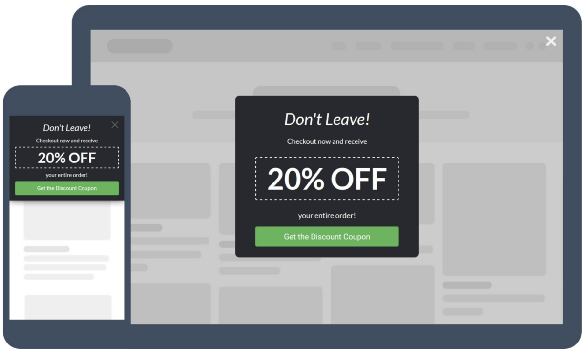
This popup not only tugs at your visitor’s heartstrings, but it offers a direct benefit in buying immediately from you. By offering a coupon code, you are making it more attractive for the visitor to purchase, since you are offering a reduced price for the products that they are interested in..
Some websites use different versions of the top title “Don’t Go”, such as “Ouch, That’s Abandonment” and similar alternatives. You know your target audience better than anyone else, so it’s up to you to decide what text you are going to use on this popup.
In this case, the popup has a coupon code for 25% off. It’s not always going to work, but giving your users a discount is a great push in the right direction.
“Wait For A Second” Popup
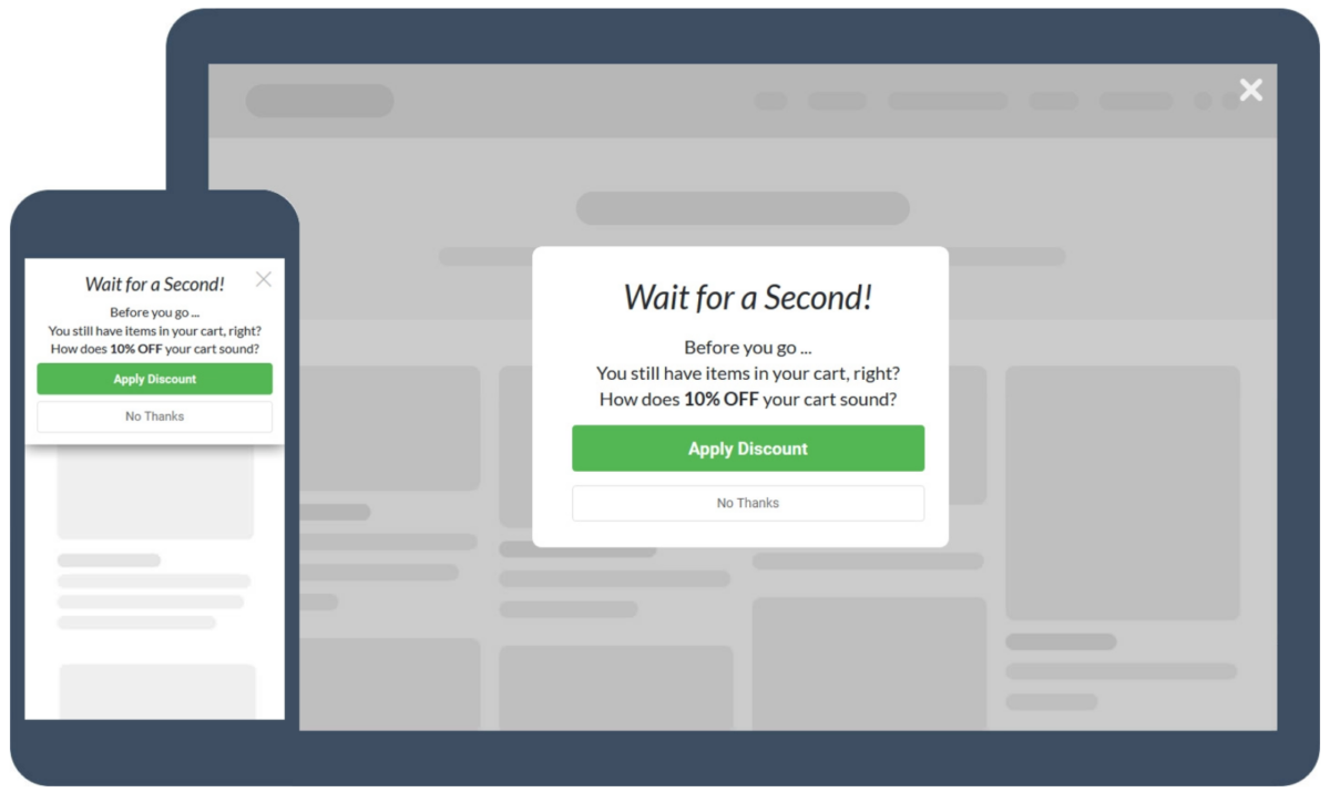
This popup has a different approach from the first one: it actually gives the visitor a chance to choose whether they’re interested in the discount or not.
Of course, you’ll want to phrase it in a way that conditions your user to do as you wish. Don’t push it too hard, though: make it easy to say yes, but don’t sound like “If You Click No, A Puppy Will Die”.
It probably goes without saying that this is not the best approach – unless you want your customers to ignore your popup completely. You can use humor, depending on the way you usually talk to your customers, but you don’t want to seem pushy.
“Don’t Miss Your Chance!” Popup
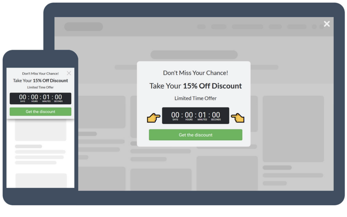
This is a favorite of ours. When it comes to sales, you want to capitalize on fear of missing out. If your website visitors know that this discount is going to end soon, they’ll want to use it. If they think they can have it at any time they come back, they won’t rush into buying. You want to push them a bit towards making the purchase by inviting them to buy now with the discount you’re offering.
By implying that they’re missing out on something, you’re increasing their willingness to spend their hard earned money – especially if they’re getting a benefit that isn’t available to other customers such as a discount.
As we mentioned in other articles, this kind of popup can’t be overused. If the discount isn’t actually a great chance because you can get it anytime, you’ll lose your credibility. If you say an offer is limited, it should be true.
“Which One Do You Prefer?” Popup
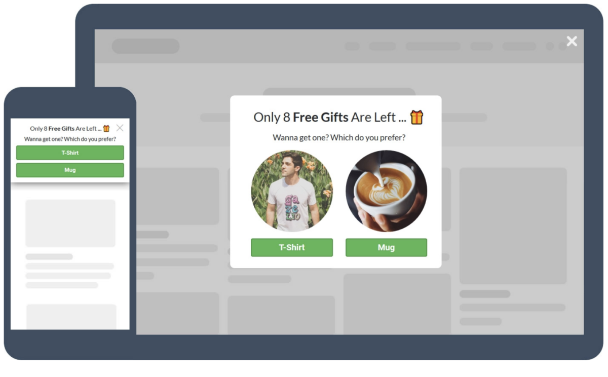
This one is a tricky popup because at a glance it seems that you are giving visitors an option to choose something, but effectively they are already saying “yes” to whatever you are offering and being given the option to select what they want back in return. . In this example, the first request is pretty clear: your visitor can choose between a t-shirt or a mug, but they’re getting a gift no matter what. And who doesn’t like free gifts?
Of course, you want your user’s email address and that’s the main goal of this offer. But users are much more likely to share their details when being offered something in return than just giving their data away for no reason.
Once again, you’re capitalizing on fear of missing out by saying there are only 8 free gifts left. Plus, you’re giving your users a choice, so they can pick their favorite.
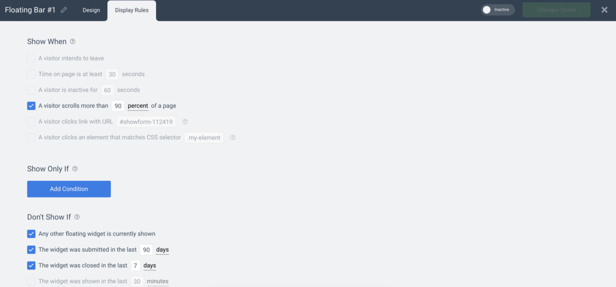
Just as the last popup we mentioned, you can’t overuse this one either. You can set up the Convertful popup to fire only when it’s the first time this visitor is coming to your website, so it won’t repeat. You can set that up in the “Display Rules” section of Convertful.
“Don’t Leave” Popup

This is the last example of cart abandonment popups from Convertful. Of course, the ones we showed you are the typical eCommerce popups: you can use other options and edit them to your preference.
In this case, the standard message is “Don’t Leave!”, with a 20% off discount. The message is similar to previous examples, with a discount – the only difference is you need to click on “Get the Discount Coupon”. This means that any user that shows up on your website for the first time will have to enter their details for the coupon. This not only helps you with cart abandonment, but it also gives you an opportunity to get in touch with that user later.
Wrapping Up
Cart abandonment is one of the most annoying issues for eCommerce. The user checked your products, added them to the cart, and gave up. It’s not always easy to know why a user left his cart behind, but these popups can help you reduce the number of times this happens..
Make sure you make the best out of each visit on your website. Get your Convertful account today! If you would like to stay up to date on current offers, you can find us on Facebook, Twitter or LinkedIn.
 How to Convert 11% of eCommerce Visitors Using Spin-to-Win Gamification
 13 Tactics To Improve Your Conversion Rate