Do you have an eCommerce business? If so, you will know that it’s not always easy to make users convert or to keep them coming back as repeat customers. So, how do you increase conversion rates and ensure customer retention?
With Convertful, it’s easy. Convertful allows you to create opt-in forms that will help your business grow by increasing conversion rates, improving customer retention processes, and collecting email addresses for your mailing list.
But before we dive into the different ways you can use Convertful opt-in forms in your eCommerce business, let’s start with the basics.
What is an eCommerce opt-in form?
First of all, an opt-in form is a form you add on your website to be able to collect information from your users. It can be used in different ways, different contexts, and with different goals in mind.
Opt-in forms can be done in quite a few different ways: you can use pop-ups, inline boxes, bars at the top or bottom of your page, the list is endless.
The aim of an eCommerce opt-in form is conversion. Generally, opt-in forms try to get users to share their email address. However, eCommerce opt-in forms do not always require an email address. The goal of eCommerce opt-in forms is to encourage users to proceed with their purchase by means of offering a discount, free shipping, or anything else that can be of benefit to the users.
In the next section, we’ll show you how to use Convertful opt-in forms for your eCommerce business. We’ll go through seven examples of opt-in forms that you can create with Convertful to increase your conversion rate and improve your relationship with your customers.
7 Opt-in Forms to Increase eCommerce Conversions and Improve Customer Relationships
Below are a few examples of what you can create using our platform; however, do not limit yourself to these examples. When it comes to marketing your products/services, only the limits of your imagination and creativity apply.
1. Coupon Opt-in
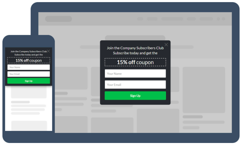
This is a pretty straightforward eCommerce form that you can use on your website. Just by visiting the website and providing you with their email address, users get 15% off immediately on any purchase.
The coupon opt-in is a great way to give those hesitant shoppers the little push they need to proceed with a purchase. We recommend placing it on all your landing pages and on your homepage.
2. The Countdown
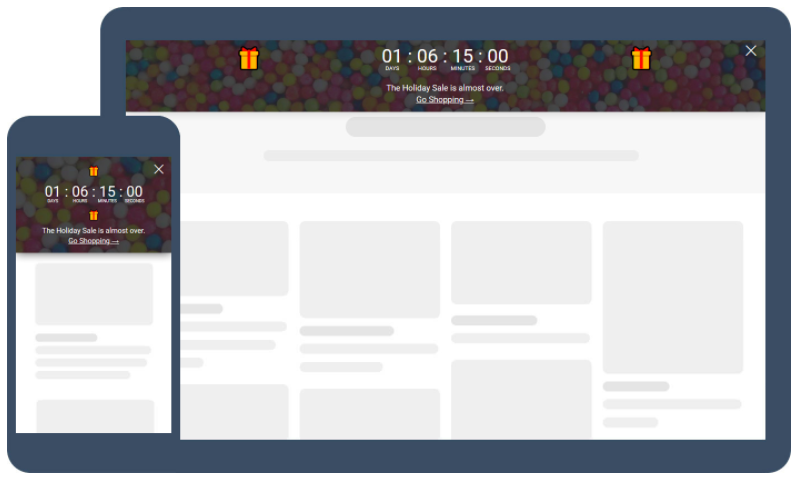
The sense of urgency is your best friend when you have an eCommerce business. This type of opt-in, the countdown timer, will help create in your customers that fear of missing out that often results in a purchase. After all, when you use a countdown timer, your offer seems even better – that’s why it’s limited in time. The timer incites users to act quickly before the countdown ends.
However, you should be careful to not overuse this technique. If every time a user visits your website you have a countdown timer running until the end of an offer, there’ll come a point when the time-limited offer stops working since users do not believe in you anymore.
3. Abandonment Pop-ups
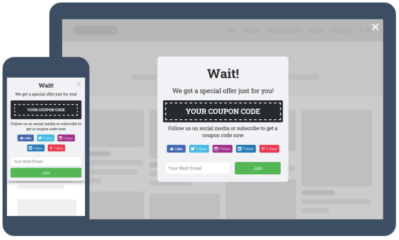
This type of opt-in form is highly effective in getting customers to carry on shopping with you. When the user is about to leave your website, the movement of the mouse triggers this pop-up. The copy helps too: by saying “Wait! We got a special offer just for you!” It catches the user’s attention just when they were about to leave.
Other than the pop-up, you only have to create a coupon code to be added on checkout, and that’s it. The reason why this opt-in form converts highly is twofold: first, it draws attention to itself by covering the whole screen; second, if the user was hesitating about purchasing, this coupon will give them that extra boost.
4. Contests and Giveaways
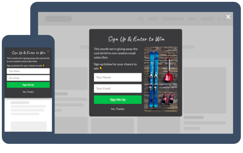
The giveaway opt-in form works for any business, but especially for eCommerce. All the user has to do to enter the giveaway, is to type their name and email address. Easy, right?
The beauty of this opt-in is that you get loads of contacts from it which you can then use to send product news to. Best of all it only costs you one unit of one or more products – you can offer a single product or a few that fit together in a custom pack as your giveaway. The choice is yours.
We don’t recommend doing giveaways for products you don’t sell, though. It might be tempting to offer highly demanded products such as tech gadgets, smartphones… However, once those contacts enter your mailing list they are unlikely to be interested in your products because they were only after the prize. That’s not the kind of recipient you want in your mailing list.
The way to avoid this is to only offer products that are yours or related to what you sell. That ensures only the right people enter the giveaway.
5. Cart Abandonment Pop-ups
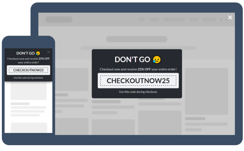
Another effective way to make sure your users convert is to use a cart abandonment pop up. This is triggered by a user trying to abandon the website while in the checkout process.
This specific pop-up plays on your users’ feelings, making them feel guilty for leaving and, at the same time, offering them an incentive to purchase.
Cart abandonment pop-ups are quite common and for good reason. They are effective, and you don’t even need to ask for an email address: you’ll ask for it during the checkout process. Then, you can add it to your mailing list.
6. Gamification Pop-ups
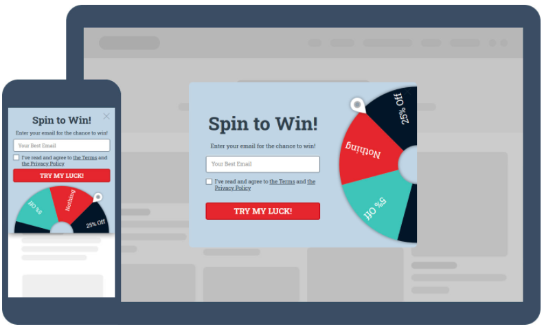
Who doesn’t like a good spin-the-wheel game? We sure love them! That’s why we offer that option in our opt-in form repertoire.
All the user has to do is enter their email and wait for the outcome. Each turn of the wheel gets you a different discount or offer. This makes shopping fun and exciting for your users and since you’re getting their email addresses, even if they don’t convert immediately, they will have other chances of doing so.
7. Scratch Cards
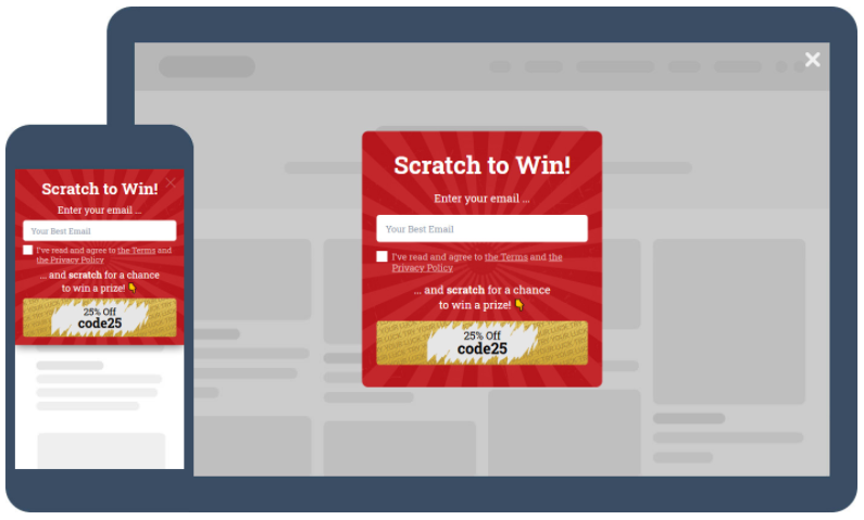
Scratch cards are also interesting to users in the way they bring a little bit of randomness and gamification to the checkout process. You can use these opt-in forms any way you want: to offer discounts, as a cart abandonment pop-up, as a website abandonment dissuader… Anything. They’re one of our favorite options because just like spin-the-wheel pop-ups, they’re fun for users too.
Wrapping Up
These are a few examples of how Convertful can improve your eCommerce store experience and performance. By offering discounts, coupon codes, or free shipping, you are making it more attractive for users to convert. These opt-in forms allow you to draw attention to your offer, improving your conversion rate, and reducing cart abandonment. Each of the opt-in forms we show has a different way to achieve this, so we recommend testing them out and finding the best ones that fit your website and products
In order to be successful with your eCommerce forms, you need to think of your users first and foremost. Your business will only succeed if you think about what your users want and what they need.
It is in your ability to deliver what your audience wants that resides your power as an eCommerce manager, marketer, or developer. With Convertful, the shopping experience you can offer is infinitely better and more effective. Get Convertful today and improve your sales process.
 18 Calls To Action That The Biggest Brands Have Used for Success
 Collecting Email Addresses on Your Website – The Guide