If you’re building your website or looking for ways to improve your website’s performance and conversion rate, it is essential to check your call to action buttons.
Calls to action, known as CTAs, point your visitors in the right direction – i.e. to the action you want them to take. This could mean getting them to subscribe to your newsletter, to sign up for a trial, to purchase your product, and so on.
When done right, CTAs are one of the most important elements of your website. They make sure users convert and guide your user experience.
When it comes to your website, you should get creative and find new ways to draw attention to your goals. However, CTAs should be straight to the point. We recommend sticking to the formulas that work – we’ll go through those in this article too.
What Is A Call To Action Button?
A Call To Action button is a clickable button on a webpage, advertisement, or piece of content that encourages the audience to take a specific action. It usually combines text with a colored background, or sometimes with an image. It creates the bridge between your content and the action you want visitors to take.
For example “Buy Now”.
You should place this button strategically on your website, as we’ll explain soon. For the time being, it just needs to be said that a CTA button asks for an action and brings the user’s attention to the website’s goal.
Why Should You Improve Your Buttons?
We’ll go through a few reasons why your call to action buttons need to be optimized. These are also the goals of any CTA button.
1. Capture attention.
Your call to action needs to get users’ attention. If you’re not capturing that attention, your CTA needs to be redone. This can be done using a different button shape and colour, changing the text in the button, or both
2. Create connection
If you want your button to work, it needs to create a connection between your content and your website visitors. If you don’t speak their language, you’re missing out.
3. Establish problem
You need to reinforce the problem your users want to solve. What is the issue that you can solve with your product? By making the problem obvious, purchasing your product becomes the only solution.
4. Build interest.
If your call to action does not incite your users to, well, action, that can undermine all the efforts you put into creating your website.. Your CTA buttons should wrap up the user experience and put them in the right frame of mind to take the action that you want them to take..
5. Build suspense.
You need to think about how you want your audience to feel. It should be exciting for them to discover your offer. Be enticing and suspenseful.
6. Transfer momentum.
Your writing should bring users up to the solution you offer. This means all the momentum created by your written and visual content should lead to the message in your CTA button. Do not disappoint your visitors.
What Defines Great CTA buttons
Now, you might already know all that we mentioned in the previous section, but it’s not as easy to put it into practice. In this section, we’ll show you the main features of a winning CTA button.
1. Simple design and straightforward message
A CTA button does not try to be something it’s not. We don’t recommend replacing this button with an inline link, or an image, or anything else. A call to action button is easily recognized by the user as something they should click. The combination of a simple button and a clear call to action is unbeatable.
2. Compelling lead-up text
The text leading up to the CTA button needs to push the user towards the action you want them to take. Being compelling implies tugging at your reader’s heartstrings: buying decisions are usually more emotional than rational.
Your lead up text needs to have a message that makes the reader jump at the opportunity. You want users to take action, using quotes such as “Get My Ebook Now” or “Yes, I Want To Try X For Free”. Make it unreasonable not to accept your offer.
3. Placement is important
When choosing a placement for your CTA button, make sure that place is visible. Depending on the page content, it might be better to add the call to action button at the end of the page, in line with the text, at the top of the page, and so on.
A way to figure out the best placement is to A/B test: try different positions and placements in order to see which one works best. There is no one-size-fits-all approach to this question. Each industry, product, or service is unique when it comes to CTA button placement.
4. Use a contrasting color to the background
In order to make your buttons pop, their color of the button should contrast with the website’s background. The button should be easily distinguishable from the rest of the content, and contrasting colors help. It’s common to use a white background and a black button, but other bright colors can make your CTA button pop.
Remember, the goal is to make your button easy to find. High contrast makes it easier for users to know where to click. If users are not converting, there might be an issue that stems from the button’s color and shape. The button needs to be obvious.
5. They are related to the previous action your visitors took
In order for users to click your call to action button, it must come as a logical sequence to the previous content (usually text, but content can include an infographic, an image, a video…). You need to build a path in your website that leads to the call to action.
Your main goal should be to take users to where you want them – your CTA button. In order to achieve this, you need to establish a connection between all the elements.
If your CTA button is related to an email you sent to your customers, your button and the landing page content need to match the email’s visual.
6. They don’t have to compete for attention with other elements
Your call to action buttons need to capture your user’s attention. This means that nothing should compete with the button, be it through colors, shapes, or other elements in your landing page or website.
It’s also important to make sure there is no confusing content on the page. Each page in your website should serve one purpose only so that users don’t get overwhelmed with too much information.
Each page should have only one CTA button, with only one proposition. If you want your users to take several actions, divide each action by page.

7. Use the first person
When it comes to communicating with customers, sometimes you’ll use the first person (I, me) and sometimes you’ll use the second person (you, your…). When it comes to CTA buttons, you should always use the first person.
By saying “Check Out My Dashboard” rather than “Check Out Your Dashboard”, you’re getting closer to the user and making them take matters into their own hands. The more personal you get (without being pushy), the easier it is to get your users to take the action you want them to.
8. Be specific
Your call to action needs to be specific: the action you want users to take has to be very clear in the CTA button.
Having a generic call to action might hinder all your efforts to create a successful landing page. Your CTA button needs to be as clear as possible, as users need to know what they should do next. If you’re not clear enough, you leave space for your website visitors or email recipients to ignore what you’re asking of them.
9. Use action-packed text
In your CTA button, remember to use text that incites action. Prefer words such as “get”, “win“ or “now” rather than “submit” or “enter”. Number one rule: don’t be boring. Make your button’s call to action exciting in a way that leads to a conversion.
10. Use the right shape
When it comes to button shape, the rule is to match the rest of the content. The button shouldn’t seem foreign to the source content, but at the same time, it’s necessary to make the button stand out.
As we mentioned before, A/B testing is the best way to make a decision, in this case, which shape your button should have. Try rectangles, rounded corners… Don’t go overboard with very original shapes: common examples are common because they work.
11. Use large and legible text
This should apply to all your text, but is especially important in your call to action buttons. Remember to pick a legible font that makes your CTA easy to read. There should be absolutely no effort required from your visitor’s side to understand what you’re proposing.
Make sure your text contrasts with the button color. Bold text is also recommended.
12. Keep the CTAs short
Your call to action should be short and sweet. Whatever information you need to add for context, place it before or after the CTA. If you have too much information on your button, you’ll end up confusing users. After all, what do you want them to do? That should be obvious and stated on the button..
If you can sum up the goal of your page in two to three words, you’ve got your call to action.
13. The button stays above the fold
Your mileage might vary on this one. Research suggests that placing your most important elements above the fold on your website (meaning users don’t need to scroll to see them) improves results and increases conversion.
However, this might not always be the case. If you have an article, your users are probably more inclined to click on your CTA button after they read the whole piece. You’ve shown your expertise to convince them, and that’s why they’re interested.
14. Establish a hierarchy among your CTAs
We don’t usually recommend having more than one CTA on the same page, but in some cases, it might work. As we said, you need to test in order to see what’s best for your product or service.
Nonetheless, if you have several call-to-action buttons on the same page, there should be a hierarchy between them. Define which button is more important: let’s say you have a “Try Now For Free” button and a “Get The Newsletter” button. Of course, that first button is more important. So, your visuals should give more prominence to that button.
15. Your CTA copy should add value

If there’s one thing that applies to all good call to action buttons, it’s that they add value to the user. Your CTA copy should offer something to the reader so that they’ll feel compelled to click the button.
An example of something you can offer is a welcome discount. Let’s say the user just needs to provide an email address to get the discount code. This makes it more likely for the user to click the call to action button, and at the same time offers you a new email address to add to your mailing list. This is a valuable offer for both you and your customer/prospect/reader.
16. Bonus button text
You can add context to your offer by adding text before or after the button. As we mentioned, your call to action text should be short and straightforward, but what if you need to add information that does not fit the button?
Let’s say you have a “Start My Free Trial” button. But you need users to know that they don’t need to use a credit card to start the trial, or that you have a 30-day money-back guarantee, and so on. This information should be above or below your button, so as to add context to the call to action. Bonus text makes it more likely for users to read it, other than just placing it in the main text content.
17. When it comes to choices, less is more
If you want users to take action, you need to avoid giving them too many options. As we mentioned, it’s ideal to have one CTA button per page – i.e., one choice.
When users have a lot of different options, it’s difficult for them to focus on what you want them to do. So, less is more: the fewer options your users have, the easier it is to get a conversion.
18. Follow the natural user flow
If you want your users to click your call to action button, you need to follow the natural user flow. But what does this mean?
Tools like HotJar give you a heatmap. This will show you where users click and where they scroll.
Having that information, you can understand your user flow. This will tell you where you should add your CTA buttons for better performance.
A/B Test Your Buttons
As mentioned above, A/B testing helps you decide where to place your buttons, which font to use, the button shape, and so on.
We recommend testing your buttons, as the rules aren’t always the same for every business or brand.
In the previous section, we mentioned HotJar as a tool to find out where your users click and scroll. This just goes to show how different products, different services, and different brands have their own rules when it comes to CTA buttons. The only way to know what works for you is by testing, testing, and testing once again.
We recommend updating your opt-in and call to action button often. If a specific combination of elements gets you more conversions, that’s great – but at the same time, what is good can always be improved, and visual cues change due to design trends as well.
How To Add A CTA Button Using Convertful
If you’re a Convertful user, adding opt-ins and call to action buttons is quite easy. We’ll go through the process now.
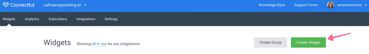
First, log in on Convertful.com and click the “Create Widget” button.
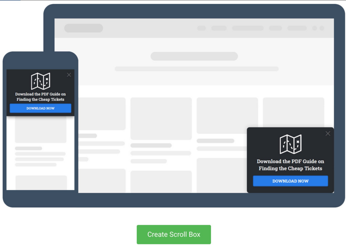
Select one of the opt-ins and click on “Create Scroll Box”.
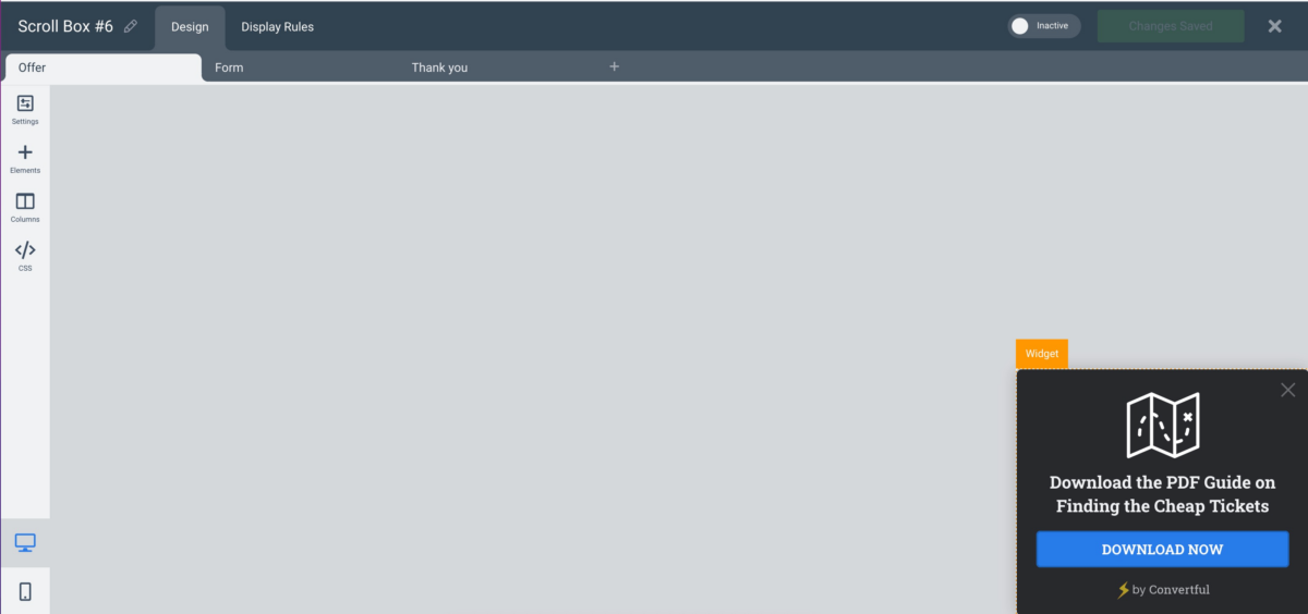
Once you open the editing window, you can decide if you want to change the opt-in in regards to the look, colors, fonts, anything you think you can improve. In this case, we chose one of the subscribe opt-ins and we’re going to keep it as it is.
If you want to edit it, you can just use the options on the left-hand menu.
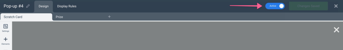
Now, once you’re satisfied with your opt-in, click on the “Active” button and you’re ready to go. You’ve got yourself a CTA button embedded in your opt-in, using Convertful’s tools.
Wrapping Up
In a nutshell, Convertful is a great option to add opt-ins and call-to-action buttons to your website. These can help you with lead generation, and, of course, build your mailing list.
Call to action buttons are quite important as part of any digital marketer’s strategy. We recommend testing these to make sure you maximize your audience and your profits.
If you don’t use Convertful yet, join today and try it out for free!
 120 Marketing Quotes To Get Inspired
 Collecting Email Addresses on Your Website – The Guide