If you’re a marketer or a business owner that does their own marketing, you have probably heard of exit popups. But what are they?
Exit popups work exactly the way its name suggests. They detect when users are about to close the page and show a popup before they leave the website.
This is a common practice when it comes to using popups for lead generation. If done right, they can grow your mailing list and even increase your sales and revenue.
Chances are, you’ve heard that “users hate popups”. That’s not exactly true. Users don’t like popups that do not interest them. However, in the case of exit-intent popups, the user is already going to leave, so there’s nothing to lose and a lot to gain from adding one of these popups to your website.
But can these popups be used on mobile? If you use Convertful, all our popups can be used on both desktop and mobile versions. Most smartphones handle exit popups quite well, and it’s easy to set up these popups for mobile using Convertful. When editing the popup, you can see a preview of how it will look on mobile as well:
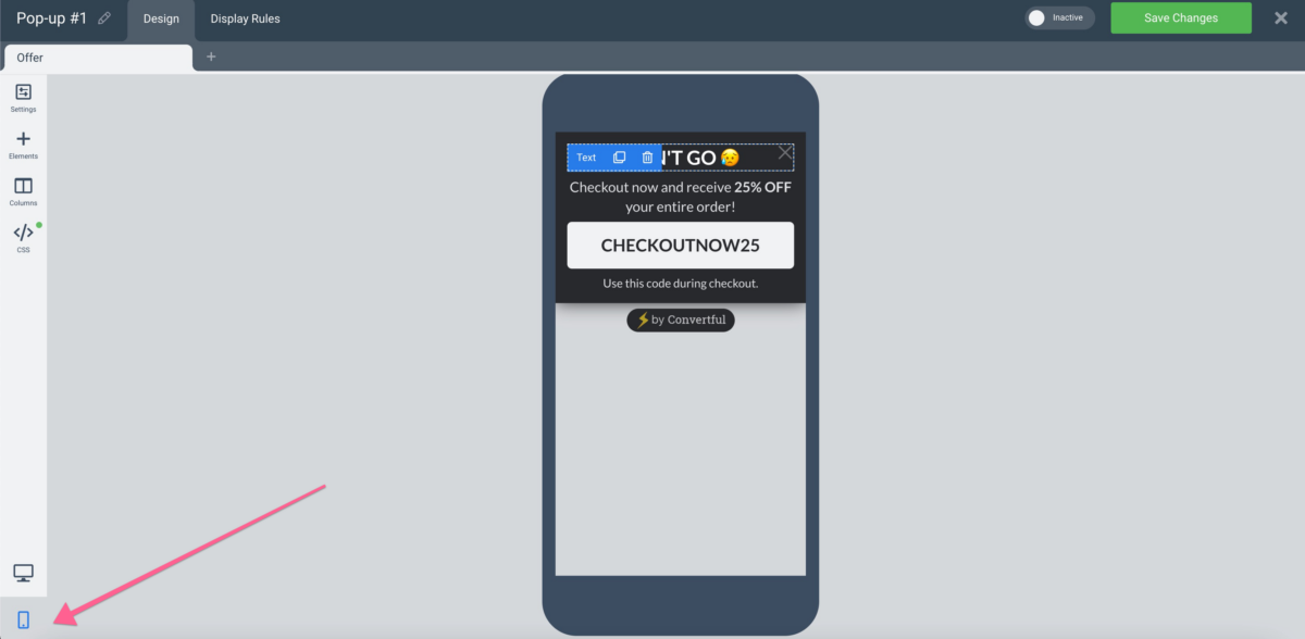
Convertful offers a variety of customization options for your templates. A targeted message is highly effective when reaching out to users that are going to leave your website.
In this article, we’ll go through a few exit popup hacks that can be used to grow your mailing list and, at the same time, increase your sales volume and revenue. Let’s go!
Offer a Content Upgrade
Content Upgrades are highly recommended to get those visitors on to your mailing list. It takes a bit of effort, because you need to create high quality content in order not to disappoint your visitors. But, at the same time, this strategy is very likely to get visitors that are interested in your product and your niche.
Gated content, or content upgrades, ideally provide content related to the problem your product solves. You can use case studies, white papers, reviews, anything that you know will be of interest to your audience. What matters is making that offer valuable enough to make users share their contact information with you.
Include A Picture Of The Offer
Visuals always make everything more appealing. If you’re offering an ebook related to your product, show a picture of the cover. This will make the offer more palpable and real in your visitors’ eyes.
Whatever you’re offering to your visitors in exchange for their email (and maybe a few other tidbits of information) needs to be clear as day. It also needs to match the niche of your website visitors, while keeping users from abandoning the website.
Use Color Wisely
Color settings in your exit popups make a visible difference in how your visitors perceive them.
We recommend using a bright color scheme in order to make your popup more lively. In other cases, it might be better to go with monochrome or grayscale hues. The main thing to remember is that your popup needs to, well, pop. Don’t be afraid to try different color schemes if you’re not sure what to go for. To make your popup stand out, you’ll also need a compelling button copy.
Use Compelling Button Copy
If your buttons have generic text such as “Subscribe Now”, maybe it’s time to try something different. Of course, there’s a reason why simple CTAs (calls to action) are used – because they have been tested and tried.
However, if you do the same thing everyone else is doing, there’s no reason for your visitors to believe you are different – or better. Find a way of making your visitors stick around by using the right suggestion. It can be something like “Give Me The Report Now!”, which provides urgency (more on that later), or something that plays on your visitor’s emotions such as “I Don’t Want To Miss Out”. FOMO, or fear of missing out, is real.
Suggest Related Posts
An easy way to keep visitors on your website is to suggest to them something else to read after they’re done with a specific post. If the user is interested in the subject, why not suggest a related read that might complement the first one?
Even if the reader does not have time to stay, this reminder might make them come back to your website or blog later, when they have more time.
Suggest Related Products
In line with our previous hack, we recommend suggesting related products in your exit popups for product pages. If your user is leaving without buying, maybe they still haven’t found what they are looking for…
If you can help your visitor find the right product, maybe they won’t leave. Perhaps they will browse further, perhaps they will buy something. You’ll never know if you don’t try – which is the underlying lesson in exit popups. You’ll never know the answer unless you ask.
Incite Curiosity
Inciting curiosity is a great way to make sure your visitors stay on your website. An example is when you mention in your popup you’ve got a surprise for them if they give you their email address.
Curiosity is a powerful emotion. It gets your visitors’ attention and makes them want to do anything it takes to know what you’re offering. This is a highly effective way to make sure visitors stay on your website for a bit more. Plus, you get their email address and any other details you might ask for.
However, remember that curiosity does not last forever. If a user wants to know what’s behind the gates, you can’t ask them to answer a full 10-question survey or they’ll get bored quickly.
Add Urgency
Adding urgency is all about making your visitors believe that they’ll get this offer only if they act now. You can use deadlines in your exit popups but remember: each visitor should not see the same deadline every time they visit your website. Make sure you set this exit popup only for new visitors.
If you’re not careful, you might end up losing your visitors’ interest, since they see the same deadline every time they visit your website. However, taking this into consideration, urgency strikes the fear of missing out (we mentioned it previously) and makes your visitors excited about your offer.
Offer A Discount
In this case, you’re not pushing for a contact, but for a purchase. This is extremely useful when your visitor is on your sales pages and they decide not to purchase for some reason.
Offering a discount, especially one that has a deadline attached to it, can give your visitor that slight push to become a customer.
Everybody loves discounts, and if they are interested in your product, they’ll most likely want to buy in order not to lose the opportunity.
Offer Free Shipping
Free shipping is something else you can offer that will increase your sales too. Of course, you cannot offer everything, so we recommend offering free shipping on purchases above a certain value.
Using free shipping as an argument for a sale is helpful for you and advantageous for your customers. Everybody wins. Using an exit popup offering free shipping is going to make a huge difference in your conversion rate.
Offer To Chat
Sometimes, your visitors are going to have questions about your products and the purchase process. This is quite common, but in many cases, the user doesn’t get an answer, which leads to frustration and abandonment.
So, on a product page, and in the checkout process, we recommend having an exit popup that allows your customers to chat. This will make it easier for your users to be reassured while buying, making sure they stay on track and go through with the purchase.
One of the most important things you must remember when selling your product online is to make sure your visitors are confident in buying from you. Offering to chat is a way to reassure them.
Create Scarcity
This is a common tactic that works especially well when you’re selling SaaS products. In that case, you can ask your visitors to give you their email address so they can save their spot on a waiting list for your software.
If you offer B2C products, you can also use tactics such as saying that the product your user is after is one of the last ten units. Users will be pushed to buy since they don’t want to be out of the loop. Scarcity is a useful technique in exit popups that increases sales and revenue.
Give A Yes/No Choice
Yes and No exit popups are quite effective as well because they appear to give your visitors a choice. The thing is, you’ll provide them with a conditioned response that will make users click “Yes” most of the time.
This is commonly seen in many different environments, no matter if it’s B2C, B2B, products, or services. And it works. By phrasing the options in a way that makes users click “Yes”, you’re decreasing the bounce rate and ensuring users stay longer on your page.
Offer A Free Trial
If you sell software, a free trial is ideal to make sure you don’t miss out on all those hot leads arriving at your website. By taking upon a free trial, your visitors have a much higher chance to become customers, since they’ll have a chance to try out your software.
Other than that, offering a free trial on your exit popup makes sure those prospects will at least know what they can do with your software before they make a decision.
It is also important to follow up with those new users in order to make sure they try out your software. Check in to find out if they have questions, what’s their use case, and so on.
Hide Popups From Existing Subscribers
This hack is very important when setting up your exit popups. How would you feel if you went to a website you already purchased from, only to get the same popup promising you an offer on your first purchase?
It’s important to make sure your popup only shows once for the same user. Otherwise, you’re going to lose your customers’ trust, and once you go down that route, there’s no coming back.
Avoid annoying your customers with the same popups over and over again. If you want to have an exit popup targeted at current customers, choose a different look, a different copy, and a different offer.
Now that you know a few hacks about exit popups, you probably want to know how to put them into practice. And that’s what we’ll show you in the next section.
How To Set Up An Exit-Intent Popup On Convertful
To create a new exit popup on Convertful, click Widgets on the menu. Then, click on “Create Widget” to create a new one.

Once you click “Create Widget”, you’ll be shown our list of different lead capture widgets:

Pick “Pop-Ups” from the left-hand menu and choose one of the options according to what you need.
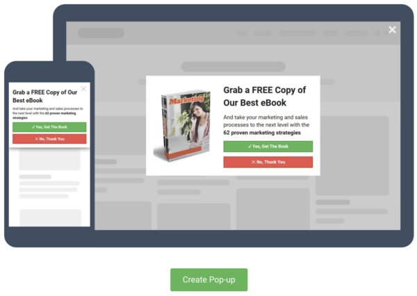
Then, click on “Create Pop-up”.
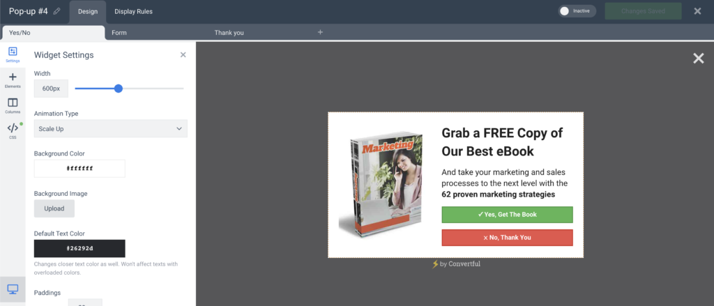
On the Design page, you can edit and set up the pop-up. Every element is customizable, for example, the button size, the text on each button, and so on.
Once finished, just click the “Inactive” toggle to change it to “Active”:

And there you go! You’ve created your first exit-intent popup. Now, just follow our hacks and you’ll be alright!
Wrapping Up
There’s a lot to be said about exit-intent popups, and we tried to cover the main hacks that will improve the way you use exit popups.
Are you a Convertful customer? If not, just check out our website and find out all that you need to know about Convertful.
If you have any questions, feel free to use the comment box or message us on Facebook, Twitter, or LinkedIn.



 13 Tactics To Improve Your Conversion Rate
 How to Use Convertful Opt-in Forms for eCommerce